Lack of interest Profile-Post Field / make "focus active" when visiting User-Profile-Page

This suggestion has been closed automatically because it did not receive enough votes over an extended period of time. If you wish to see this, please search for an open suggestion and, if you don't find any, post a new one.

erich37

Well-known member
when visiting a "User-Profile-Page", for example this one:

Mike


The Box (field) which says "Write something" is quite hard to see as it is a white-colored field on a white-colored background.

Please make "focus" active, so that the cursor is blinking in the field and the yellow-colored background shows.
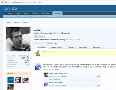


profile_focus_active.webp


:)
 
Upvote 0
This suggestion has been closed. Votes are no longer accepted.
I don't think it's hard to see...

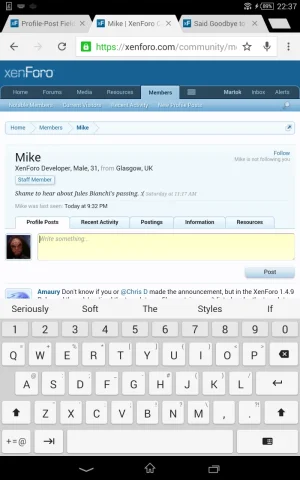
Anyway, the problem with making this focus active is that, on tablets and phones, it automatically invokes the keyboard:

Screenshot_2015-07-21-22-37-23.webp

This is not desirable as users won't necessarily be visiting a profile to make a profile post (more often than not it's just to look at a user's information).
 
Whether focused or not, I can agree it's faint, which is why we use the same text color for everything non-header and why we've made the focus background a clear value on our site, but it's fairly easy to see and even easier to see in @Martok's screenshot because tablets zoom in a little.

A better suggestion, however, would be to simply adjust the Text Control Placeholder Text style property under the Forms property group. By default, it's hard-coded (as in, not coming from the color palette) as #A0A0A0/RGB: 160, 160, 160.

Adjusted to #646464/RGB: 100, 100, 100:

KHF Focus 1.webp

KHF Focus 2.webp
 
Back
Top Bottom