The world gets crazy more and more with every day of my life, people seems to have less frontiers, less rules, less concentration. The world is a big pizza with to many different things on it, so i dont know what i want, what i choose, what i do, what i miss, what i prefer.
To give all this people who miss it to have clear frontiers, clear parts and clear ways i have to stop the actuall fashion of having no order on my websites.
For example i made a breadcrump for XF like in VB, and while doing it i found out that you dont have a Ordnung in passing infos to the breadcrump, so i made some if then elses and have it now. (Watch it on xendach.de)
In the same time i found out that there is no clear Ordnung at other parts of XF.
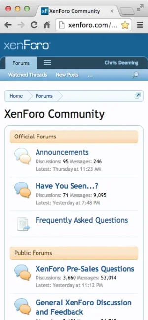
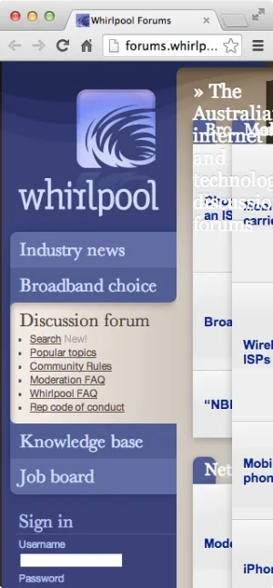
Sometimes we have the big rounded lines around, sometimes not, e.g.
Then compare the popup for a user with the cp page looking like in VB.
Why we have not the same Ordnung, means things in the same row, why have " watch your profile" there? It opens in a page without the menu at the left side. This confuses normal users, i want to have a board for grandparents e.g. and not for nerds.
Why we have arrows for board and users to see the pop-up, but not for cp and communication.
Why i have popups for not selected bars, but not for the selected one?
And please find a nicer way to show the title.
A lot of small parts i have done or will do now to make my board-people happy and for me another running board.
But i think this Ordnung - we like this word here in germany - should come out of the box.
Last edited:

