You are using an out of date browser. It may not display this or other websites correctly.
You should upgrade or use an alternative browser.
You should upgrade or use an alternative browser.
Implemented Online Status Indicator / move outside of Avatar-image
- Thread starter erich37
- Start date
- Status
- Not open for further replies.
This suggestion has been implemented. Votes are no longer accepted.
I agree. Also, what if a person's avatar is actually green? Then the indicator will be completely invisible.
What if you want it in the postbit, and the theme is actually green?
As stated a couple of other times, leave it as it is, and if needed, use a simple template edit or css to change the location of it. This quote right here covers pretty much everything needed to understand why....
This is one of those things which will never be agreed on by everyone.
This is one of those things which will never be agreed on by everyone.
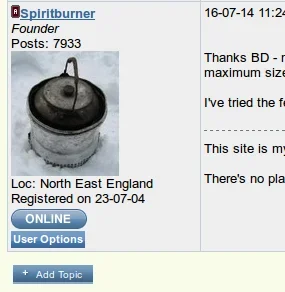
True - but for such a useful feature it's a shame it is so discreet. My member demographic is quite old & many with dodgy eyes (myself included!) plus they are used to the big icon shown below. It would be a shock for them when we move. I appreciate the new feature can be altered via CSS but would it be a big job for someone who knows what they do to create a online/offline button like this?

but would it be a big job for someone who knows what they do to create a online/offline button like this?
Not really, now that there is a defined class, it would be pretty easy to accomplish.
What if you want it in the postbit, and the theme is actually green?
There are probably a lot more forums that have at least 1 member with a green avatar than there are forums with green themes. Also, for members customizing the theme it makes more sense for them to have to change the indicator than it does for someone who wishes to use Xenforo right out of the box and might have members with a green avatar.
Subtle and understated is the name of the game, clean and lean. It makes for more aesthetically pleasing design and doesn't pad out and crowd the page.
Like others have said, a few CSS tweaks and you can make it look like whatever you want. If your users do need education the use the new help page manager, create an entry and direct them to read it
Like others have said, a few CSS tweaks and you can make it look like whatever you want. If your users do need education the use the new help page manager, create an entry and direct them to read it
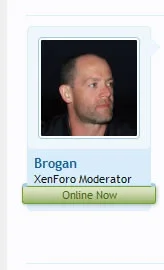
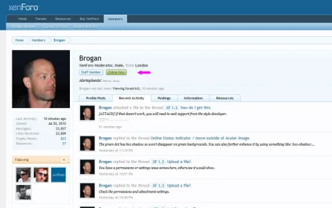
Meh, I don't think it needs a banner. I think it would be better beside the username.
With that said, how about only making it visible if you hover over someone's avatar?
I guess that wouldn't suit mobile browsers so another suggestion would be to make it disappear when hovering over someones avatar or to make it permanent when a browser window is a certain size.
With that said, how about only making it visible if you hover over someone's avatar?
I guess that wouldn't suit mobile browsers so another suggestion would be to make it disappear when hovering over someones avatar or to make it permanent when a browser window is a certain size.
With that said, how about only making it visible if you hover over someone's avatar?
I guess that wouldn't suit mobile browsers so another suggestion would be to make it disappear when hovering over someones avatar or to make it permanent when a browser window is a certain size.
You can do that with CSS, and make it conditional for non-responsive pages. I already do that for private controls at the bottom of messages.
It makes for more aesthetically pleasing design and doesn't pad out and crowd the page.
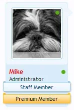
Subjective of course. My members want an online or offline banner & even a location banner (helps 'localise' advice given). We also have a drop down allowing users to message the member, read their other threads or posts without having to go to their profile page. I call that enhanced functionality handled in a simple & elegant way. XF strikes me as too bare-bones in this regard but XF seems solid & well supported with plenty of add-ons & customisation & the best of the bunch for our needs which is why I've coughed up my dough for the licence & am commissioning add-ons to get us to our starting point.
As a non-coding admin my preference is going to be able to have the choice to have these things configurable via the ACP as I wouldn't know how to do a CSS tweak.
Just substitute the word green here for any color you have there.
- Status
- Not open for further replies.
Similar threads
- Replies
- 1
- Views
- 82
- Question
- Replies
- 1
- Views
- 376
- Replies
- 11
- Views
- 1K
- Replies
- 1
- Views
- 279


