Lack of interest Online / Offline

This suggestion has been closed automatically because it did not receive enough votes over an extended period of time. If you wish to see this, please search for an open suggestion and, if you don't find any, post a new one.

Shelley

Well-known member
Licensed customer
Edited since moving to Suggestions ~ Peggy :)

foiooz.png
2yy4j6s.png
 
Upvote 2
This suggestion has been closed. Votes are no longer accepted.
Already designed both with a 1 and 2px radius. I'll throw those mockups soon and let you look.
 
I think we could keep the postbit nice and clean/sleek with should only contain the user's avatar and username. If you are interested any further than that in the user view it's member card. There should be where the status of the user is :P Check out the image.
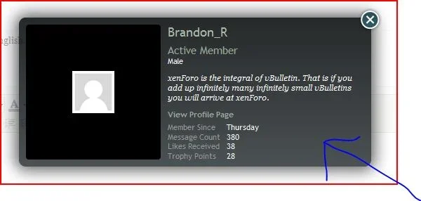
 

Attachments

  • Capture.webp
    Capture.webp
    14 KB · Views: 27
These are awesome, and they fit in so seamlessly. Certainly a thumbs up from me!

Same here... My only suggestions would be that I would only show the green online and would show nothing for the other status's
 
Show green if online, show the red if you can see the hidden people, there is no need to display the "offline" icon.
 
If kier and/or mike are going to implement this and want to use the icons let me know and I'll send you over the psds.
 
I think it would be better if it didn't show an icon at all if they're offline, only showing when they're online (and for invisible users for staff to see).
 
Don't worry I posted in the completely wrong thread. And before I edited Mert quoted me. *shakes fist at mert*
 
Back
Top Bottom