AndyB
Well-known member
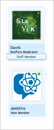
I suggest removing the shadow for the online indicator. The reason is that depending on the background color of the avatar, the online indicator either looks like it is a dot with a sharp edge, or a dot with a soft edge. I assumed this meant two different things until I sent a private message to Brogan for clarification.


Upvote
0
