You are using an out of date browser. It may not display this or other websites correctly.
You should upgrade or use an alternative browser.
You should upgrade or use an alternative browser.
XF 2.0 Old Page Width Controller settings for xf2?
- Thread starter sbj
- Start date
That is mainly for responsive design. That is not the same thing I ask.I believe this is what you want.
Also not the same thing I ask.Search for "Maximum page width" in ACP?
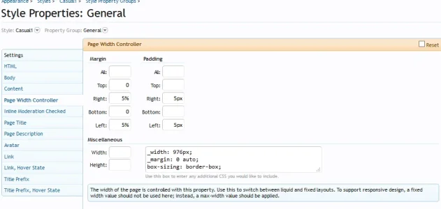
That page width controller made it happen that on the left and on the right side of the forum laylout, you always had a 5% margin between your screen and the forum layout for example.
Last edited:
That page width controller made it happen that on the left and on the right side of the forum laylout, you always had a 5% margin between your screen and the forum layout for example.
In XF1 we have fluid style. I don't think this is such a good idea as some monitors are very wide. In XF2 the fluid style has been replaced with a fixed and is set to 1200 px by default. I like to increase this "Maximum page width" to 1400 px.
I know for that reason we can use the maximum page width. Anything above it will be fixed, which is a good solution.I don't think this is such a good idea as some monitors are very wide.
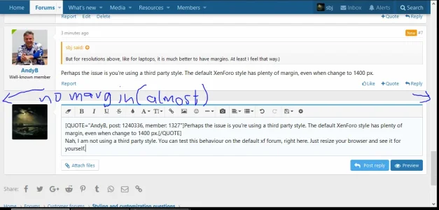
The problem here is for lower resolutions. It all feels "pressed together", like there is no room to breathe in. I feel like that, when there is no margin between the screen and layout.
(PS: I am not talking about the responsive design breakpoints. They must be felt like it is pressed together because we can't afford wasting space and it is practical not to have margins. But for resolutions above, like for laptops, it is much better to have margins. At least I feel that way.)
But for resolutions above, like for laptops, it is much better to have margins. At least I feel that way.)
Perhaps the issue is you're using a third party style. The default XenForo style has plenty of margin, even when change to 1400 px.
Thank you Andy, your help is always appreciated. This replicated the old behaviour I was used to.To retain a margin for laptops, add this to the extra.less template:
(PS: I prefer 95%. Too much margin feels like too much empty space, and no/low margin feels like pressed together, I find 5% the best for the eyes.)
@AndyB
I'm bumping this, actually this is not quite what is working for me. The problem is, while the p-body-inner behaves exactly like I want, anything above it doesn't. Which means both navigation bars and the logo still stay static, which makes it ugly. Cause the above part is full width, and under it the width is different. The alignment breaks.
I tested several css classes for the above part trying to use width/max-width, but none worked.
Bump
Maybe @Steve F or @Russ ?
I try to have margin on the right and left side of the screen for laptops.
With maximum page width we have margins for big screens, and for responsive design break points the margin disappears (which is good).
But for dimensions between the responsive break points and the max page width (for laptops), there is no margin as seen in post number #8 above (default xf behaviour).
Any help would be appreciated. Andy's solution only applies to the inner body, which is not good as the alignment with the header disappers.
That is why I don't want to target particular resolutions, I want automatical margin.Laptops have many different resolutions
You see in my 1st post an example for XF1, where we could define an auto-margin of 5%. That took care of everything, I want the same.
Search the ACP for
pageEdgeSpacer and change it to something like 25px (can't use a percentage here because it is used in a calculation for the navigation). Then search for responsiveEdgeSpacerRemoval and change it to @xf-responsiveNarrow.It could be replicated but not without some work. In XF1 there was a pageWidth class for virtually all elements on a page. In XF2 this isn't the case so what would need to be done is grab all *-inner elements and write a little custom CSS. I gave you the above direction because it will likely work as you want with little effort. 
Yeah, I thought so. Thank you.I gave you the above direction because it will likely work as you want with little effort.
Well, Andy's solution is almost what I want
.p-body-inner {width: 80%;} but both top navigations and the logo and the bottom are not affected. Is there any quick css for the top part to act like the inner body? I tried to give them percentage but it breaks them somehow. If there is no easy way, all good. At least I know your way now. Thanks.@Steve F , just read this and may be you can help me out, since I guess you know best where to start: with all the different screen desktop resolutions, I would like to show a different pageWidthMax to different browser resolutions. Mainly, because I have a bunch of nav entries and the navigation transforms to the side scroll nav thing on resolutions <1440px.
What I´ld like to achieve is to mimic the old fluid style from XF1 to a certain extend (<1200/<1440/>=1920px) . I´ld like to do this with a lazy loader, so the used pageWidthMax value transforms on the fly while a user is changing the browser width (to also display the appropriate ad sizes and placements for that width). Could you gimme an advice, where it would be best to start? Quite frankly, I went through the templates and I am not really sure, where to put it in.
What I´ld like to achieve is to mimic the old fluid style from XF1 to a certain extend (<1200/<1440/>=1920px) . I´ld like to do this with a lazy loader, so the used pageWidthMax value transforms on the fly while a user is changing the browser width (to also display the appropriate ad sizes and placements for that width). Could you gimme an advice, where it would be best to start? Quite frankly, I went through the templates and I am not really sure, where to put it in.
Similar threads
- Replies
- 12
- Views
- 953
- Replies
- 7
- Views
- 747
- Question
- Replies
- 5
- Views
- 1K
- Replies
- 5
- Views
- 1K
- Replies
- 2
- Views
- 1K


