You are using an out of date browser. It may not display this or other websites correctly.
You should upgrade or use an alternative browser.
You should upgrade or use an alternative browser.
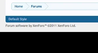
Nice new footer!
- Thread starter Onimua
- Start date
x4rl
Well-known member
IndeedAre you suggesting only show the buy xenforo for unlicensed members?
Please tell me this will be available for all of us when xF goes Gold! Also the links editable in the admin cp?
Unfortunately not. He said it was just for XF.com.Please tell me this will be available for all of us when xF goes Gold! Also the links editable in the admin cp?
Perhaps if we all gang up on him............
It's not really supposed to fit with the rest of the style - it's intended to be a separate information and link repository below the main content, so it's designed to be distinct from the style, while leaving the default style largely unchanged so we don't give a false impression of the software itself.It doesnt seem to fit in with the rest of the style, and personally I'd have those links at the top of a page (like we already do in the navbar) so why need it at the bottom.
How about making it a widgetized footer and add that functionality into Xenforo?
F
Floris
Guest
The new xfsite footer section looks pretty cool, Kier, would it be okay with you if I emulate the look of it for the two similar to xenforo default styles I have available, I wouldn't copy your content of course, just the basic look and feel, it would give my similar to default styles a continued likeness.
Emulate is one way of putting it Alice
F
Floris
Guest
Which would also make them (footer colors) change colors when you change the @primaryDarker and such globally in the editor in the acp..right?
You can also just make a Style Property yourself in a custom group.
And then use @yourNameLight and @yourNameDark to do whatever you want, so it's different from the main theme colors, and still dynamic and easy to upgrade; even visually - and per theme.
Emulate is one way of putting it Alice
Excuse me!
Now how do I go about doing that?You can also just make a Style Property yourself in a custom group.
And then use @yourNameLight and @yourNameDark to do whatever you want, so it's different from the main theme colors, and still dynamic and easy to upgrade; even visually - and per theme.
Edit ..Nevermind...I figured that out...it is actually really easy...LOL. Click a button fill out the info. Nice. I didn't even think of that
F
Floris
Guest
7mb .mov file, quicktime / vlc plays this just fine.Now how do I go about doing that?
Edit ..Nevermind...I figured that out...it is actually really easy...LOL. Click a button fill out the info. Nice. I didn't even think of that
http://dl.dropbox.com/u/693961/xenforo_style_properties.mov
AnthonyCea
Well-known member
Where is the 'don't feed the troll' tag ??
I'm disappointed !!
I'm disappointed !!
I'm liking the new footer. The only thing I don't like is the gradual dark black at the bottom of it. It seems to be part of the follow twitter/facebook @xenforo http://xenforo.com/community/styles/default/xfcomforums/forum-footer.png >>>


Similar threads
- Replies
- 6
- Views
- 106
- Question
- Replies
- 0
- Views
- 48
- Replies
- 10
- Views
- 191
- Replies
- 9
- Views
- 209
- Question
- Replies
- 3
- Views
- 132

