You are using an out of date browser. It may not display this or other websites correctly.
You should upgrade or use an alternative browser.
You should upgrade or use an alternative browser.
Style New Horizons - Dark Style (W.I.P)
- Thread starter Shelley
- Start date
Miner
Well-known member
Looking good, i feel it will be better without the shadows on both side in category image.
Looking good, i feel it will be better without the shadows on both side in category image.
Kim already suggested that which was the reason for the whole re-design and it's on my todo list. The .nodeList .categoryStrip will undergo (hopefully) a redesign where it will be seamlessly intigrated into the design (shown in the latest screenshots). Well, that's what I hope whether it's pulled off is another story.
OH wow.. I so much prefer that version 
Really slick!
Still a fraction bigger than I would like, but loving it more and more!!!
You know I frequently do things like this...start over here with this vision... the BOOM suddenly over here with that LOL I actually love it when it gets all organic like that, and takes you places you weren't expecting!!!!
Some of my best work has come about that way, and this is looking like some very tasty work from you Shelley!!!
OH wow.. I so much prefer that version
Really slick!
Still a fraction bigger than I would like, but loving it more and more!!!
You know I frequently do things like this...start over here with this vision... the BOOM suddenly over here with that LOL I actually love it when it gets all organic like that, and takes you places you weren't expecting!!!!
Some of my best work has come about that way, and this is looking like some very tasty work from you Shelley!!!
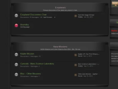
Been at this for several hours now slicing the crap out of the category headers and then the node li headers totalling x2 3 piece images and shifted the code a little to get it working . think I managed to get it working how i envisioned kim ( been cursing a little at the style) but I lowered the size of the lip categorystrip which is joined on the nodelist li (im sure there is an easier way) but i couldn't find it but anyway lowered it significantly i think.
Edit: and kim you're a star.I would have kept the red category headers had not been for your suggestion on the shadows and i think this looks better than earlier screenshots. Thanks again for the feedback and suggestions
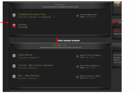
I have issues with the shadows.... It's been bugging me since the first changed screenie.... but now I think I see what issue I have. If you have those two side shadows (which look nice), the bottom shadow makes no sense and I don't think it should be there. (Does that make sense?)
View attachment 39934
That was intentional. I quite like that look. The two shadows on the sides are box-shadows (css) and the bottom shadow is part the of 3 piece footer node li image. Without the shadows I felt it left the design rather flat and I wanted to give the nodes something that makes them stand out.
hmmmmm *takes a closer look and see's what can be done*
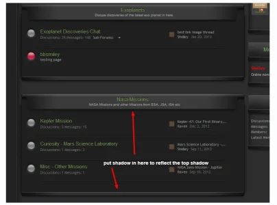
It's that darn logical side of me. With the size of the side shadows, there would be no bottom or top shadow.. and you have no top shadow, so my head yells that the bottom shadow shouldn't be thereThat was intentional. I quite like that look. The two shadows on the sides are box-shadows (css) and the bottom shadow is part the of 3 piece footer node li image. Without the shadows I felt it left the design rather flat and I wanted to give the nodes something that makes them stand out.
hmmmmm *takes a closer look and see's what can be done*
Bugger, you don't have it switched on lol
Interesting point Azhria, I think the shadows are fine myself, the light source seems to be in the 12 o'clock position and slightly North of the Catbar, which would give both lateral and longinal shadows, the strong highlight on the cat bar also suggests a strong light source, so there would be a significant amount of shadow.
It would if the shadow was showing at the top of the category bar, but it's not it's showing inside at the bottom of the category bar, which suggests it's offset by a certain amount.. but then the shadows at the sides suggest it's central because of their positioning.... can you see my dilemma? It's hurting my headInteresting point Azhria, I think the shadows are fine myself, the light source seems to be in the 12 o'clock position and slightly North of the Catbar, which would give both lateral and longinal shadows, the strong highlight on the cat bar also suggests a strong light source, so there would be a significant amount of shadow.
It's that darn logical side of me. With the size of the side shadows, there would be no bottom or top shadow.. and you have no top shadow, so my head yells that the bottom shadow shouldn't be thereThe other problem is that you're running the risk of too many shadows in one area, what with the two sides, the three on the category header and then the bottom as well, it's going into the realm of overkill. I agree the bottom needs something..... *takes a wander to the site to look at the live skin and ponder further* (You got me thinking now... you know that's never a good thing!)
Bugger, you don't have it switched on lol
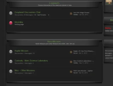
Well you know when it comes to enhancing styles I have taken your advice more than a 100 times and each time you haven't been wrong, I'm quite sure your not wrong on this occasion and will make the change right now. 2 sec i'll post an updated screeny and let you decide whether the bottom shadow should be there or not.
I think without might be better now you mentioned it. 2 secs
edit: added screenshot. Your right, i think the bottom-shadow is better being gone.
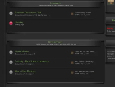
You know me.. I like to make you workWell you know when it comes to enhancing styles I have taken your advice more than a 100 times and each time you haven't been wrong, I'm quite sure your not wrong on this occasion and will make the change right now. 2 sec i'll post an updated screeny and let you decide whether the bottom shadow should be there or not.
I think without might be better now you mentioned it. 2 secs
LOL, I disagree, I think the light source is not overhead of the middle of the category, it is slightly above the top of the category bar, hence the large highlight on the curve of the category bar.
But lol, it's not that important I don't think, it certainly doesn't look wrong imho.
But lol, it's not that important I don't think, it certainly doesn't look wrong imho.
You're far more talented than I, KimLOL, I disagree, I think the light source is not overhead of the middle of the category, it is slightly above the top of the category bar, hence the large highlight on the curve of the category bar.
But lol, it's not that important I don't think, it certainly doesn't look wrong imho.
Shelley's used to me nitpicking either way LOL
I like this concept with the title bars.Did a re-size of the titlebars @Kim but i kept the shadow since I like this though i could tinker with it and lower the height but overall the shadow is something I think will be kept. As for the size I think i shaved off 30% off the height.
View attachment 39920
Similar threads
- Solved
- Replies
- 1
- Views
- 60
- Replies
- 1
- Views
- 559
- Replies
- 4
- Views
- 800
- Replies
- 4
- Views
- 3K
- Replies
- 3
- Views
- 704
