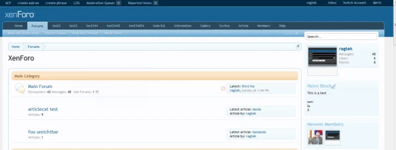
The only thing that could be done would be to start scrolling the tabs, but that is a truly ghastly UI concept, and I have no plans to implement it.
Site owners must be conservative in their deployment of extra tabs - there is a finite space available.
") less navtabs.
less navtabs.
")