XF 1.5 Mobile vs PC avatar size

Hello

I have followed the instructions here to create a nicer avatar size (300 x 150), which looks fantastic on the pc, but it looks pretty bad on mobiles and squashes all the post content to one side. Is there a way to have the avy size shown on message_user_info template depend on platform?
 
Last edited:
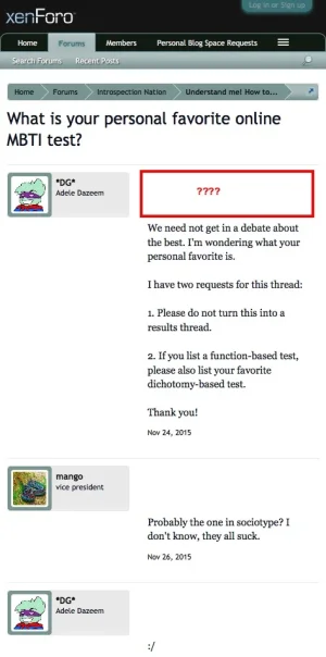
Well I fixed the problem. For future reference for anyone else who might experience similar problems and find this thread, the trick is to set the width and margin-left to auto, like this:

(In extra.css or directly in the message user info).
Code:
thread_view .messageList .messageUserInfo a.avatar img,
.thread_view .quickReply .messageUserInfo a.avatar img,
.conversation_view .messageList .messageUserInfo a.avatar img,
.conversation_view .quickReply .messageUserInfo a.avatar img
{
    width: 150px;
    height: auto;
}

.messageUserInfo
{
    width: auto !important;
}

.message .messageInfo,
#QuickReply
{
    margin-left: auto !important;
}

and then to put the margin into the padding-left of quick_reply so that it applies to both the reply and the message content above:
Code:
#QuickReply textarea
{
    width: 100%;
    *width: 98%;
    height: 100px;
    padding-left: 160px;
    box-sizing: border-box;
}
 
Back
Top Bottom