XF 1.5 Mobile formatting issues after upgrade to 1.5.11

Sonya

Member
I upgraded my test site on Tuesday to XF 1.5.11 and had no issues. Yesterday morning I upgraded my live board to the latest version and one of my admins has a problem with how the board is formatted on his mobile.

He is using Chrome version 54.0.2840.85 on a Samsung S6.

When logged out, the Login/Sign Up link at the top is broken and part of it is off the top of the page:
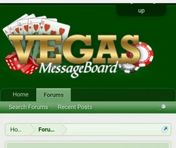
login.webp

When logged in, the username/inbox/alerts is formatted oddly and the Post New Thread button is broken into two lines:
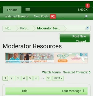
newthread.webp

I am unable to recreate this issue on my S7 or on my husband's Droid.

We are using the standard style that came with XF. Has anyone else seen this issue? Any ideas on what might be causing this?
 
Make sure there are no template that need to be merged (shouldn't be if it was a simple upgrade and using a default style with just color modifications and no template modifications).
Have them flush their browser cache on the iPhone.
 
I don't see an issue there - it looks normal to me.
This is how it appears on my S7:
shouldbe.webp

We removed that "Log Out" modification we added and have the same formatting issue.

I checked the Outdated Templates after the install and found no issues. I've also had him log out and flush the cache.

Is there anything that could have gone awry in the upgrade that would cause this? Our test environment works fine for him after the upgrade, the live version does not, although both are the same other than the number of messages and users.
 
I can't actually reproduce any of the issues he's having in Chrome on my S6. Very similar version (54), though I see a minor build number difference.

This update has very few style changes and nothing global, so I don't think there's anything in the upgrade that would have directly caused it.
 
We have very few template edits. I'm not super savvy with the technical side of being an admin, so I try to change as little as possible. There are some changes to:

EXTRA.css (adds a little space above the top ad, which we don't use on mobile)
member_card (which shouldn't effect this)
navigation_visitor_tab (I'm not sure what this change does)
search_bar (added some extra text to search box)
sidebar_online_users (commented out Staff from sidebar)
thread_list (to separate sticky threads)

I can fiddle with those in our test environment to see if I can reproduce the issue.

Thanks for that info, @Mike. Maybe my admin is just lucky that way. :)
 
Top Bottom