You are using an out of date browser. It may not display this or other websites correctly.
You should upgrade or use an alternative browser.
You should upgrade or use an alternative browser.
Messenger style conversation layout
- Thread starter Paul B
- Start date
Haven't even thought about a messenger style layout but kind of digging it.
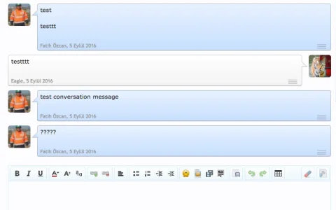
I like it!Has anyone tried implementing anything like this?
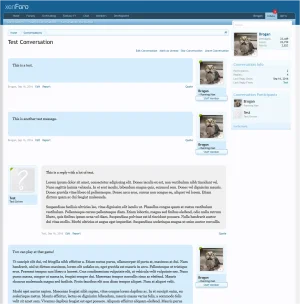
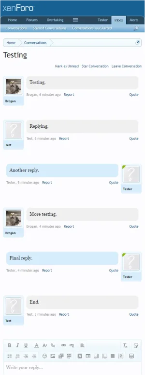
Two minutes of messing around gives ...
View attachment 141432
Thanks.
The fact it's just the add-on and I just modified/developed it.
Brogan, I think it should be core.
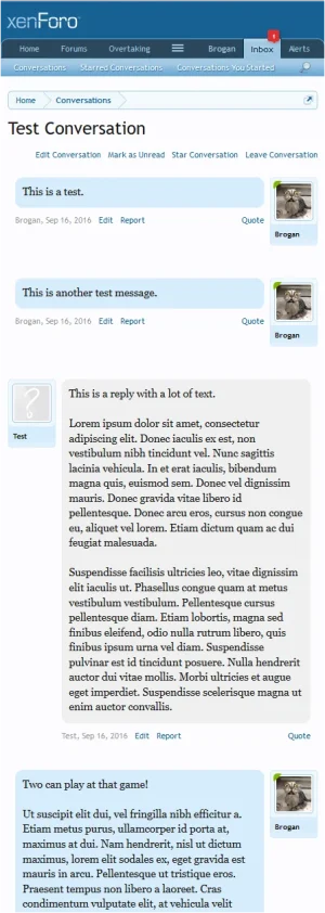
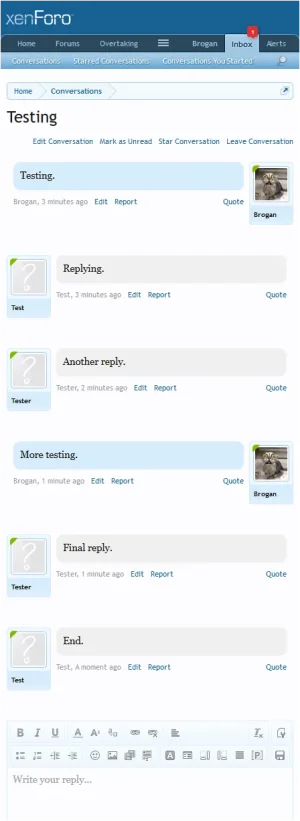
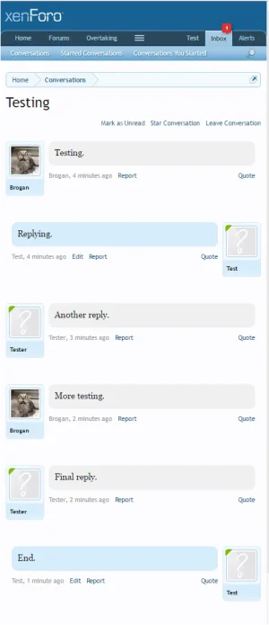
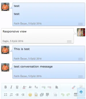
Responsive view:
The fact it's just the add-on and I just modified/developed it.
Brogan, I think it should be core.
Responsive view:

I like where you're going with this!Has anyone tried implementing anything like this?

I prefer the clean, simple look so I just removed that using CSS.
You can always restore it, or even do something with an arrow on the message content instead.
It's not something I'm going to implement on my own site so I'm not going to spend too much time on it.
Currently it's just a single template modification and a few lines of CSS.
You can always restore it, or even do something with an arrow on the message content instead.
It's not something I'm going to implement on my own site so I'm not going to spend too much time on it.
Currently it's just a single template modification and a few lines of CSS.
Instructions here: https://xenforo.com/community/resources/messenger-style-conversations.5324/
Similar threads
- Replies
- 23
- Views
- 2K
