You are using an out of date browser. It may not display this or other websites correctly.
You should upgrade or use an alternative browser.
You should upgrade or use an alternative browser.
Messenger style conversations anyone?
- Thread starter Paul B
- Start date
I doubt I'll be using it on my own site but it was an interesting exercise nonetheless.
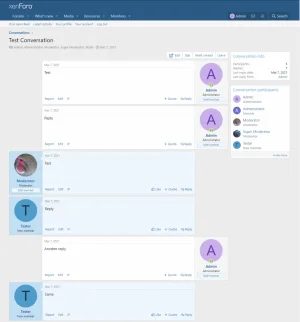
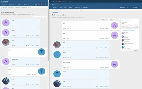
A simple toggle in the LESS code allows it be easily flipped from left to right, the borders and radii are correct at all width (which is harder than it sounds due to inheritance and media queries), the avatars and member content flip, attribution arrows line up correctly, and the editor avatar flips.
All done in extra.less, other than for one template edit which is required on the conversation template, to add the different classes for own and other messages.
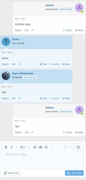
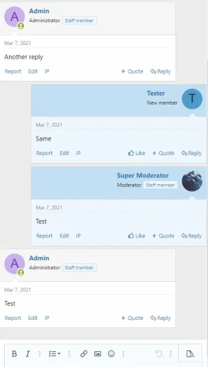
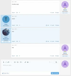


I liked the first screenshot version better.I'm not sure what you mean by first approach.
It's as simple as this? I figured there's got to be more as the background changes to a blue as well.It's the same code in all screenshots
Thought so. Are you going to make this publicly available? I sure hope you will (as is even).Yes, there's a lot more code than that.
That would be my preference and it's how I did it in XF1.Instead of having whole full peofile block, remove it and leave only the user avatar.
In fact, I stripped away most things in XF1 including the title, banners, etc. and it more closely resembled a messaging app.
I need to do a bit more work on it and then I'll publish a guide.Thought so. Are you going to make this publicly available? I sure hope you will (as is even).
Or maybe even package it as an add-on ...
Yep. IMHO its difficult to read/follow.IMHO it looks messy and disjointed
I'm okay with how this looks now so I'll post a guide soon.
This is the desktop/wide view from the Admin account's perspective:
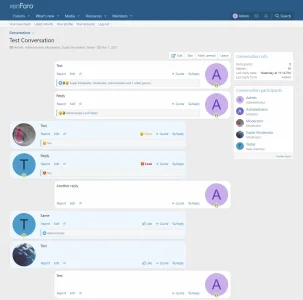
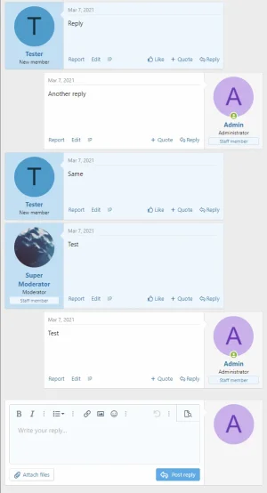
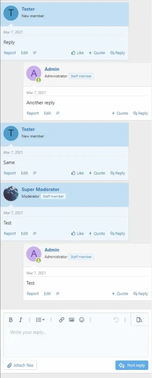
This is the mobile/narrow view from the Tester account's perspective:
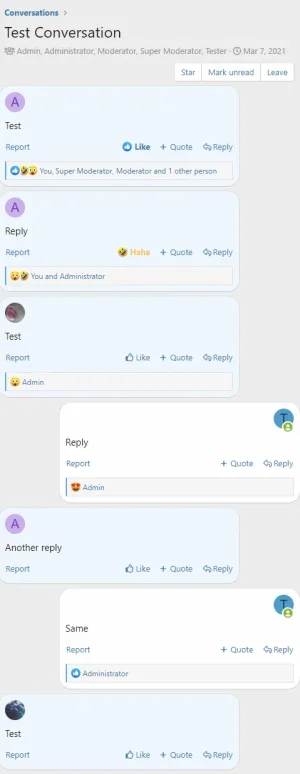
Configurable options are:
This is the desktop/wide view from the Admin account's perspective:

This is the mobile/narrow view from the Tester account's perspective:

Configurable options are:
Less:
<xf:set var="$ctaMessageSelfSide" value="right" /> // side for own messages - right or left
<xf:set var="$ctaMessageAttribution" value="no" /> // display the message date and time and [New] badge - yes or no
@__ctaMessageRadius: 20px; // radius of message containers - a value between 10px and 30px works best
@__ctaMessageWidth: 80%; // width of messages
@__ctaMessageOtherColour: @xf-paletteColor1; // colour of the messages of other participantsSimilar threads
- Replies
- 15
- Views
- 882
