You are using an out of date browser. It may not display this or other websites correctly.
You should upgrade or use an alternative browser.
You should upgrade or use an alternative browser.
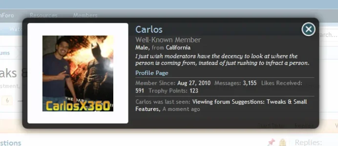
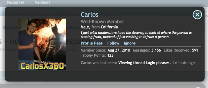
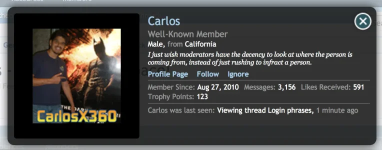
Membercard changes - now with whitespace!
- Thread starter Carlos
- Start date
CTXMedia
Well-known member
I like the first one better!
Are you sure it's not a simple case of the "Large" version of avatars being bigger in XF 1.2 ?
Have you tried re-uploading it to see if it fills the space?
CTXMedia
Well-known member
Are you sure it's not a simple case of the "Large" version of avatars being bigger in XF 1.2 ?
Have you tried re-uploading it to see if it fills the space?
Yup - that seems to be it - I've just uploaded a different image and it fills the space.
CTXMedia
Well-known member
More importantly, it doesn't use an image anymore.
Really? It seems to - http://xenforo.com/community/data/avatars/l/2/2869.jpg
DBA
Well-known member
The membercard background is no longer an image, this is what it used to be.
http://xenforo.com/community/styles/default/xenforo/overlay/member-card.png

CTXMedia
Well-known member
The membercard background is no longer an image, this is what it used to be.
View attachment 47701
Ah, yes, I see ... lol ... I'd thought you meant the avatar image. DOH!!
Russ
Well-known member
CSS3 gradient?
Looks like just a background color
Code:
.xenOverlay.memberCard {
background: none repeat scroll 0 0 rgba(0, 0, 0, 0.8);Mike Edge
Well-known member
Just remember the change is related to responsive - not having a background image allows the member card information to also change based on the width.
Good point. So I guess if we use a custom bg image, two themes should be considered with mobile detection to activate which so responsive gets default card.
Shelley
Well-known member
Just remember the change is related to responsive - not having a background image allows the member card information to also change based on the width.
View attachment 47706
Yeah I figured that was the reason why background-color was used to replace background-images.And although my next comment really isn't to make a point and practical I'd respectfully like to say "screw width". I like my membercards big and chunky, I like them big, i like them round I like them funky. Chunky chunky, chunky
Mike Edge
Well-known member
I like them big, i like them round I like them funky. Chunky chunky, chunky
I think this may have to become my new siggy...
Similar threads
- Question
- Replies
- 3
- Views
- 726
- Replies
- 19
- Views
- 2K
- Replies
- 58
- Views
- 9K
- Question
- Replies
- 9
- Views
- 2K


