You are using an out of date browser. It may not display this or other websites correctly.
You should upgrade or use an alternative browser.
You should upgrade or use an alternative browser.
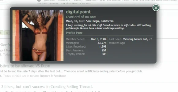
Not planned member card redesigned
- Thread starter Nasr
- Start date
This suggestion has been closed. Votes are no longer accepted.
this looks way better and much more structured 
well, if digitalpoint can do it... then there should not be a layout problem.

I believe it used to be like that, they changed it to the current design because there was some layout problem with it. I agree though it looks better with columns.
well, if digitalpoint can do it... then there should not be a layout problem.
Matter of tweaking and preference -- I like DP's version too.
I think they changed the previous design which had 2 columns to also accommodate for addons that use the hook in that position. If you have a lot of addons, the data won't fit or will overflow outside the card.
Edit: The thread that triggered the change from a previous 2 column setup:
http://xenforo.com/community/thread..._card_stats2-results-in-squished-stats.14449/
Edit: The thread that triggered the change from a previous 2 column setup:
http://xenforo.com/community/thread..._card_stats2-results-in-squished-stats.14449/
I think they changed the previous design which had 2 columns to also accommodate for addons that use the hook in that position. If you have a lot of addons, the data won't fit or will overflow outside the card.
Post Ratings, Pokes, Cash System, User Albums, Sportsbook, StockTrader, Blogs, Resources... just to name a few that add into that area.
Indeed.
With the proposed new layout anything more than two or three additional entries will break out of the bottom.
No necessarily. If a user is more than capable of inducing breaking by installing add-on x they can fix it by applying a new design.
Hopefully this will be an option if entertained alot of us don't have the whole wikipedia data stuffed in our membercards. Personally this doesn't suit people with small amount of data within the membercard and it's more of a wasteful amount of space for those that do have limited data. Hopefully that is something you'll cater for if this is entertained.
I was referring to the fact that if it was made the default style.
Ifs and buts. And if that is the case then there wouldn't be a need to touch it if member-x kept with the default installation with zero add-ons. Argument can go both ways.
I've just modified my membercard to reflect the two columns (it's easy to achieve with a bit of css) I'd likely need to stretch the card downwards further if any more addons wanted to put stuff in there.
well all I'm asking is please cater for those that don't install an abundance of add-ons that don't require this proposed layout. Because whilst you cater for one party your not thinking of the other party who don't need such a layout.
I'm not catering for anyone, i was just curious if I could do it.. and I could LOLwell all I'm asking is please cater for those that don't install an abundance of add-ons that don't require this proposed layout. Because whilst you cater for one party your not thinking of the other party who don't need such a layout.
I'm not catering for anyone, i was just curious if I could do it.. and I could LOL
Yeah I didn't mean you specifically more suggesting that if the suggestion is entertained think of both groups but since you brought yourself into the thread I was merely replying to you.
It threw me, I'll be honest. I saw the first post and thought oooh wonder how easy that would be and decided to give it a go... came back and posted, without realising there'd been a multitude of posts in the meantimeYeah I didn't mean you specifically more suggesting that if the suggestion is entertained think of both groups but since you brought yourself into the thread I was merely replying to you.
Back again.  If you didn't have that big avatar in the membercard you could save vasts amount of space on the default membercard. How about setting that to avatar m. = space saver (just throwing out options}
this would allow to extend on the
width.
this would allow to extend on the
Code:
.xenOverlay.memberCard .userInfoIt threw me, I'll be honest. I saw the first post and thought oooh wonder how easy that would be and decided to give it a go... came back and posted, without realising there'd been a multitude of posts in the meantime
Yeah the way I seen this one going is a column layout would be introduced with zero thought going to the other group. So making this an option if entertained should be the way to go with this. I've personally never had any layout issues and i have a few add-ons that use the membercard. That being said, I seen all your membercards and I don't think you ever need to worry about this issue occurring.
I read your replies and I'm confused, just to be sure: would you prefer to keep the current design on XF or do you prefer a different design?Yeah I didn't mean you specifically more suggesting that if the suggestion is entertained think of both groups but since you brought yourself into the thread I was merely replying to you.
IMO the column layout looks less cluttered, since there is better use of white space.
Similar threads
- Solved
- Replies
- 5
- Views
- 97
- Replies
- 5
- Views
- 527
- Question
- Replies
- 5
- Views
- 102
- Replies
- 11
- Views
- 474

