You are using an out of date browser. It may not display this or other websites correctly.
You should upgrade or use an alternative browser.
You should upgrade or use an alternative browser.
Not planned member card redesigned
- Thread starter Nasr
- Start date
This suggestion has been closed. Votes are no longer accepted.
Mike Edge
Well-known member
well all I'm asking is please cater for those that don't install an abundance of add-ons that don't require this proposed layout. Because whilst you cater for one party your not thinking of the other party who don't need such a layout.
Agree, Many of us don't use 110 add-ons
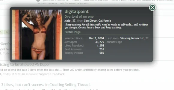
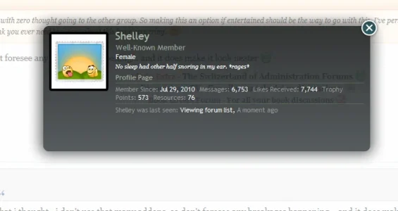
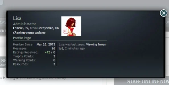
I read your replies and I'm confused, just to be sure: would you prefer to keep the current design on XF or do you prefer a different design?
Current design I see zero issues with it for those that don't expose huge amounts of data within the membercard.
Yep that's what i thought.. i don't use that many addons, so don't foresee any breakages happening... and it does make it look neaterYeah the way I seen this one going is a column layout would be introduced with zero thought going to the other group. So making this an option if entertained should be the way to go with this. I've personally never had any layout issues and i have a few add-ons that use the membercard. That being said, I seen all your membercards and I don't think you ever need to worry about this issue occurring.
I think that would look better (avatar) to the left of the data at the top. You could even shave off px off the membercard design also.
The other concern i have with that layout is that the .xenOverlay.memberCard .lastActivity area is vastly wasted and doesn't utilise the space efficiently. Another grievance why I don't like this layout.
Wonder what else we can come up with... *heads back into css*I think that would look better (avatar) to the left of the data at the top. You could even shave off px off the membercard design also.
The other concern i have with that layout is that the .xenOverlay.memberCard .lastActivity area is vastly wasted and doesn't utilise the space efficiently. Another grievance why I don't like this layout.
Wonder what else we can come up with... *heads back into css*
geez now you've given me an idea for a vertical design membercard layout. *shakes fist at az*
My devious plan worked... I must be losing my touch, doesn't usually take me that many bloody posts to get you moving *polishes halo*geez now you've given me an idea for a vertical design membercard layout. *shakes fist at az*
My devious plan worked... I must be losing my touch, doesn't usually take me that many bloody posts to get you moving *polishes halo*
That's because you didn't apply the proper motivation.

My devious plan worked... I must be losing my touch, doesn't usually take me that many bloody posts to get you moving *polishes halo*
Thinking not actually doing. I'm sure the membercard would benefit others and not something i personally really need so it's on a todo list.
That's because you didn't apply the proper motivation.

thinking leads to doing . . . heh heh heh Not something I need either, I just find the concept interesting enough to fiddle with (and distract me from what I was supposed to be styling.... you know the way the game is playedThinking not actually doing. I'm sure the membercard would benefit others and not something i personally really need so it's on a todo list.
thinking leads to doing . . . heh heh heh Not something I need either, I just find the concept interesting enough to fiddle with (and distract me from what I was supposed to be styling.... you know the way the game is played)
I think you'll find fast the proposed structure is gimiky at best. Sure it's worth wasting a few minutes with but I can't see anything fruitful coming from it unless we're now cracking Biker on the nose with a thick newspaper and swiping his snout.
Sounds like a perfectly reasonable pastime to me! *goes to buy more newspapers*I think you'll find fast the proposed structure is gimiky at best. Sure it's worth wasting a few minutes with but I can't see anything fruitful coming from it unless we're now cracking Biker on the nose with a thick newspaper and swiping his snout.
Sounds like a perfectly reasonable pastime to me! *goes to buy more newspapers*
At the end of the day I personally feel my argument towards not going for the new structure speaks for itself and is good. I've only spent countless hours modifying membercard in all shapes and sizes and a variety of designs so I think I stand as a good voice towards why this layout is not beneficial for those that don't expose vast amount of data within the membercard.
The thinking is that if a proposed layout is remotely being entertained then simply think of both groups since the last activity data itself is not utilizing space efficiently (said it before but can't be stated enough). I think the current layout works brilliantly which is why I'm voicing my opinions (and that i spent huge amounts of time playing with the membercards). Some may not like that but most are not in their modifying membercards in a variety of different shapes, designs etc.
Perhaps the issue here is people should show some self restraint and not install every add-on under the sun and expect things to display fine. Anyway, you know my views about this proposed structure so I'll leave it at that.
Think outside the box and utilize the space.
But she breaks things when she goes outside the box.
ShhhhhhhhhBut she breaks things when she goes outside the box.
But she breaks things when she goes outside the box.
Yeah that one flew over my head not sure I want to know unless that was a subliminal threat.
Similar threads
- Solved
- Replies
- 5
- Views
- 97
- Replies
- 5
- Views
- 527
- Question
- Replies
- 5
- Views
- 102
- Replies
- 11
- Views
- 474


