Longview Computer Programmers

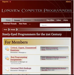
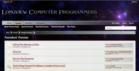
I must say, some parts of your site looks great, and some parts really need a bit more TLC. For example, your sidebar blocks look really good, but the black text on the red background on forum view is hard to read. Also, the white background on thread view needs to be changed as it is too bright. I would try a shade of grey for the back ground and add a border-radius to the message block of about 10 or so px.

Over-all a great start, and your style has the potential to be really great. And best of all, it will be unique, and XF needs unique styled forums to really showcase it's potential.
Wow, thank you for taking a look at the site, and for your useful comments. I knew that taking on a dark theme would be a challenge, and I'm glad to see that it works for you. Thanks to all the information at this great community I've learned a lot about styling XenForo, and enjoy working with it.

I guess it's time to roll up my sleeves and apply some TLC. ;)

I just took another look at the site. I really like the postbit, it blends well with the background. I think your thread preview pop-up is styled really well, probably one of the sleekest I have seen here. The site is coming along very nicely.

I take it you are not done with the breadcrumbs? The grey arrows don't work IMO. Breadcrumbs can be a pain to style, on my site I just removed those arrows as I didn't need them.

As I stated above, you have a great start on making a style that will have your forum stand-out, and not just against other similar topic forums.
 
Also if I may ask why do you have a usergroup named "not banned"?
I am the one to blame for the user group arrangement.
upload_2016-7-22_1-54-53.webp

When we were first making this site, the plan was to build a programming school that would provide a better way to learn to learn our profession than what college provides, especially considering the economics. I expected a lot of people in their late teens or twenties showing up and I wanted to offer something valuable but not easy to get into. People not matching up to what we are doing would get banned so not being banned would be an accomplishment. It is the military boot camp concept.

The original idea was we would know within three posts if someone was meant for what we are doing. So not getting banned after three posts gets you promoted to not-banned. Before that, you are not a regular member. I guess you are registered but that gets not permissions. Not banned, you start getting permissions.

This Is Not Summer Camp
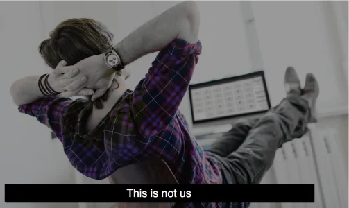
This is not summer camp. A prominent software company ran a picture somewhat like the one above on their home page. We are the opposite of that picture. Yes, it's nice when epiphanies or other progress is made like that, but most of the time, progress is going to be the result of something that is nothing like that. There is so much BS dominating our industry, including the "lol haha twitter me on facebook" type of thing, where everyone is all nice all the time. I wanted to stand in contrast to that. I wanted to make starting into our group as different as possible from what people expect and have seen elsewhere. I wanted to make what we are doing so valuable that people who are serious about it will go with the program whether it makes sense to them at first or not. Now days, everything is all nice and happy and mostly full of crap. People are so busy being nice that we act like the Floating Div Scam is something to be clever about instead of something to fix at its root cause. I think it is important to go against that pleasant mob mentality.

The Design of Our Site
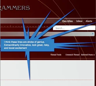
Meanwhile, how about this designer, Kirsten? Pretty good for someone who just started getting involved in web design in the last year. She does it in her spare time. Her day job takes most of her and that job is unrelated to the work we are doing at this site. I think her design is fantastic. That is why I posted our site here. She 100% responsible for it, except that she accommodated an irrational preference I had for a red theme. There is a private forum within our site with a completely different theme. What do you think of this? She made the background image with some special software she uses:
upload_2016-7-22_2-2-14.webp

and she made this, that goes with this site:

StarfieldLogoFinalA.webp


And maybe perhaps condense your logo in the header a bit.
upload_2016-7-22_2-15-0.webp
 
The posters information block left of the post. That term is a "left-over" from the vB days. RIP vB.
Thank you filling me in. Maybe it is trite to say, but the the way a few guys peeled off of vB to make Xenforo looks to me like a major event in software history. Forum software is a significant class of software, Xenforo seems to be the undisputed world champion, as a direct result of certain guys starting with what they knew from all their experience, including vB, which I gather is the former champion, and then from that start, they made this marvelous product we are using right here.

With that as context, there is a potential use of forum software that we need to implement at Longview Computer Programmers. The idea is combine content management, blogging, forum software functions, membership, and shopping cart functions into a seamless system. It is what we need. It seems Xenforo, with a different set of templates and some additional tables and fields in existing tables, already handles nearly everything involved in blogging and content management, and its code base, being one of the best systems ever developed, would be a great choice to extend into any other functionality needed for a lot of applications, including everything I am talking about.

Is this already done, but I don't see it? An idea that has been considered and found good or bad?

Fundamentally, LCP does not need to be a forum centric site, but it does need to foster an online community and needs a forum for that. But first-time visitors should see something that isn't a forum. It should show whatever we use for marketing and explaining what we are about. The format should not be confined to a forum or scheme. That is where blogging an content management need to be primary.

Any thoughts on that?
 
on the design, I am just the lucky partner who cannot design my way through a first grade drawing class. I want to add this comment an aspect of the design the strikes

upload_2016-7-26_3-48-24.webp
 
The one thing I love most about XF is pages. You can use them to mimic any thing you like, making the need for a blog obsolete. They are something you should consider to use for first time visitors.

Your website looks fantastic, and kudo's to your partner. I can't wait to see how the site evolves, and I believe that this is the first time I have said that about any website, :)
 
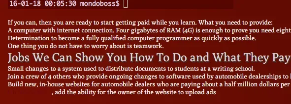
If you change your body text colour you can achieve this:

upload_2016-7-26_20-55-41.webp


Achieved by altering this CSS code:

Code:
font-family: Poly, 'Trebuchet MS', Helvetica, Arial, sans-serif;
    color: rgb(252, 252, 255);
    word-wrap: break-word;
    line-height: 1.28;
    background-color: transparent;

Makes it much easier to read on the red background.

Might want to take a look at changing the Facebook share option in the styles to the opposite of what you have now; there are two choices, light and dark - the opposite to what your're using now will fix the dark text on the red background.

upload_2016-7-26_20-58-53.webp

Hope this helps

;)
 
Top Bottom