My new site is here
I developed my own Forum icons and am liking the graphics work so much I started looking at logos.
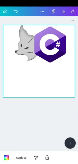
Since my forum theme is the translation of FoxPro programs to C#, I'm thinking of developing a logo that changes from the FoxPro logo to the C# logo one small piece at a time, either in place or side by side.
If they were side by side, the C# logo would not be visible to start with. As a small block of the FoxPro logo would disappear and, a same size block of the C# logo would appear. The pieces could be randomly chosen from each of the two logos, and eventually, the FoxPro logo would be completely gone, the C# logo completely visible. Then it would start over again after a pause.


If it was one on top of the other, I'd simply replace one piece of the Fox logo with a piece from the C# logo. Small squares come to mind.
Would like to see it both ways.
How would I do this?
I developed my own Forum icons and am liking the graphics work so much I started looking at logos.
Since my forum theme is the translation of FoxPro programs to C#, I'm thinking of developing a logo that changes from the FoxPro logo to the C# logo one small piece at a time, either in place or side by side.
If they were side by side, the C# logo would not be visible to start with. As a small block of the FoxPro logo would disappear and, a same size block of the C# logo would appear. The pieces could be randomly chosen from each of the two logos, and eventually, the FoxPro logo would be completely gone, the C# logo completely visible. Then it would start over again after a pause.


If it was one on top of the other, I'd simply replace one piece of the Fox logo with a piece from the C# logo. Small squares come to mind.
Would like to see it both ways.
How would I do this?
