You are using an out of date browser. It may not display this or other websites correctly.
You should upgrade or use an alternative browser.
You should upgrade or use an alternative browser.
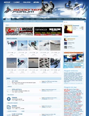
Just finished transferring my largest forum
- Thread starter raytrails
- Start date
It looks excellent - well done - and also good to know your migration from vB went OK and the users like it.
The only thing I don't like - just my opinion - is all the stats in the post bit (under the avatar) which to me is taking XenForo's simplicity away and putting vB's clutter back in The effect this has is to add quite a lot of empty space in very short posts. However I am sure your community have got used to that info being there, it will be the same issue for me when I migrate.
The only thing I don't like - just my opinion - is all the stats in the post bit (under the avatar) which to me is taking XenForo's simplicity away and putting vB's clutter back in
Pageviews or visits?This is a chart of the activity at the site since I migrated from vBulletin last summer:
View attachment 25422
This is a chart of the activity at the site since I migrated from vBulletin last summer:
View attachment 25422
Hello,
Do you have charts before migrating ?
Thanks
Visits.Pageviews or visits?
No, sorry.Hello,
Do you have charts before migrating ?
Love your design, particularly the color palette and the forum icons. Great to see a forum succeeding like that.Visits.
No, sorry.
Very impressive site sir!
Cor wow I am impressed! I love the way the header logo fades off into the blue just like sky does.
If you want to play a little more I would choose just one element in the "Debatt" area and change the colour to something not-blue. Maybe a sea green or purple - snow has those colours in it.
The complete blue in that area which will exist inside the forums is hard on the eyes. Eyes need some contrasr.
The change could be just a thin line, horizontal ones or border. Just a small thing to help the eye fatigue.
Secondly I can see what Tsin Ju means. But to me the size of the icons is cool. That is welcome because it is unusual.
I think the lines in the icons are too thick. They are like a 'child' look. XF lines are thin and elegant. So they do not fit.
But I guess changing that would not be fun to do.
Minor points - really the design is very striking.

