Just Converted my Tech Forum

AWS

Well-known member
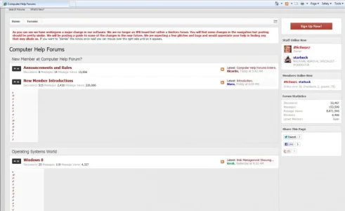
I just converted Computer Help Forums.

Even though I have been critical of certain things I always have and still do love the software. After all it's the software that counts so none of that other stuff matters.

I'm using Ehrens Baisik brand free theme with some changes to it. It's the same theme I used with IPB.

Initial reactions are better then I expected. In fact staff was 100% behind the change. Users are telling me that everything runs much faster and that graphics in threads look more crisp and videos play better. Probably because the server has less strain on it.

Anyway let me know what you think.
Looking good Aws.

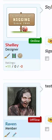
This is just at a glance but I'm not sure the placement of the online/offline indicators are the best choice as they cover the messageuserblock arrow which gives that adverse affect. Also, they don't seem to lath on to the message block and hang off the top you'll probably have to adjust the margin for that.

Otherwise, seems to look alright style wise to me but i've only skimmed and glanced at your site.
 
Thanks Shelly. I noticed that and it's on my list of changes.

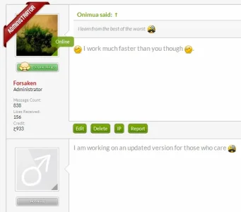
I'm not sure whether the following is appealing (I may post the code when time permits) is have the online/offline indicator diagonally span across the avatar. Below is an example but I used this for the .staff class but the same principle can apply to the online/offline indicators.

pagnav.webp

Another option is that you could remove the arrow from the message block if it's not vital to have it in and slightly move the indicator down.

arrow-removal.webp

Just a few options at your disposal if you wanted to go down that route.
 
Thanks again. I do like the badge way you have the staff badge. I hadn't thought about removing the arrow.
 
Thanks again. I do like the badge way you have the staff badge. I hadn't thought about removing the arrow.

Which add-on/modification for the online/offline indicators are you using? I'll give it an install and see if I can get that ribbon effect display.

Yeah. I've never been a fan of the whole arrow design and it's always one of the first things that gets the display: none; treatment.

Yeah, if you could put me onto the modification you are using that would be appreciated.
 
This is a cool site - and as a designer I'm pretty hard to please.
The colours have a stylish combo - love the silvery gray and the dark maroon sets it off very well.
Neat apt icons.

Shelley of course is the Queen of CSS around here so I leave that to her. :)

You might like to look at ToggleMe to collapse some of your categories for a shorter intro page. It lets you select which to leave expanded, which to show collapsed. It also remembers a user choice from last time. Very much up to you though.
I'd also recommend Nodes As Tabs to make more use of your navbar. You could place links to your categories up there, and have secondary links display on the second bar + dropdown.
See my Tutorial for some other useful addons.


Congratulations and welcome to XF.
 
Shelley I do appreciate the offer. That would be awesome if you could help me out with this. The mod I'm using is Jaxel user ranks.

Morgain thanks for comments. I've been struggling with the length index page for a couple years now. I did download node as tabs and I'm going to give it a go and see if it helps.

Thanks Brandon.

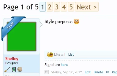
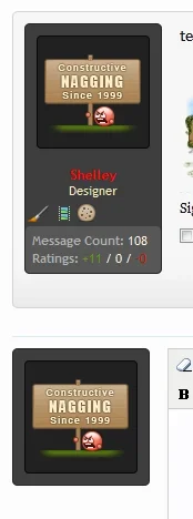
I've just installed this online/offline indicator that seems to give a better placement http://xenforo.com/community/resources/rt-online-status-ribbon.1276/

online_indicator.webp

are you having issues with your ranks? They look fine to me.

I did do some ribbon ranks that you can view here that may interest in. http://xenforo.com/community/resources/double-ribbon-ranks.841/
 
I've just installed this online/offline indicator that seems to give a better placement http://xenforo.com/community/resources/rt-online-status-ribbon.1276/

View attachment 39083

are you having issues with your ranks? They look fine to me.

I did do some ribbon ranks that you can view here that may interest in. http://xenforo.com/community/resources/double-ribbon-ranks.841/
I didn't see that one when I did my search.

I know I only have 1 full day running xenforo, but, I checked Google webmaster tools this morning to remove any 404's from the old links. I expected there would be a least a couple hundred.To my surprise there wasn't any. So I went and did a Google site search and all my old links re-direct to the new. I was surprised the re-direct tools worked that well. When I went from vbulletin to IPB only about half worked.
 
Grats on the conversion,

You have a styling issue with IE which makes your subforum lists break the pages, works on other browsers fine however.
 
Congrats on your conversion :D

Like Shelley the only thing I can see is the online indicator/arrow issue.

I would kill the arrow also, it doesn't really look good in FireFox anyway and just gets in the way there.

Well done, and may your site continue to thrive! :D
 
Back
Top Bottom