Have more Styles to choose from

Suzanne O

Well-known member
Hey guys,
Just a suggestion here that I know you probably should give some thought about. I reckon you should have a set of default styles to use instead of this one.
I have been on other forums that use this software and the complaints have been about the colours of this particular style.
I strongly suggest that you have a dark style with some other colours.
 
Using the color pallet can quickly and easily create alternate styles in just a few clicks though?
 
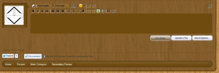
creating a dark theme using only the built-in editor proved quite difficult. unless the system has changed dramatically since the early beta days, it will not be easy to get satisfying results. it was an enormous amount of work trying to get uniform and usable mouseover (hover) effects because everything about them assumes a light theme. even the names (secondaryDark, primaryLigher, etc) reinforce this and require one to remember that 'darker' means 'lighter' and so on. there are also a ton of gradient graphics that look terrible on a dark theme and have to be hunted down and removed.

k&m should release a dark style in addition to a mobile theme. mobile web usage is not a fad.

Still the same regarding styling the editor it's a PIA.
 
Still the same regarding styling the editor it's a PIA.
i remember looking through css for instances of 'white'... pasting a ton of 'fix for dark' css into extra.css... i even remember having to manually edit js files for overlay effects (like logout) and for tinymce.
 
i remember looking through css for instances of 'white'... pasting a ton of 'fix for dark' css into extra.css... i even remember having to manually edit js files for overlay effects (like logout) and for tinymce.

I noticed in chrome yesterday what looks okay in firefox some menus are still showing white as well as the text area border right/left. Absolute nightmare.

Just to also note why xenforo shouldn't showcase a dark style the images consisting in the editor span across 2 spritesheets and several as standalone images which is absolutely and utterly ridiculous.

In the meantime i have to figure out how to get the light borders and -moztext ******** removed and hopefully not by going into js files. I understand the tinymce issues are indeed down to tinymce (I think) but the spritesheet spanning 2 sheets and stand-alone images damn too much work. :D
 
i did this with some minimal changes to the button images and a bunch of css....that said...it is a pain in the ass...for sure..i would say without a doubt the editor is the hardest thing to deal with styling concernededitor.webp
 
i did this with some minimal changes to the button images and a bunch of css....that said...it is a pain in the ass...for sure..i would say without a doubt the editor is the hardest thing to deal with styling concernedView attachment 40077

So far I've managed to soley use css and did a full image design/replace (very time consuming) Are you seeing any adverse effects in chrome/opera 2nd screenshot.

Firefox:
editor_xenforo.webp

Chrome:
editor_xenforo_chrome.webp
 
Are you seeing any adverse effects in chrome/opera 2nd screenshot.

A few things...
the border to the left and right of the entirety of the editor, one darker one lighter in chrome
the top, left and right borders of the font family and size selectors are showing as white-ish grey in chrome vs black in ff
 
A few things...
the border to the left and right of the entirety of the editor, one darker one lighter in chrome
the top, left and right borders of the font family and size selectors are showing as white-ish grey in chrome vs black in ff

I took a closer look (fresher head this morning) and just figured out the issue with regards to the borders around the icons. :)

Edit: all fix *fingers crossed there's no adverse affects elsewhere*
editor_xenforo_chrome_fixed.webp
 
I took a closer look (fresher head this morning) and just figured out the issue with regards to the borders around the icons. :)

Edit: all fix *fingers crossed there's no adverse affects elsewhere*

i have the same issue. what was your fix?
 
I can't recall the class i used but i remember the problem was in other browsers was caused by the border-color using -moz browser prefix i just added an additional line without any browser prefixes and that seemed to fix it. next time i'm in the admincp i'll post it if by the offchance you couldn't find the class to attach it to but i don't think you'll have any problem in finding it.
 
I can't recall the class i used but i remember the problem was in other browsers was caused by the border-color using -moz browser prefix i just added an additional line without any browser prefixes and that seemed to fix it. next time i'm in the admincp i'll post it if by the offchance you couldn't find the class to attach it to but i don't think you'll have any problem in finding it.
thanks for the tip. that has been giving me the ****s for well over a year now.
 
Top Bottom