HackSlashRepeat.com - Action RPG/HnS Gaming Community

Looks good. XenPorta looks great.
I think this "gaming scene" is a crowded space, it might be hard to attract a crowd.
Working hard with creating good content is likely the most important thing for you.


http://www.hackslashrepeat.com/events/monthly
- for the current day ... the red on red doesn't work (Im on Chrome).
Great, thanks DD. I'll make a note of it!

In regards to the gaming scene, I know it's difficult. I've tried to focus on a niche (Hack and Slash PC games) rather than a broader spectrum of genres, games, platforms etc that many other sites attempt to and fail.
 
What are the Hack and Slash games ?
Wii Sports Resort Swordplay ?
To view this content we will need your consent to set third party cookies.
For more detailed information, see our cookies page.
 
@Greg,

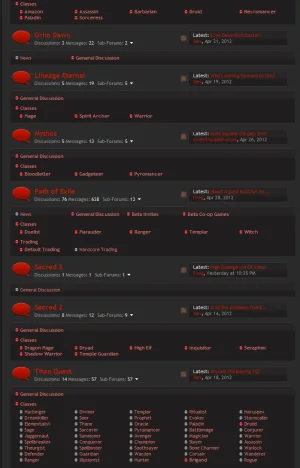
I am reviewing your forums right now. I find the white on red in the categories a bit hard on the eyes personally. You could also lighten the grey font color used for discussions/messages slightly to make it stand out more. Perhaps even darken the shade of red you're using a bit which would cause the white to stand out and hurt the eyes less in my opinion.

Some food for thought. Otherwise it looks really good. =)
 
Back up, I was restoring our old database which had about 200+ members and 2300+ posts :)
Looks better now that you've removed the category descriptions. I would adjust the coloring of the read / recently read forum markers. Telling the two reds apart is a bit difficult if not looking closely.
 
Looks better now that you've removed the category descriptions. I would adjust the coloring of the read / recently read forum markers. Telling the two reds apart is a bit difficult if not looking closely.

Good suggestion, I've made the "read" image black and white now (grey). The "unread" image is still the same red.
 
There's too much forum sections. It's a overkill for a such small forum and something that doesn't attract visitors.
TooManyForums.webp
This forum setup probably fits for one or more million posts/users, but not for a small forum.
 
You might want to consider only adding those subforums once you actually have a bigger userbase, for now I think those general forums without the separation of classes and whatnot might be a better idea, I doubt only with 200 members they'll cover all classes separately, or create enough discussion that grants having them separated.
 
Thanks guys, I've taken your advice on board and removed the subforum listing. It does look cleaner!

I've also added a funky background. I hope you all like it.
 
Bump, been over a year now since I first created the site, I have changed so many things since my last post even.

Any feedback welcome :)
 
Top Bottom