Steffen
Well-known member
- Affected version
- 2.0.7
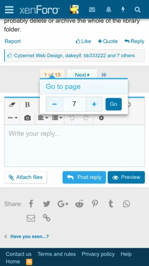
Our users say that the the "+" and "-" buttons in the "Go to page" menu are hard to hit on touch devices. I think they are right, those buttons have a width of only 25 pixels.
"A minimum recommended touch target size is around 48 device independent pixels on a site with a properly set mobile viewport." (https://developers.google.com/web/fundamentals/accessibility/accessible-styles)
Any maybe the "-" button could be placed to the left of the input field (because the pagenav shows the "Prev" button on the left, too)?