First thought that came to mind...
Emm, I, see
Kay, ee, why,
Emm, oh, you, ess, ee.
View attachment 269621

How's this?
First thought that came to mind...
Emm, I, see
Kay, ee, why,
Emm, oh, you, ess, ee.
View attachment 269621
I quite like the traffic light in the yellow box, it can be easily used for the site icon too (favicon and pwa)View attachment 269594
Thought of this as another possibility for the new logo, but worried it's too simplistic
It's important for SEO to go beyond that.I think it's very important to get listed and favorable (first page) positioning in Google's search results.
So, what do people find when they Google "your special interest forum?"
That's a good one. Apart from the annoying key icon and having to register to actually see anything which will lose you loads of traffic and members.
Certainly. I wasn't going to write a tome on SEO and keywords in this context / environment. My comment included but a single example.If there is a niche then you ideally want to rank well for that niche whether it's a forum our not. Very few people add the keyword form to a search because most people are looking for information about the niche per se without it being forum.
")
Of course. Run your searches with as many conceivable combinations of keywords. Think like the "consumer" or searcher.It's very easy to rank in the top few serach results if you are a forum assuming that people put the word forum in their search
Yep. But again, I wasn't going to expound on the rather vast subject of SEO. I was trying to keep the message simple by including just one example of a search.The only way to find out how you are doing is to just put the special interest search terms (without forum) and then see how you are doing compared with the completion, ie all the YouTube crap, Wikipedia, retailers, dealers, bloggers etc.
having to register to actually see anything which will lose you loads of traffic and members.
")
But, what do I / we know, eh?

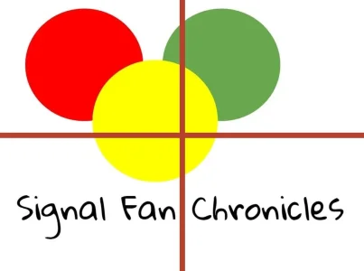
It's not too simple. It's unpleasant to look at. The circles aren't centered so the logo lacks harmony. They also remind me of Mickey Mouse. The color combination gives me a headache. It's too bright and there's not enough contrast. The font looks too playful or childish in this context. It might not even be legible on mobile devices because it's so small.
Here's another logo design I had in mind:It's not too simple. It's unpleasant to look at. The circles aren't centered so the logo lacks harmony. They also remind me of Mickey Mouse. The color combination gives me a headache. It's too bright and there's not enough contrast. The font looks too playful or childish in this context. It might not even be legible on mobile devices because it's so small.
I think you should ask or hire someone to design a modern logo for you. You can focus on more important things like creating good content for the people you want to visit your site. That's my honest opinion.

That's a million times better than the one you posted before this.
That's a million times better than the one you posted before this.

/* mobile logo larger */
.p-nav-smallLogo
{
    display: none !important;
}
.p-header-logo
{
    max-width: none !important;
}
.has-js .p-header
{
    display: block;
}That looks great too. You could drop the first word because it's not in your domain name. But yeah. Now you have a beautiful logo. Congratulations!
That looks great too. You could drop the first word because it's not in your domain name. But yeah. Now you have a beautiful logo. Congratulations!
Yes please use one and open your site lol.
We use essential cookies to make this site work, and optional cookies to enhance your experience.