Flexile Dark

Flexile Dark 1.1.5.1

No permission to download
Status
Not open for further replies.
Hmm... maybe trying re-installing/overwriting Flexile Blue? What XML file did you import "Flexile Blue" from?
"Flexile Blue" is the default Flexile style renamed. I have "Flexile Default" as it's parent.

I could re-install, but that would be the nightmare I was trying to avoid. I have 67 edited templates.

Since the fix you provided works in the default Flexile style, I deduce that one of my edited templates is not inheriting the change. What I don't understand is why it doesn't show up as an outdated template. Either way, if you can just share with me which templates you modified to fix the conversation CSS, I will revert that template then re-apply the modifications.

Thanks for your time!
 
Erik, any chance you missed my post above? I know it is my issue. I am hoping you can just point me in the right direction.
 
Sorry, I missed your reply. It's in flexile_exceptions.css:
Code:
div.secondaryContent + div.sectionFooter {
margin-top: -5px;
border-left: 1px solid #D6D6D6;
border-right: 1px solid #D6D6D6;
border-radius: 0 0 6px 6px;
}
 
This is a beautiful theme, I'm very impressed with just how clean it is.

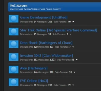
That said, I do have one question about modifying the read/unread post icons. Your icons seem to have transparent main elements. The light and dark blue appears to be produced by some other aspect of the theme. I'm not sure how to approach this, as I'm only familiar with editing icons with transparent borders, like Xenforo's stock icons. =P

Could someone please point me in the right direction? With respects to replacing the icons of this particular theme?

This is what I get when I use Shelley's Orb Status Icons (http://xenforo.com/community/threads/orb-status-icons-v2.8571/) for instance:

icons.webp

Thanks for any help!
 
This is a beautiful theme, I'm very impressed with just how clean it is.

That said, I do have one question about modifying the read/unread post icons. Your icons seem to have transparent main elements. The light and dark blue appears to be produced by some other aspect of the theme. I'm not sure how to approach this, as I'm only familiar with editing icons with transparent borders, like Xenforo's stock icons. =P

Could someone please point me in the right direction? With respects to replacing the icons of this particular theme?

This is what I get when I use Shelley's Orb Status Icons (http://xenforo.com/community/threads/orb-status-icons-v2.8571/) for instance:

View attachment 16075

Thanks for any help!
Refer page 2 ;)
 
Does anyone know if this style is able to be made fluid like the original xenforo style without any issues?

cheers
 
What issues are you referring too? And how do I make it fluid also? Cheers
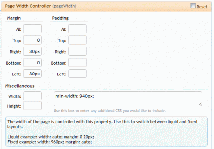
I don't know what issues he is referring to, but to make it fluid all you have to do is make the Page Width Controller style property look like this (under the General group):

pagewidth.gif
 
I don't know what issues he is referring to, but to make it fluid all you have to do is make the Page Width Controller style property look like this (under the General group):

View attachment 16210

Thanks Erik. This will make it like the default XF skin I believe? Just to confirm, fluid does mean it auto adjusts as per users resolution??
 
What issues are you referring too?
There are tons of articles on the advantages and disadvantages of fixed vs fluid styles. Here is one of them: http://webmasterformat.com/blog/fixed-vs-fluid-web-design

In short, a fixed page will look the same always. You design the page and it should appear the same to anyone with just a few basic assumptions such as the page uses compliant code.

A fluid page is great for many reasons, but you may have some users contacting you about the way the page looks "off" to them. Often they will need to send you a screenshot because they are using a different monitor or resolution then your settings. You may also find your pages don't appear as you wish them to, but no one informs you of the problem. Basically, you don't have the same level of control over your design with a fluid page.
This is only really a problem if you have a poorly-designed and -built website. You shouldn't have any problems with XenForo given it uses a min-width: attribute (so the page doesn't get too small) and includes features like automatic image resizing.

Users with large screen resolutions may dislike a fluid layout because it is often too wide and will stretch out text into long lines. But in that case you can always use a max-width property, or simply provide a fixed-width style as it is often up to personal preference as to which one is better. :)
 
I agree Erik. I don't have your expertise but in my experience fluid layouts require more careful design and thought. For example, you need to use em instead of pixels for the fonts to look correctly. Even if you do everything correctly, you will have some users contacting you regarding the points you shared.

Fixed width = same experience for all users
Fluid width = taking advantage of the maximum screen for everyone, at the cost of a bit more care required in development and some users needing to be educated and/or disliking the style.
 
I can't seem to find the correct place to edit the bottom bar color on a logged in userbar. Could someone point me in the right direction? =)

loginbar.webp
 
Apply this to your extra.css file:

Code:
#userBar {
    border-bottom: 1px solid #FFFFFF !important;
}

Obviously, change the code above to fit the color you want to change it to...
 
Status
Not open for further replies.
Back
Top Bottom