@Russ any word on this?
Also, is it possible to widen the avatar images to fill the white space any? I finally got some animated avatars working and they're a little constrained:

@Russ any word on this?
@Russ any word on this?
Also, is it possible to widen the avatar images to fill the white space any? I finally got some animated avatars working and they're a little constrained:
View attachment 94484
I'm still a little lost on the red. The text inside the search box is grey on my install. What red are you referring to?Just tried my code on FF/Chrome/IE and it all showed up good. What code exactly did you place on yours? Did you change the red to something else?
For the avatar are you looking for bigger avatars basically? https://xenforo.com/community/resources/avatars-big-tall.1741/ is that something along the lines of what you want.
I'm still a little lost on the red. The text inside the search box is grey on my install. What red are you referring to?
For the avatars, I suppose that is, if you think that code will widen them then that's what I'll use.
No, because you said something about it being red and I wasn't sure if we got our wires crossed and wanted to double check first. I saw that and my first thought was "what red is he talking about? Did I not explain it correctly?"Did you add the code I gave you in my prior post? A few posts of mine back?
No, because you said something about it being red and I wasn't sure if we got our wires crossed and wanted to double check first. I saw that and my first thought was "what red is he talking about? Did I not explain it correctly?"
#QuickSearchQuery::-webkit-input-placeholder { color: #CCC; }
#QuickSearchQuery:-moz-placeholder { color: #CCC; }
#QuickSearchQuery::-moz-placeholder { color: #CCC; }
#QuickSearchQuery:-ms-input-placeholder { color: #CCC; }Ah, gotcha. I definitely misread that one. My bad. Code works. I'll futz with the colors.Haha, I just meant it was an example code.
You can make it any color you want:
Code:#QuickSearchQuery::-webkit-input-placeholder { color: #CCC; } #QuickSearchQuery:-moz-placeholder { color: #CCC; } #QuickSearchQuery::-moz-placeholder { color: #CCC; } #QuickSearchQuery:-ms-input-placeholder { color: #CCC; }
Ah, gotcha. I definitely misread that one. My bad. Code works. I'll futz with the colors.
So the avatars you recommend that code from Jake?
I agree, which is why I was basically interested in just trying to widen the viewable width. This way I could keep things relatively constrained.I personally am not a fan of it because depending on the users avatar a user could have a taller one than everyone else. I like everyone to be consistent with that you can't if I recall.
I agree, which is why I was basically interested in just trying to widen the viewable width. This way I could keep things relatively constrained.
.messageUserInfo .avatar img {
height: 140px;
width: 140px;
}Plainly put I'm not a fan of how avatars function on xenforo. Currently I think the only real option would be CSS to increase it, unless you wanted to change the size of the medium avatar(96x96)globally by doing a file edit(don't have the link currently)
On my phone but this would stretch it(just loses quality)
Code:.messageUserInfo .avatar img { height: 140px; width: 140px; }
Works just fine.Does this need to be updated to work on v1.4.4?
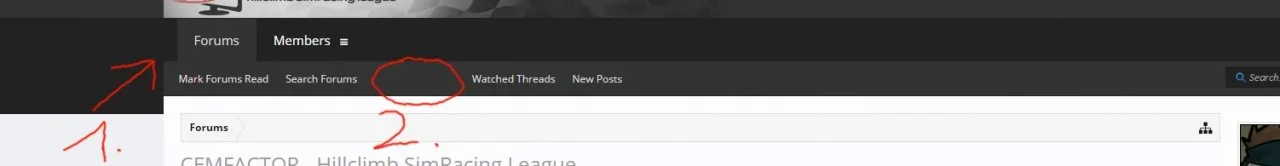
") I have just two minor questions, see the image below:
I have just two minor questions, see the image below:")
.navTabs {
padding: 0 0px;
border-left-width: 0px;
}.navTabs .navTab.selected .tabLinks a:hover {
color: rgb(222, 222, 222);
text-decoration: underline;
}This is an awesome style. Thanks for offering it for free!
I have noticed that in the message box when creating a post that if you make text bold it does not appear bold in the post editor. It only shows bold after you finalize the post or view it in a preview.
Superb skin
1) How can I move the two tabs by 16px to the left so that the are on the same height as the logo on top?
2) How can I change the hover-style for this links here and on the bottom of the forum? I'd prefer it to just underline them, but to stay white when hoeverd.
Thank you
EDIT: For the Tab-thing I put this in Extra.css, I hope this is ok. At least it works.
Code:.navTabs { padding: 0 0px; border-left-width: 0px; }
EDIT2: In the meantime I figured out Issue 2, I addess to EXTRA.CSS the following code. I hope it's ok.
Code:.navTabs .navTab.selected .tabLinks a:hover { color: rgb(222, 222, 222); text-decoration: underline; }
You mentioned you were going to look into this issue. Any luck?
Thanks.
 , the bolding works on a couple different forums.
Is there a way of changing default fonts to others? The fonts provided look nice but show a lot of problems when diacritic characters are used, especially on non-Windows machines. Diacritics with different sizes/styles are used then.
"Trebuchet MS",Helvetica,Arial,sans-serifWe use essential cookies to make this site work, and optional cookies to enhance your experience.