Critique of our forum list invited

Stuart Wright

Well-known member
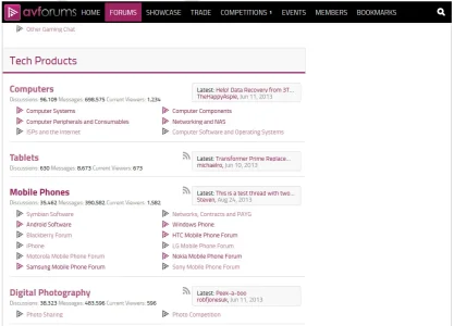
I'm keen to hear from experienced Xenforo forum owners what they think of this design of forum list.
And particularly whether you think it will work without the node icons.
The colours of the subforum icons and fonts is not set, yet.
It's important that I get your honest opinions, please, before we set this in stone.
Thanks
temp.webp
 
Looks awesome! (y) Though you should put some margin-top on the rss icon...

Just one question...Why did you choose pink? I think blue would be better.
 
So the rss icons should be vertically centered? I agree, thanks.

It's not pink, it's #9d2362 - red-violet, and it is the main colour of the design from the designers.
This is pink. This is red-violet.
If you give it an opacity of .75, it ends up looking pinker, which is kind of unfortunate. I don't have anything against pink, though we are a website visited by men 96% of the time, so blue is a predictable choice. Perhaps it's better not to be so predictable.
Red-violet is a good colour, I think. It works well in the icon and logo above.
I will probably make the subforum icons and text variants of grey to remove the amount of red-violet in the page.
 
Regarding the exact color: mind that the appearance of color is dependent upon the monitor and color scheme settings of the user. Some users will see pink. I do like the color scheme, because the violet with grey/black font matches really well. Some very successful websites use a similar color scheme.
Even though its a bit bold to use a pinkish scheme on a tech crowd.

I do think that your forum icons are an essential part of AVF identity and you should not loose them. Your users have grown used to clicking on the icon(s) of their interest. Its useful to keep that. Especially since your icons are really well designed.

I would lower the RSS icons.
Thanks for that feedback. I could get category icons in there, I should think. Let me mock that up.
 
It may help the overall alignment to remove the triangle icons on subforums, as well as the rss icons
 
It may help the overall alignment to remove the triangle icons on subforums, as well as the rss icons
So remove the subforum icons as well? I deliberately indented the subforums so the main forums are easier to identify.


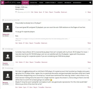
Could I also invite feedback on our discussion page layout please?
The key change is the addition of the grey message divider intended to make it easier to see where messages are, but also to bring the post date to a more prominent place. Note the time needs to be visible.
I also put the permanlink top right of the new message divider because that's where we have it now in vBulletin and it then means the row of links from Edit on the left to Reply on the right are in a clean area.
functionality and aesthetics wise, do any forum admin out there forsee any problems with this design?
Thanks

temp2.webp
 
Last edited:
No he is saying just remove the subforum icons. not the whole subforums.
Yes that's what I thought. I left them in there because I felt that it would be easier for the eye to locate the subforums with icons, but maybe not. I will create a mockup and share.

temp3.webp

How is that?
 
Last edited:
Personally I like the subforum icons, I think it looks a bit bare without them, especially with no node icons. You can probably do without the node icons but if you are considering adding them in, I think having a different one for each forum would look good.
 
On second thoughts:

- Bring back the subforum icon, but smaller
- Is the final design going to be fixed at this width? It's much too small
- Would remove the RSS icons if possible, anyone that wants to access RSS feeds can use the button in their browser
- The subforums might look better with a light grey background, similar to how it's done on my forum
- Possibly lose the discussions/messages/current viewers counts, never thought those were very good for the flow in the default style (would need to move title down to compensate)
- Use the icon you had for subforums (or a larger version preferably) as a node icon - better than having none
- Go as OCD as possible on all the alignments/spacing (e.g. tablets is not vertically centred between the two surrounding borders)
 
I think the "Latest" seems slightly disconnected from the forum it belongs too.

I'd maybe extend the border around the forum name as well and lighten the background.
 
Thanks for your input, everyone.

On second thoughts:

- Bring back the subforum icon, but smaller
- Is the final design going to be fixed at this width? It's much too small
- Would remove the RSS icons if possible, anyone that wants to access RSS feeds can use the button in their browser
- The subforums might look better with a light grey background, similar to how it's done on my forum
- Possibly lose the discussions/messages/current viewers counts, never thought those were very good for the flow in the default style (would need to move title down to compensate)
- Use the icon you had for subforums (or a larger version preferably) as a node icon - better than having none
- Go as OCD as possible on all the alignments/spacing (e.g. tablets is not vertically centred between the two surrounding borders)
The site width is 960px, which, once the 300px wide sidebar is subtracted (has to be 300px to get an MPU advert in there), leaves us with what we have here.
Would removing the RSS button negatively impact SEO? Otherwise I would remove it to get the latest poster info box wider.
The wife just spent a while reading the forums and complained that her eyes were hurting. I do think the site is too white. Problem is that the same issue will apply to our editorial as well. I think we're going to have to either make the whole content area off white or just messages. This is a big deal. Is the current mainstream thinking on the 'net that dark text on #FFFFFF is not a good idea? What colour is the background on Google results, YouTube, Facebook, Twitter?
I think the discussions/messages/current viewers counts are important for showing people that your forums are busy (when they are ;))
So you *would* have a node icon? This would eat into the width available for the counts.
Personally I wouldn't vertically align the main node links in the available space. I think it looks better with a space above to help the eye land on them.

Thanks again for your input.
 
- Subforum icons need to come back (but designed smaller)
- Navigation Menu text seems a bit large causing the navbar to look cluttered (imo) and crammed.
- RSS Feed Icon could be a tad smaller
- The seperation between the forums doesn't feel quite right (can't put my finger on it but from the screenshot it looks cluttered) but then I know how screenshots can be deceptive and not give the true actual picture as I reviewed styles that looked mediocre that actually look far better seeing it live. But the node separation on forum_list doesn't seem prominent enough or quite right, seems a little erratic.


All minor stuff that can be worked on further imo and done right could have a significant impact for the better.
 
Looking good. I would get rid of the RSS icon though. sub forums need some sort of icon, honestly if you don't know forums well, you would think they were just links.
 
Top Bottom