Critique for a colorblind...:)

Hi there,
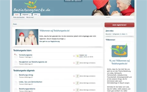
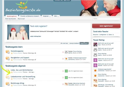
i start a new project next week, it´s about love, partnership and all the things, that come with it (includig headache...). Problem: It´s very difficult to difference colors for me (and to speak english), so could you take a look on the side?Would be very nice and very helpful.

Screen 1 (logged in)
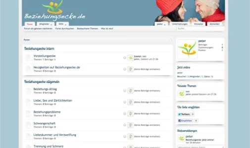

loggedin.webp


Screen 2 (logged out)

loggedout.webp

I choosed the style Soft responsive by Arty, and don´t wonder, i took the branding-free-version...

See it live HERE

I hope to hear from you,
best wishes,
Peter
 
I think it looks great. The only thing I would do is increase the height of the header as it looks cut off at this top. Otherwise, you did a great job.

Gabby
 
Ah the responsive style by arty. Nice job on the alterations. One thing however I feel looks a little odd is the navbar sitting so close to the logo, I dunno, it looks a little odd to me being so close which is down to the blue bg/logo spanning all the way across.

Otherwise, great looking style and site :)
 
These two look a wee bit too excited to rub hands together ....

unhelpful.gap.shoppers.webp

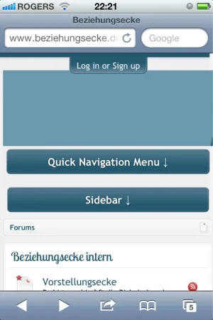
The mobile style on my iphone looks like this ...
mobile.iphone4s.fr_1458_size880.webp

That big blue nothing at the top seems to be just a space waster.
 
Hey, thanks for your critiques!!

The mobile style on my iphone looks like this ...
That big blue nothing at the top seems to be just a space waster.

Yes, i didn´t spent much time for the mobile style , seems there is a lot to do for me...

Ah the responsive style by arty. Nice job on the alterations. One thing however I feel looks a little odd is the navbar sitting so close to the logo, I dunno, it looks a little odd to me being so close which is down to the blue bg/logo spanning all the way across.
Otherwise, great looking style and site :)

Ah okay. Do you think it would be better, when the navtabs don´t overlap the header logo?

Thanks for helping me out:)
Peter
 
The only thing I would change is the white background. By all means, use a light color or keep it white. But it seems a bit bright in my opinion.
 
Back
Top Bottom