Constructive Criticism for my forum design

How would you rate your experience?


  • Total voters
    11
Do you think I should turn off logo masking? I think that may be contributing to that
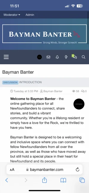
Use the code provided in the link below to make your logo bigger on mobile


Attachments

  • 917AC149-5A3D-4599-B22E-16BEDA4B07CA.webp
    917AC149-5A3D-4599-B22E-16BEDA4B07CA.webp
    60.1 KB · Views: 11
I’m wondering if I could adjust it so when the user scrolls up, the icons for profile, alerts, etc will expands over to the left and when you scroll down it collapses as it already is. Does that make sense?
Haven't tried it, but I wouldn't recommend it.
 
I would put your 1st Category - as your last category where it's at the bottom of your forum.

Bayman Banter
Announcements
Suggestions & Bug Reports
Introduction
 
Use the code provided in the link below to make your logo bigger on mobile

That worked for me :) I have the logo smaller on the desktop view and bigger on mobile with that.
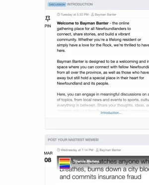
 
Just had a look. I'd play around with colours in settings a bit more. I have the background, the tabs and the node tabs varying shades and the background colour slightly different. It can be a lot of playing around but you can really make it a bit more individual that way. And it look less corporate.

I'd also work on the logo sizing and placement. I spent a ridiculous amount of time fiddling around with that.

I'd have a different home page. I use Bob's Article Management System as a home page - with photos and articles on. But there are other options for making a home page.
 
What I did with my logo was - crop it in paint.net top and bottom before uploading it (so it has less height). Then when you upload it you could set the header background to the same colour as the logo background - so it doesn't look so cropped. To adjust the size/height of the logo then, on the page you can do this in Settings - Appearance - Style Properties - Header and Navigation. Scroll down to "Header/logo row" and under Extra "CSS Less" you can type in different sizes in code and try them out. I have

height: 85px;

You can change that number to 100 or 70 or whatever and see the difference.
 
So basically you could shrink the entire logo - including the white lines, before uploading it, set the background colour to the same as the logo and then fiddle about with the size/height settings as above until the header bar is the right size and the logo is the right size.

Changing the colours really made a big but subtle difference to mine. It was quite time consuming and fiddly though. I ended up with a green theme with salmon accents and some darker accents.
 
Haven't tried it, but I wouldn't recommend it.
I managed to fix the issue with this code:

Code:
//Logo Mobile Size
// ########################### FULL SIZE LOGO ON MOBILE ########################
.p-nav-smallLogo {
    display: none !important;
}
.p-header-logo {
    max-width: none !important;
}
.has-js .p-header {
    display: block;
}

Works perfect.
 
Just had a look. I'd play around with colours in settings a bit more. I have the background, the tabs and the node tabs varying shades and the background colour slightly different. It can be a lot of playing around but you can really make it a bit more individual that way. And it look less corporate.

I'd also work on the logo sizing and placement. I spent a ridiculous amount of time fiddling around with that.

I'd have a different home page. I use Bob's Article Management System as a home page - with photos and articles on. But there are other options for making a home page.
Can you send a link to this add-on? I can't seem to find it!

Thank for your input! I appreciate you taking the time.
 
So basically you could shrink the entire logo - including the white lines, before uploading it, set the background colour to the same as the logo and then fiddle about with the size/height settings as above until the header bar is the right size and the logo is the right size.

Changing the colours really made a big but subtle difference to mine. It was quite time consuming and fiddly though. I ended up with a green theme with salmon accents and some darker accents.
Thanks! I tried creating the logo through "logo.com" and went with the color scheme. I still need to fiddle with it and change things around as it is very basic right now.

Do you have a link to yours so I can check it out?
 
Haven't tried it, but I wouldn't recommend it.
Also, do you know what I could add in extra.less to fix this issue? I will provide two screenshots to show what I mean. If you notice on the "fix" screenshot, the date and pin portion doesn't have its own little block. In the "reference" screenshot, it does. It looks a little tacky like it is right now.

[edit] I fixed it by inspecting the element and adding this:

Code:
.porta-article-item .porta-article-date .porta-date-block {
    background: #fefefe;
    border: 1px solid #f3f3f3;
    width: 50px;
    padding: 10px;
    text-align: center;
    text-transform: uppercase;
    white-space: nowrap;
}

.porta-article-item .porta-article-date .porta-date-block b {
    display: block;
    font-size:1.5em
}

See FIXED screenshot.
 

Attachments

  • fix.webp
    fix.webp
    82 KB · Views: 5
  • reference.webp
    reference.webp
    76.6 KB · Views: 4
  • FIXED.webp
    FIXED.webp
    81.6 KB · Views: 5
Last edited:
Also, do you know what I could add in extra.less to fix this issue? I will provide two screenshots to show what I mean. If you notice on the "fix" screenshot, the date and pin portion doesn't have its own little block. In the "reference" screenshot, it does. It looks a little tacky like it is right now.

[edit] I fixed it by inspecting the element and adding this:

Code:
.porta-article-item .porta-article-date .porta-date-block {
    background: #fefefe;
    border: 1px solid #f3f3f3;
    width: 50px;
    padding: 10px;
    text-align: center;
    text-transform: uppercase;
    white-space: nowrap;
}

.porta-article-item .porta-article-date .porta-date-block b {
    display: block;
    font-size:1.5em
}

See FIXED screenshot.
try with this:
Less:
.porta-article-item .porta-article-date .porta-date-block {
    border-width: 1px !important;
    border-color: #e0e0e0;
    background: #ffffff;
}
 
I managed to fix the issue with this code:

Code:
//Logo Mobile Size
// ########################### FULL SIZE LOGO ON MOBILE ########################
.p-nav-smallLogo {
    display: none !important;
}
.p-header-logo {
    max-width: none !important;
}
.has-js .p-header {
    display: block;
}

Works perfect.
I must have misunderstood what you wanted.
 
Top Bottom