You are using an out of date browser. It may not display this or other websites correctly.
You should upgrade or use an alternative browser.
You should upgrade or use an alternative browser.
Implemented Consistent Placement Of Post New Thread Button
- Thread starter ibnesayeed
- Start date
This suggestion has been implemented. Votes are no longer accepted.
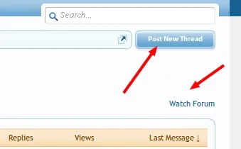
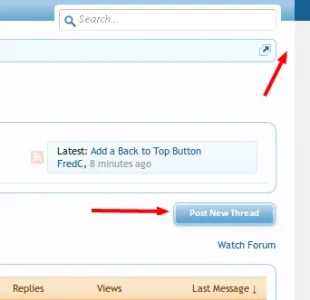
I am just asking for consistency. If the placement below sub-forums makes more sense then in absence of sub-forums it should be placed right above the "Watch Forum" link, not next to the breadcrumb bar.This has already been changed from where you want it to where it is now.
It has purposely been placed below the sub forum list.
I am just asking for consistency. If the placement below sub-forums makes more sense then in absence of sub-forums it should be placed right above the "Watch Forum" link, not next to the breadcrumb bar.
I wholeheartedly agree with you.
There is a very interesting discussion about it overhere: http://xenforo.com/community/threads/the-position-of-key-buttons-next-to-the-breadcrumb.3066/, where you will find many suggestions/proposals from the community on this subject matter.
I still think that the subject matter you rise here, is one of the -very few- areas that do not yet seem to be 'quite right', in Xenforo.
I disagree. I think the Post New Thread button is in the right place. If it was to be place where the OP suggests then it would lead to two things:I still think that the subject matter you rise here, is one of the -very few- areas that do not yet seem to be 'quite right', in Xenforo.
- Potential confusion for some users as to where the new thread would be created - in one of the existing subforums just below the button or in the forum they are actually in
- When there are many subforums (let's say 10+), the user would first be looking at the threads in the forum, then have to scroll right to the top of the forum to be able to create their own thread.
The current location makes it clear where the new thread is being created - in the forum you are in - and it is much easier to use due to less scrolling required.
Hello Martok, everthing you are stating is true. That (the points you make) were the reasons why it was eventually moved below the subforums listing, based on community feedback.
But, this is not what the OP is suggesting. Read the OP again and you will see that he never suggested to place it back after the breadcrumb. He is looking for consistency, not to put it back where it originally was perse.
(I wrote this before I could see Brogans reply which states partly the same)
But, this is not what the OP is suggesting. Read the OP again and you will see that he never suggested to place it back after the breadcrumb. He is looking for consistency, not to put it back where it originally was perse.
(I wrote this before I could see Brogans reply which states partly the same)
Last edited:
Maybe the OP should give a suggestion for a consistent place that always works no matter the circumstances. I can't really think of one. I know that @Karelke has put his above pagination but to me that doesn't feel natural, at least to the majority of us (LTR). Your eye naturally leads to the right after looking at the threads so you wouldn't expect the New Thread button to be over on the left, especially as on virtually every other site any similar button is always on the right.Hello Martok, everthing you are stating is true. That (the points you make) were the reasons why it was eventually moved below the subforums listing, based on community feedback.
But, this is not what the OP is suggesting. Read the OP again and you will see that he never suggested to place it back after the breadcrumb. He is looking for consistency, not to put it back where it originally was perse.
The breadcrumb is .. IMO .. rarely useful. So saving space (and making the breadcrumb smaller) to fit the [New Post] button is a good idea IMO. For the most part ... there are many situations ... I think it should be removed entirely.
To be honest, I thought about it myself and came up with similar reasoning why things are the way they are. But creating new thread is a very significant action that needs to be very intuitive and consistent. It is not a problem for us, but it is for grandma. There are users who can't figure out how to add links in a post or how to add an image; and you have to teach them using video or images. And if that is the case then you have to teach them two places (far from each other in case of many sub-forums) to look for.
I still don't advocate one location over the other, I am just asking for the consistency, I have no issues if it comes by placing the button somewhere else in a third location.
There will be a trade-off, and I think this is more intuitive to assume that the thread will be created in the forum you are, unless the create thread button is next to a sub-forum on the same horizontal line.Potential confusion for some users as to where the new thread would be created - in one of the existing subforums just below the button or in the forum they are actually in
This argument can be used the other way too, naturally when the thread listing page loads, it doesn't automatically scrolls to where the thread listing begins, and user has to first look at the sub forums then threads, scanning top-to-bottom. Having so many sub-forums will make the scrolling essential (especially for small screens) before you can see the button in question.When there are many subforums (let's say 10+), the user would first be looking at the threads in the forum, then have to scroll right to the top of the forum to be able to create their own thread.
You will find counter arguments to this in my above messages.The current location makes it clear where the new thread is being created - in the forum you are in - and it is much easier to use due to less scrolling required.
I still don't advocate one location over the other, I am just asking for the consistency, I have no issues if it comes by placing the button somewhere else in a third location.
I can't wait to upgrade to XF2. I am discovering that many of the small amounts of pet peeves I had about (the already great) XF1 UI are solved by the obvious improvements XF2 brings to the table in this area. (Lots of words just to state I am feeling happy  )
)
Yes, also this issue is now fixed! Really good decision to get rid of the old breadcrumb and attached button-functionality.
[Implemented]
Yes, also this issue is now fixed! Really good decision to get rid of the old breadcrumb and attached button-functionality.
[Implemented]
Similar threads
- Replies
- 1
- Views
- 50
- Replies
- 5
- Views
- 110
- Replies
- 5
- Views
- 80
- Suggestion
Lack of interest
Better placement of Share thread button on mobile
- Replies
- 1
- Views
- 393


