Looks nice! I went with a portal mainly to attract attention to some of our better posts. I could see using this for other forums, though--you immediately know from viewing the page what the forum's topic is.
You are using an out of date browser. It may not display this or other websites correctly.
You should upgrade or use an alternative browser.
You should upgrade or use an alternative browser.
Clip The Apex
- Thread starter Paul B
- Start date
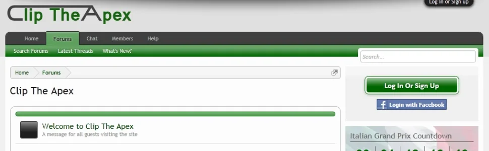
You've done a wonderful job, Brogan. Sadly, the logo still looks like "Lip the Apex"  Whatever happened to the logo suggestions from long ago? Some of those were quite good
 ")
Whatever happened to the logo suggestions from long ago? Some of those were quite good You've done a wonderful job, Brogan. Sadly, the logo still looks like "Lip the Apex"
Funny enough I was thinking about that when I first posted in this thread. I still think making the "C" into a track and having it joining to the end letter "x" would have been a creative route to explore. Speaking of the logo, I feel it (#logo) could do with some margin: 10px 0; as it looks awfully crammed imo.
Yeah, I think there is a few different things that could be done along those lines to make a really sharp looking logo.Funny enough I was thinking about that when I first posted in this thread. I still think making the "C" into a track and having it joining to the end letter "x" would have been a creative route to explore.
I considered doing a "latest posts" block but meh, couldn't be botheredLooks nice! I went with a portal mainly to attract attention to some of our better posts.

I was spending so much time on it and the members couldn't agree on which one to go with so I just went with that.Sadly, the logo still looks like "Lip the Apex"
I think we tried about 20 different logos and none of them really looked right.Funny enough I was thinking about that when I first posted in this thread. I still think making the "C" into a track and having it joining to the end letter "x" would have been a creative route to explore. Speaking of the logo, I feel it (#logo) could do with some margin: 10px 0; as it looks awfully crammed imo.
I agree this one isn't ideal and I'm not a particular fan of it, but until something better comes along it will have to do
It works well as an avatar, not so well as a logo...
I'll see if I can dig up some of the comments from the members, they were less than flattering

I deliberately kept the margins and padding as low as possible as I wanted a very slim header to avoid using up too much vertical space.
The logos are mockups nothing great to look at but distinguishing the lettering might eliminate the clip being mistaken for "lip"? The "C" and "A" have been converted to a vectored layer from the type and the A does extend out too far but it'll give you some ideas on the possibility of a colour changes to your existing font to make the clip less like lip. I dunno, my mockup doesn't really fair any better but you know, it gives you the general idea.

Attachments
My favorites are still in this post: http://xenforo.com/community/thread...-logo-critique-thread.8536/page-2#post-131534
I really can't find anything wrong with them and why your members would have anything bad to say about them. Then again...I know nothing about F1 (and its following).
I really can't find anything wrong with them and why your members would have anything bad to say about them. Then again...I know nothing about F1 (and its following).
If my site is indicative at all, mostly a bunch of moaning, middle-aged men(and its following).
If my site is indicative at all, mostly a bunch of moaning, middle-aged men
Your site and our big board forum are apparently populated by the same members.
As part of a forthcoming major design change, I'm pleased to announce that all border radius has finally been eliminated
What a long job that was - there are so many different elements and classes which have it.
I think I've got it all now, including the search date picker, moderator bar link hover and item counts, navigation tabs, menus and links, smilies and BB Code on help page, buttons, overlays, pop-ups, etc.
A virtual prize to anyone who spots any I've missed")
http://cliptheapex.com/community/
Next to be worked on are the margins and padding, changing them from 10px to 8px.
Oh and to make things easier, I extended the color palette so I can use @property in my pages, etc. without hard-coding colours.

(Those aren't the actual colours)
What a long job that was - there are so many different elements and classes which have it.
I think I've got it all now, including the search date picker, moderator bar link hover and item counts, navigation tabs, menus and links, smilies and BB Code on help page, buttons, overlays, pop-ups, etc.
A virtual prize to anyone who spots any I've missed
http://cliptheapex.com/community/
Next to be worked on are the margins and padding, changing them from 10px to 8px.
Oh and to make things easier, I extended the color palette so I can use @property in my pages, etc. without hard-coding colours.
(Those aren't the actual colours
)Looking good!
I couldn't help but accept your challenge, and found one you missed in the search popup.

I couldn't help but accept your challenge, and found one you missed in the search popup.
Code:
.formPopup .controlsWrapper {
    background: url("styles/cliptheapex/xenforo/gradients/category-23px-light.png") repeat-x scroll center top #E0E0E0;
    border-radius: 5px 5px 5px 5px;
    font-size: 11px;
    margin: 5px 0;
    padding: 5px;
As part of a forthcoming major design change, I'm pleased to announce that all border radius has finally been eliminated
What a long job that was - there are so many different elements and classes which have it.
I think I've got it all now, including the search date picker, moderator bar link hover and item counts, navigation tabs, menus and links, smilies and BB Code on help page, buttons, overlays, pop-ups, etc.
Lol brogan, you should have researched a little...
Put this in your extra.css and see the magic!
HTML:
* {
    border-radius: 0 0 0 0 !important;
}I know I can do that, but that doesn't help me when I want to selectively identify and apply border-radius to certain elements, giving me complete control.
So first I had to identify them all which that single line of code wouldn't have been able to do
I will probably be restoring the border radius to certain elements, the error overlays for example.
So first I had to identify them all which that single line of code wouldn't have been able to do
I will probably be restoring the border radius to certain elements, the error overlays for example.
I finally had some time to (almost) finish working on the style.
It's a lot cleaner and sharper now, with no border radius at all and overall contrast has been improved by darkening the page background and a few other major elements.
I also reduced and/or removed a lot of the margins and padding; as we have a fixed width and it has been designed to work on 1024 screens, we need as much usable horizontal space as we can get.
In addition, a lot of the gradients have been removed and all the remaining gradients are essentially new ones, as are a lot of the icons and widgets.
We also have a funky new member card, with more of a motorsport theme.
There are still a few tweaks left to do, but I can work on those over the coming week.
Some time next year I'll look at doing a full redesign, but for now this will do.
The season starts in less than 4 weeks so I don't want to be working on the site when I should be watching the racing
ChemicalKicks
Well-known member
Reminds me of vBulletin, bit plain.
I am into F1 and I know that's what you're site is about but I didn't get the impression that it was the main draw
I am into F1 and I know that's what you're site is about but I didn't get the impression that it was the main draw
We're quite proud of our new custom overtaking add-on: http://cliptheapex.com/community/overtaking/
Only the main index is visible to guests, you have to be logged in to get to the good stuff like the interactive lap charts.

Only the main index is visible to guests, you have to be logged in to get to the good stuff like the interactive lap charts.
Great job Paul,We're quite proud of our new custom overtaking add-on: http://cliptheapex.com/community/overtaking/
1) What scripts do you use to display the data? Can you give a general idea on the setup of that feature?
2) How do you add the Twitter icon to the footer next to RSS? I remember you post something like that a long time ago but couldn't find it.
Thanks
We're using Flot for the charts (http://code.google.com/p/flot/) but that chart above has been heavily modified as it's not standard Flot code.
For the tables we use Data Tables http://datatables.net/
The Twitter icon is added by editing the footer template:
The corresponding CSS classes must be created and added to EXTRA.css.
For the tables we use Data Tables http://datatables.net/
The Twitter icon is added by editing the footer template:
Code:
<li><a href="{$requestPaths.requestUri}#navigation">{xen:phrase go_to_top}</a></li>
<li><a href="https://twitter.com/#!/ClipTheApex" rel="nofollow" class="CTAfooterSocialMedia CTAtwitter" target="_blank" title="Follow us on Twitter">Twitter</a></li>Similar threads
- Replies
- 0
- Views
- 34
- Replies
- 4
- Views
- 90
- Suggestion
- Replies
- 0
- Views
- 56
- Replies
- 1
- Views
- 42