Clip The Apex

Paul B

XenForo moderator
Staff member
I thought it was about time I posted here, so here it is, my forum: http://cliptheapex.com/

It's mainly for Formula One, but we do discuss other motorsports.

I'm not big on graphics and styling so I've kept it very simple. I like to think that it's sleeker this way, but in reality it's because my design skills are sorely lacking and everything I do ends up looking decidedly third rate, so now I don't even bother trying :LOL:

We make extensive use of Pages, especially for the Race Hubs and Fantasy F1.

We also use them for the About Us and the Staff Page, as well as a page detailing overtaking in F1 back to 1982 (both members only).

The Pages functionality was one of the main reasons why I considered switching to XenForo as soon as I saw it.

We only use 3 add-ons which are: King Kovifor's BBCode Manager, Darkimmortal's TaigaChat and Minorin Standard Editor Toolbar.
I've said it before but I'll say it again, without those add-ons we wouldn't have been able to switch to XenForo so thanks guys.

I would also like to thank Dean for making it possible for us to switch from phpBB via vB & ImPex. We did lose passwords but almost all of the members were able to login without any support or problems.

Feel free to offer any opinions and suggestions, but don't be offended if I ignore them :D ;)
There are lots of things I would like to do but I don't have the ability or time, so it will more than likely remain as it is until the next major overhaul.
I do tweak it from time to time, but time is very limited so it's a matter of grabbing the odd hour here and there.

Update Monday 3 February 2014

This post is way out of date now.
Pages are only used for the Race Hub now and as for add-ons, I've gone the opposite way to most people and actually have many more installed :D
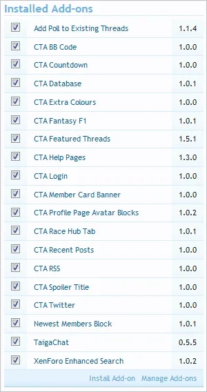
upload_2014-2-3_13-21-21.webp
 
Last edited:
I think the colouring of the text could be changed in the category area to another colour and the category gradient re-worked. The text is quite difficult to see being dark text on a dark green. That's the only issue I can see with it otherwise nice job.
 
I've never been happy with those and in fact I tweaked it just last night, removing the light border and increasing the font size.

I did look at using images and/or a different gradient but see my first post for why that never happened :D
 
I've never been happy with those and in fact I tweaked it just last night, removing the light border and increasing the font size.

I did look at using images and/or a different gradient but see my first post for why that never happened :D

I think the problem with the gradient is that it's not gradually fading and displays too far down from the top which remains prominent until the last few pixels. have you tried using the navigation-tab.png gradient image and lighting the text to a white colour? I haven't checked to see if the gradient I suggested will look any better but judging by the height of it, it should do.
 
I tried that one originally but it too also looks a bit strange as it ends up with a light band at the top and bottom of the category strip if I use 'top' and a light strip along the center if I use 'bottom'.
I'll keep on working on it though as it needs sorting.
 
here's a mockup paul. If you think this gradient looks better let me know and I'll add it here for you to use.The background colour and border is still using your existing colours. IMO it's your gradient and text colour that throws everything off.

brogan_cat.webp

Edit: gradient upload via attachment system as shown in the screenshot.
 

Attachments

  • cat_gradient_cta.webp
    cat_gradient_cta.webp
    110 bytes · Views: 10
My only suggestion is to remove the registration block to view the "statistics" etc. People have copied them to other sites anyway, but I would rather browse yours.. however the requirement to register means I often look at these other sites instead.
 
My only suggestion is to remove the registration block to view the "statistics" etc. People have copied them to other sites anyway, but I would rather browse yours.. however the requirement to register means I often look at these other sites instead.
That is our biggest draw and has been responsible for a huge increase in registrations, and subsequently posting.

That will never be removed.

If you would rather view them on my site, why not register?
It only takes 10 seconds :confused:
 
That looks great Shelley.
I'd definitely use that and appreciate the help :)

just uploaded the gradient in my previous post.

BTW have you ever thought about having imagery floated to the right inside the category headers like i did at urbanfantastic.com? I honestly feel this would add an extra dimension to the whole page and break out the greens a little with the appropriate imagery. For some odd reason I always felt this kind of site would suit the different images inside the cat headers.
 
That's something I spent quite a bit of time on but could never get it to look even half decent :(

I tried images at the end and also across the whole strip, but my abilities are sadly lacking in that area :D
 
If you would rather view them on my site, why not register?
It only takes 10 seconds :confused:

I don't enjoy "posting" about F1 as much as I used to, much prefer to talk about it in person, I would only be a reader.. so going to other sites saves me the trouble ;) (how to be lazy 101)
 
That's something I spent quite a bit of time on but could never get it to look even half decent :(

I tried images at the end and also across the whole strip, but my abilities are sadly lacking in that area :D

I think floating the images will look the part if you float them to the right. Trouble is on a few forums people will float them to the right and not fade the left hand side of the image so there's a horrid cut off point. Also lowering the opacity of the image a little helps so it's prominent but not too prominent that it destracts.

I'll ask the owner for permission where i admin and see if I can replicate your category header paul and add in the appropriate imagery and do the effects I suggested in photoshop see how it looks. where there any specific imagery you had in mind? bare in mind the height of the images will be between 40-45px so any extremely large images might not look great when scaled down dramatically.

Ps. I noticed you never changed the colour of the cat text. tut tut :p

edit: ah you did change some of the text colouring, looking better paul. (y)
 
Yeah, I tried fading and opacity but as you know, I suck at imagery :D

Here's one of my attempts (stop sniggering at the back!).

node-1-strip3.webp

I think the main problem is the height doesn't make it easy on which images to use.
I tried resizing and crops but could never get it looking anywhere near decent.

Plus of course there's the sticky issue of using royalty free, non-copyright images...
 
Yeah, I tried fading and opacity but as you know, I suck at imagery :D

Here's one of my attempts (stop sniggering at the back!).

View attachment 18320

I think the main problem is the height doesn't make it easy on which images to use.
I tried resizing and crops but could never get it looking anywhere near decent.

Plus of course there's the sticky issue of using royalty free, non-copyright images...

Ahhh it looks like you never masked the image then used the gradient tool black >>>> transparent setting on the masking area which would have given you a nice transparent faded gradual effect you used the white gradient which has the opposite effect you wanted to achieve. Also your example looks like it's at 100% opacity so that will be another reason why it never turned out as well as you hoped it to be. Another effect on top of the image I did was created a pattern and lowered that to 10% so it was very subtly noticeable which adds to the visuals.

I'll have a mockup done tomorrow and we can see what you think and take it from there. Pending you want the imagery on the category headers.

the fact that you have a nice radius for the categories this will now add to the visual effect also. Yeah, I suppose google images would have some images that are free to use right?
 
I'll have a mockup done tomorrow and we can see what you think and take it from there. Pending you want the imagery on the category headers.
Thanks Shelley.
If I you can get it looking right, it's definitely something I want to implement.

I've gone for a fairly muted palette so that will just help to lift the forum home page a bit.
 
Your site is very polished and it shows that you have put many hours of work into it. I like the choice of colours as they are pleasing to the eye. Congratulations on a fine site. :)
 
Top Bottom