Clan [RAD] - Multi-gaming community

Russ

Well-known member
Hello everyone :)

I've plugged this a couple times on XenForo already but now time for my official thread.

http://clanrad.com/

Converted back from phpBB, and has been doing pretty good since. We have a ventrilo server which is our primary form of communication but I just started a campaign to boost activity on the website.

It's a small clan geared towards mainly FPS games.

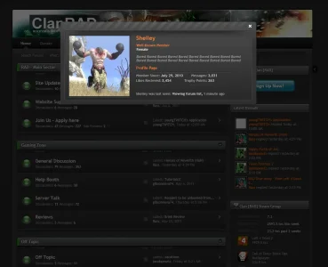
Any who thanks to http://themesinc.com/ for the lovely xenFracture style and also thanks to Shelley for the user rank icons :), I also was working on a homepage using XenPorta but realized at this point in time it wasn't really needed. However... I am using it for the new system as seen here. Right now I've been working on some "how to videos" for my users as not all of them are forum savvy as many of us here.

Anywho, if anyone is also into games such as Call of Duty Series, Counter-Strike, League or Legends, Dead Island(coming up) feel free to register and be apart of the community, I'll get it active eventually :)
 
Very sharp, clean, very nice job.

Just a visual issue I noticed with the shadow being cut off (and looks like those matte problems) The screenshot better explains.

russ_shadow.webp
 
Your sidebar toggle icon seems to be off. Unless that was intentional adjusting the a.sidebar_toggle and setting the margin-right: to -29px will rectify that.
 
Your sidebar toggle icon seems to be off. Unless that was intentional adjusting the a.sidebar_toggle and setting the margin-right: to -29px will rectify that.

Don't even remember editing that :) thanks shelley for the input, i'll look at those shadows and fix the sidebar

EDIT: There we go updated the news posts:
http://clanrad.com/threads/rad-give-away-free-left-4-dead-2-or-1-black-ops-map-pack.192/

just edited the css to have the comments stand out a bit more, and in doing so it fixed the shadow problem :)

Any other suggestions I'm open!

Much better Russ. :)

Just a thought, unsure whether you'll agree but i feel that the like container could be styled better as it really (for me) doesn't compliment the style design very well. I also find it hard to read the .liketext /link which I'd suspect others would find it strenuous on their eyes. Thoughts?

Perhaps add a little space from the bottom of the .message .publicControls top of the like container?

like_container.webp
 
Much better Russ. :)

Just a thought, unsure whether you'll agree but i feel that the like container could be styled better as it really (for me) doesn't compliment the style design very well. I also find it hard to read the .liketext /link which I'd suspect others would find it strenuous on their eyes. Thoughts?

Perhaps had a little space from the bottom of the .message .publicControls top of the like container?


Ya I noticed that once I fixed the comments ;p, that's on the next to-do list haha :)

Ok updated like box for the news system :)
 
Ya I noticed that once I fixed the comments ;p, that's on the next to-do list haha :)

Ok updated like box for the news system :)

Much better. Dare I tell you about the next improvement I think you should make? :p

The membercard. I feel the white border doesn't look at all consistent with the style and I'm suspecting the white border was put there to highlight the membercard against the dark background? I think with an appropriate design and some styling enhancements to the membercard it'll round off your whole style nicely. Just my opinion, I think the membercard could really be enhanced better. Don't hate me too much Russ. *runs* :D

I'm going to get Peggy in here for that spanky smiley! Jk I welcome all feedback and you're right, the white literally doesn't flow with the template at all, I customized it with your member dark card actually, contemplating on whether I'll keep it or make adjustments.
 
I'm going to get Peggy in here for that spanky smiley! Jk I welcome all feedback and you're right, the white literally doesn't flow with the template at all, I customized it with your member dark card actually, contemplating on whether I'll keep it or make adjustments.

I'll not say no to a spanking. :P

Take a look at the black membercard here http://xenforo.com/community/threads/testing-animated-white-smilies.18198/page-2#post-237149

I think with additional styling to compliment the style your using this could definitely conform to your visual in the way of consistency. Because I'm not working on any more projects at present the design will give you an idea on what I'm talking about. You could extend it further by adding in some of those diagonal repeating patterns, which I'll advise to include but refrain from adding under text. Probably add the pattern at the top in the space where the close icon resides running horizontally across the top.

Hopefully that will induce some ideas for you. :)
 
I wasn't sure whether I made any sense for what I was referring with regards to the membercard so I made a few more alterations and went ahead with that diagonal patter design at the top of the membercard which I suggested in the previous post. The screenshot will give you a better idea on what I was on about. :)
 

Attachments

  • russ_mockup_ss.webp
    russ_mockup_ss.webp
    72.6 KB · Views: 18
I wasn't sure whether I made any sense for what I was referring with regards to the membercard so I made a few more alterations and went ahead with that diagonal patter design at the top of the membercard which I suggested in the previous post. The screenshot will give you a better idea on what I was on about. :)

Looks really clean Shelley, I think it's given me an idea for a lot of the overlays actually :) thanks
 
Hey Russ, how did you make your news section display kind of like a blog? I really like that! :)
I'm using XenPorta with the custom article view, except I basically disabled the portal part as I didn't really have a need for it quite yet.
 
Top Bottom