Bring Back the Tabs

0ptima

Well-known member
Since its inception, tabs have been an integral part of XF and used to switch between content within a page.

Tabs are used when viewing new content
upload_2015-7-21_20-43-49.webp

Profile page
upload_2015-7-21_20-44-19.webp

The RM and XFMG use them
upload_2015-7-21_20-45-57.webp

upload_2015-7-21_20-50-5.webp

3rd party addons also use them
upload_2015-7-21_20-47-37.webp

upload_2015-7-21_20-48-59.webp


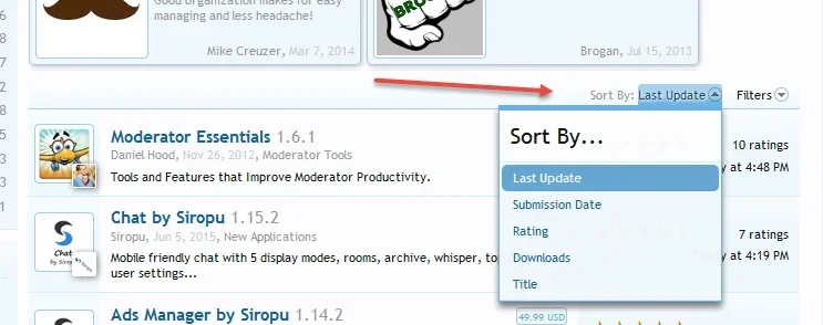
With RM 1.2 and XFMG 1.1, some tabs have been replaced by sort options

upload_2015-7-21_20-52-3.webp

upload_2015-7-21_20-53-30.webp


The sort options dont fit in with the rich use of tabs throughout XF and 3rd party addons. Furthermore, the sort options are not as mobile friendly as the tabs.

Please re-consider bringing back the tabs in the RM and XFMG.
 
While I'm fine with either was there a reason it was changed? May of been posted already... that I've missed.
 
Significant limit in terms of number of options, sizing issues and challenges with other content in place, vertical space usage on mobiles, most options unlikely used that often.

You'll note that the other examples within XF don't use tabs for sorting options. The example with the MG and RM are really the only examples. Using tabs for sorts isn't a particularly common option; sorting in a menu is a fairly common action, especially as it will be somewhat infrequently compared to the main content.
 
The thing here we also have to consider our members as this goes further than just us as admins not liking the idea. I have just purchased my 3rd copy of XF and resources being the backbone to this installation. This is a business solution and we have staff members that don't see this type of logic @Mike. They just want to log on and have a simple way to sort for newly added and updated resources and this new way completely reverses that option for them.

Then looking at my other two public forums we have the same issue with our members, so at the need of the day it might be easy to explain this away with us the forum owners it becomes a completely different matter with our members. Even myself coming here it is the most used option I use each time when viewing resources, it is quick easy and clean and does the main function. You also mentioned the mobile view and to date I have not seen any issue with the old way either on my phone or tablet.

As @0ptima mentioned it is a common format throughout XF right now and our members are just used to it being like this.

Taking into account all these items I will now be stuck on my current version of RM until such time as this feature is brought back either as core or an add on o_O
 
Tabs don't scale well with the design and the ux of the site. I mean, there are currently six different search types in XenForo right now, all displayed using tabs. On a regular XenForo installation with a couple of addons which make use of this feature an end user would see over 6 tabs when searching the forums. I celebrate the decision of the devs to reduce the number of tabs in certain areas and I would definitely encourage them to reduce the remaining tabs even more for the sake of the usability of XenForo.
 
I can't support this suggestion, sorry.

Using tabs in some places for navigation, and in other places for filtering and sorting, is confused UI design.

The new method is more logical, with the two types of operation separated. In fact, I would prefer to see this method extended to the Members tab, with filtering and sorting operating in the same way as with RM 1.2.

I'm sure someone will soon release an add-on for those who want to go back to the old way ;)
 
Tables was absolutely perfect and user friendly.
Now the content is hidden. This has been a big mistake.
I am very disappointed with this.
Please, consider bring back the tabs.
 
I think that the tabs for sorting offer a solution to a problem, because people will generally look for newly posted items in RM & MG and that was available with one click under a tab. Now this is hidden under a dropdown this disrupts the routine of the user.

Putting sorting options under a drop down is logical. But then we need a different solution for this problem. I have posted one solution here:
Give us a 1 click new resources option
The same obviously goes for the MG.
 
Tabs look and function much better for the majority of devices. Trying to doctor a work around for a responsive design that is truly not mobile friendly is not the right answer in my opinion.
 
I don't mind the new look at the moment, but perhaps have an option in the settings to either show tabs or drop downs?
 
Can't say I'm a big fan of the elimination of tabs in Resources and Media (and perhaps elsewhere) as a way of sorting items. The change is a rather large design shift, and it makes the interface inconsistent both within parts of xenforo (the More search area still has tabs, for instance, as does the Members page) and add-ons that used tabs to cohere with the rest of xenforo. Now, after upgrading to 1.5 rc, my site is inconsistent in this regard, as I have a mix of add-ons that adopted the former tab-based sorting paradigm (which I think was easier and more intuitive, frankly) and new pages within xenforo that use the drop-down situated on the upper right-hand side of the screen (quite easy to miss that, too).

So why did you do this?
 
Didn't see this thread till after I created my post. I vote for bringing back the tabs. They look friendly and are more intuitive.
 
@jauburn I have merged your thread into another discussion.

To answer your question directly:
Significant limit in terms of number of options, sizing issues and challenges with other content in place, vertical space usage on mobiles, most options unlikely used that often.

You'll note that the other examples within XF don't use tabs for sorting options. The example with the MG and RM are really the only examples. Using tabs for sorts isn't a particularly common option; sorting in a menu is a fairly common action, especially as it will be somewhat infrequently compared to the main content.
 
They look friendly and are more intuitive.

I have a different opinion than yours, I like the elimination of tabs, it makes things simple for all devices and keeps the space uncluttered. A lot of people overlook the sorting when its tabbed anyway, so its a step in the right direction to streamline things.
 
I have a different opinion than yours, I like the elimination of tabs, it makes things simple for all devices and keeps the space uncluttered. A lot of people overlook the sorting when its tabbed anyway, so its a step in the right direction to streamline things.

I'll keep an open mind. But this is a big design shift, IMO, and my initial impression is not good.

The look of Media and Resources in the area where tabs used to be is kind of naked, IMO.

medianotabs.webp

With Resources, it's not so bad when you put a feature or two up there.
 
Is it possible to "downgrade" the Resources and Media components and use the older versions with XF 1.5?
 
If it's the first time you've taken notice of it, then it may take some getting used to.

Is it possible to "downgrade" the Resources and Media components and use the older versions with XF 1.5?
You can't downgrade if you have already upgraded. But you can use older versions on 1.5.
 
Back
Top Bottom