XF 2.2 Article thread and forum updates and improvements

article previews.jpg
Screenshot 2020-07-31 at 12.54.25.png
When we first announced support for article-type threads and forums, we noted that this was an initial foray and that revised styling was in the pipeline.

Today, we can show you some of those revisions and the options that come with them.

Revised article styling​

Screenshot 2020-07-31 at 12.31.41.png
Firstly, we have some updates for the main article thread page.

The author section at the bottom of the article has had some attention to visually separate it a little more from the article body, and in order to provide a bit more meat for search engines to bite into, the author's about text is rendered underneath their name too.

As articles can be very long, we also show the author's name in the attribution bar at the top of the article too, along with the number of comments that can be found below the article body.

Behind the scenes, we've also added schema.org metadata markup to help identify this content as an article and associated author, which will be more highly regarded as quality content by search engines than a standard forum thread.

Screenshot 2020-07-31 at 12.28.12.png


New listing layouts​

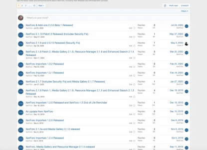
For 2.2.0 beta 1, article forums can list their contents either in standard thread listing format, or the new 'expanded' view.

Screenshot 2020-07-31 at 11.37.39.png Screenshot 2020-07-31 at 11.37.28.png

With 2.2.0 beta 2, these options have had a re-think.

Screenshot 2020-07-31 at 13.02.24.png


We have renamed the 'Full' option, which shows a standard thread listing to Standard. (We have also renamed any other instances where a thread listing is shown from full to standard, you'll find this mostly in widget options)

Expanded view​

Screenshot 2020-07-31 at 12.42.37.png
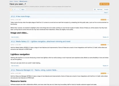
The existing Expanded option has been revised, and now pulls a modified version of the full article first-post template that removes the footer controls and adds the article title.

If you set the snippet length option here to 0, the entire first post (the article) will be rendered in the list, such that multiple full articles are visible on the listing page, much as you would expect to find on a blog.

Of course, you can choose a snippet length if your articles tend to be very long, or if you want people to view articles on their own canonical page along with their comments.

Preview​

Screenshot 2020-07-31 at 12.54.25.png
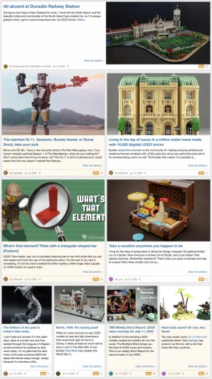
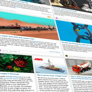
Preview is our new, third display option for article listings.

It displays article blocks in a responsive grid, with the first article on the page occupying the full width of the page, the next few being half-width and the subsequent blocks occupying a quarter width. The grid is entirely CSS driven, and I'm sure we'll see all manner of different layouts in use with custom CSS before too long.

Preview mode is intended to be used with a snippet of the article text, and includes the ability to show a cover image, which currently fetches the first embedded image from the article, whether that be hot linked with an [IMG] tag, or directly attached. If no image can be found, the layout will gracefully omit the cover image.

The most important info about the article is all here, including the author's name and avatar, a link to the comments and indicators to show unread comments.

Inline moderation works in all article listings now.

Screenshot 2020-07-31 at 13.01.01.png

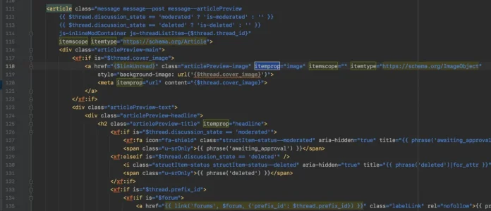
Similar schema.org metadata markup to that in full and expanded articles is also present in previews.

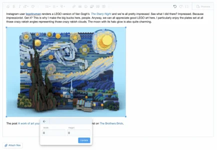
It's worth noting that the cover image only has to be the first embed in the article in order to be used as a cover, but it does not necessarily have to be visible. A sneaky trick to get a cover image that is separate from the content of the article is to set its width and height to 0, rendering it invisible in the actual article body.

Screenshot 2020-07-31 at 12.52.40.png

Conclusion​

Article threads and forums are an important part of the feature set for XenForo 2.2, and one that we intend to continue to develop as time goes on. This is probably as far as we'll go for 2.2, but we hope that you'll be happy with what we've done so far.

I should also add some credit to The Brothers Brick, whose excellent RSS feed populates my article test data - Kier
 
Hi Guys, Very excited to see these big steps in the software. I'm happy to see the innovation and obvious development to make all of our forums more relevant and useful in 2020. Keep up the great work. Looking forward to the final version and the future.
 
It displays article blocks in a responsive grid, with the first article on the page occupying the full width of the page ...
I noticed that beyond the first page, the top article continues to occupy the full width. I know that's what it says on the tin, but it appears a little jarring to have an "old" article randomly emphasised this way. Is this behaviour intended, or am I being unnecessarily triggered?

Loving these improvements btw!
 
Good point @Myke623. With the layout, designed to highlight the newest as largest... that logic breaks as you paginate and perhaps they should be all small boxes, or, I think medium and small is a nice look and compromise, leaving out only the large one which in turn showcases it on page 1. So, as is now, but on page 2 and on... medium/small.
 
Last edited:
I noticed that beyond the first page, the top article continues to occupy the full width. I know that's what it says on the tin, but it appears a little jarring to have an "old" article randomly emphasised this way. Is this behaviour intended, or am I being unnecessarily triggered?

Loving these improvements btw!
It makes sense to not have full width beyond first page.

you should make this a suggestion
 
OTOH, I'm presuming there would be an option to use this kind of cascading view or not. Ideally option to have the original preview layout, the new preview layout, or full columns display (variable width).

EDIT: Oh, looks like there is no option for the preview layout :(
 
Last edited:
Yes there are tools to convert individual threads, a batch of threads based on criteria or entire forums to a different thread/forum type. We talked about this in the latest HYS thread.
 
I would restyle this slightly in my own forums. I am thinking I would increase the text size of the attribution bar at the top since I find it to be a bit lost. Just a few tweaks in, and this is what I came up with. Notice I removed the redundant attribution and date immediately below the article (thread) title, although that may not be possible forum-wide without some alterations, or a conditional to remove it only if the thread type is "article."

View attachment 232373

And I just wanted to add that this is really going to change how I look at forums in the future. I am already thinking of ways to use this on existing threads to help differentiate them more as content vs. discussions. 👍👍
You don't need that attribution bar. The previous style of username display should be there but hidden by CSS.
You can enable it.
 
Last edited:
Even if the category is selected with a "article" view, is there no option to make thread such as questions and answers?
When the article is selected in the settings, the thread type cannot be changed. It would be better if there was such an option.
 
Even if the category is selected with a "article" view, is there no option to make thread such as questions and answers?
When the article is selected in the settings, the thread type cannot be changed. It would be better if there was such an option.
Mods with the correct permission will have a tool for changing thread types per below.

 
That's not what I want to ask.
I choose a node type as an article. (to get the grid view) When there is an article, I cannot select topics as question-answer or poll.
It can be held when there is general discussion, but not in article type.
 
You can request a modification, but I am pretty sure XF is not going to render the article type pointless by making it a global display mode.
 
Definitely a suggestion thread item.

One thing I would like with articles is the ability to upvote them as you might a suggestion instead of just reacting. But that's just me musing based on a possible use case so I haven't posted a suggestion yet.
 
In article type nodes I would like to have the titles bolded when there's new replies like regular nodes do. I feel the user has been trained to scan for bolded titles as they scroll a forum. If the titles are always bolded as they are now then that goes against the user expectations found in the other node types.

I like the recent change of changing the comment icon's color to denote new replies instead of the previous 'New replies' text added as that was having some spacing issues on some of the lower articles in desktop view.
 
I like the recent change of changing the comment icon's color to denote new replies instead of the previous 'New replies' text added as that was having some spacing issues on some of the lower articles in desktop view.
Unfortunately that is not good for those who find change of icon color does not help those who have trouble seeing that or any color. The text 'New replies' is a more clear and consistent indication that there are new replies. Not a fan of that change (n)
 
Back
Top Bottom