XF 1.2 Anyone tried new Adsense Smart sizing ads? Problems...

Moddis

Active member
Adsense just recently release an improvement to their Responsive ads called Smart sizing. It actually pretty great and works perfectly by changing the ad size even on screen orientation change.

However, it does not seem to work too well on the desktop version of xenforo. When placing the new code into the ad_message_below template and when the actual post is shorter than the right side user block, the .messageList .message height does not increase to allow the banner to fit into that post section and just pushed into the next.
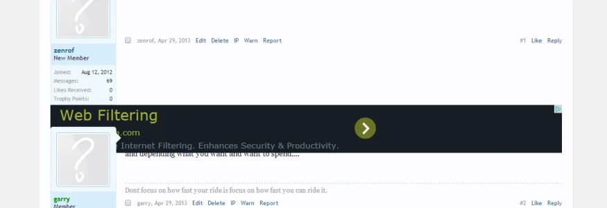
upload_2013-12-28_17-39-9.webp

Are you running into the same issue? Is this a google problem or is there an easy fix I can add to my template?

BTW - The new code looks like this:
Code:
<script async src="//pagead2.googlesyndication.com/pagead/js/adsbygoogle.js"></script>
<!-- BottomBreadcrumb -->
<ins class="adsbygoogle"
     style="display:block"
     data-ad-client="ca-pub-PUB-ID"
     data-ad-slot="8921468886"
     data-ad-format="auto"></ins>
<script>
(adsbygoogle = window.adsbygoogle || []).push({});
</script>

I did not want to temper with their code too much because everything is supposed to be automatic and responsive but I did try removing the display block and changing it to something else which did not help.

Thanks for your input.
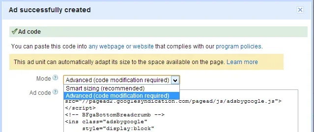
 
Looks good thanks. I have been using the Responsive ads(Advanced Mode) along with media queries which is working out pretty well. However, just noticed the new code type (Smart sizing) for the responsive design (which is now recommended based on google) and though would give it a try and not have to worry about any additional CSS on my end.

upload_2013-12-28_18-15-53.webp
 
It seems they finally followed through on their promise to make it dynamic.
However, it doesn't seem to work on my site so I wonder if I need to update my ad units.
 
Yeh.. the update on making it dynamic is awesome but its a bummer for me because I'm not fully finished with customized all my ads using media queries but at the same time cant convert to the new ad code since it does not fully work.

Please do let me know if you end up with it working somehow with some tweaks to message style...


Update:

Seems like the adcode is correctly showing under the post because google thinks it has enough room to display it there since the message list element is 960px wide. The problem is that its not counting for the additional elements floating inside (like the user block). Not sure what to do with that...

upload_2013-12-28_19-49-49.webp

Update 2:

I was able to encapsulate the google ad code in inline-block and 100% width div tags which seemed to fix the problem:

Code:
<div style="width:100%; display: inline-block;">

Ad Code

</div>

So far it looks good but do post if if there are other cleaner solutions.
 
Last edited:
Ok, I think I'm starting to figure this new ad code out...

Basically, you still need to put it in a container as you would your older responsive ad code and you still need media queries if you want that container to change along with display size therefore changing the google ad size. If you leave out the container and the sizes, it will just use the next container it finds and deliver ads all shaped and sizes as long as it fits the width. As an example, on a mobile device in horizontal view, it showed me a 728x90 banner but on a vertical orientation, it gave me a 200x200.

Another interesting thing I found is that if you just add "data-ad-format="auto"" to your excising ad code, it will dynamically change the ad content based on orientation. However, I don't know if this is a problem with google if you don't use the exact ad code specified.
 
Just checked and all of my templates are already using the latest code so all I need to do is change the mode for each ad unit :)

I note though that it is still not dynamic - it still requires a page refresh to serve the correct sized ad unit.
 
Just checked and all of my templates are already using the latest code so all I need to do is change the mode for each ad unit :)

I note though that it is still not dynamic - it still requires a page refresh to serve the correct sized ad unit.

It doesn't work on PC when you resize window but it is dynamic on mobile when you change screen orientation. This is probably good enough for now because I doubt anyone will be rotating their monitors or resizing browser.

EDIT: I bet the trick that google users is that they automatically get both ads ready for you since they know ahead of time the vertical and horizontal resolution of your device. Just guessing...

Thanks for the info.
What are the media queries you are referring to exactly?

I mean that you still needs a container around the new responsive adsense mode to prevent if from showing 250x250 ads in places where you might want to display a 234x60 if someone is viewing on mobile device with screen width of around 300px. So in that situation, you would probably want to have a media query stating that if max width is 300px, change the container that the new google code is in to a size that will not allow it to show its 250x250px banner.

I may just leave it for now to show any size it wants as long as it fits my 100% width container just because it can probably select better optimized and higher paying ads if it has a lot more ad options to chose from but it is something I might change latter.
 
Just checked and all of my templates are already using the latest code so all I need to do is change the mode for each ad unit :)

I note though that it is still not dynamic - it still requires a page refresh to serve the correct sized ad unit.

I just retested my new responsive ads (that were dynamic on mobile) and it seems they are no longer dynamic. I don't know what changed but it could be related to it still being in beta.
 
Its no longer working on my specific device but it is working when I emulate using the amazing NEW chrome developer console emulation option!

- First go to Console Settings> Overrides > and check "Show 'Emulation' view in console drawer"
- Open Drawer and select "Emulation" tab
- After you select a device to test with, you can flip between horizontal and vertical view by going to: Screen and clicking on the "Swap Resolution" button in between the horizontal and vertical numbers:

- upload_2014-1-11_1-37-47.webp

upload_2014-1-11_1-40-33.webp
 
Back
Top Bottom