You are using an out of date browser. It may not display this or other websites correctly.
You should upgrade or use an alternative browser.
You should upgrade or use an alternative browser.
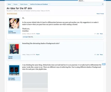
An idea for the XF skin
- Thread starter random
- Start date
I was thinking the same thing. Default skin does not look bad but it is not practical. It is really hard to differentiate the posts. Looks like a mess to me. There are different ways of achieving this. One is using different shades of background color for each post. Like phpbb does.

But this is not the only way. I actually have this problem with skins. I find a great looking skin, but usability is zero. Posts look like a mess. For example, I love the Whisper skin, it looks very nice to me, but it has the same problem.
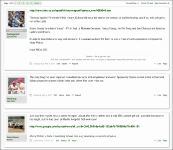
I don't like the DFX skin so much however the thread page looks really good, it is easier for the eyes to separate the posts. But DFX skin does not achieve this by using different shades of backgrounds for posts. There is a grey background behind the posts that make it easy to differentiate between the posts. But in xenforo default skin, there is only a thin light blue line for this which is not enough.

When you just look at a skin, it may look good but for the default skin especially, usability must be the priority.

But this is not the only way. I actually have this problem with skins. I find a great looking skin, but usability is zero. Posts look like a mess. For example, I love the Whisper skin, it looks very nice to me, but it has the same problem.
I don't like the DFX skin so much however the thread page looks really good, it is easier for the eyes to separate the posts. But DFX skin does not achieve this by using different shades of backgrounds for posts. There is a grey background behind the posts that make it easy to differentiate between the posts. But in xenforo default skin, there is only a thin light blue line for this which is not enough.

When you just look at a skin, it may look good but for the default skin especially, usability must be the priority.
tell me what to add to extra.css.I like it simple, but you could easily add some css to make it more obvious....
Firebug....
View attachment 11376
i am all ears.
For me the avatar has been a pretty good indicator of separate posts.
With long posts you can't see the avatar. I'm not saying it is impossible to notice that posts are seperated. It's just not easy for users to automatically perceive. There is a reason why phpbb uses different colors. It is not only about how it looks, it is about how users perceive things without paying too much attention.
Ugh here we go again with the last minute screw ups. No it's fine, please leave it, thank you.
Sorry to be so blunt, but I really feel this style was already perfect the first time it was released. No 'solution' needed. There's a style system for customization.
Sorry to be so blunt, but I really feel this style was already perfect the first time it was released. No 'solution' needed. There's a style system for customization.
With long posts you can't see the avatar. I'm not saying it is impossible to notice that posts are seperated. It's just not easy for users to automatically perceive. There is a reason why phpbb uses different colors. It is not only about how it looks, it is about how users perceive things without paying too much attention.
I've seen long posts before, but again for me I notice when I come across an avatar again that a new post has started. In addition to that, even without signatures, the username, timestamp, and controls on the right at the bottom also catches my eye when I'm at the end of the post.
If posts are so huge that it completely makes it impossible to see the different between one post and the other, please show me one.

If posts are so huge that it completely makes it impossible to see the different between one post and the other, please show me one.
I'm not saying it is impossible to notice that posts are seperated. It's just not easy for users to automatically perceive. There is a reason why phpbb uses different colors. It is not only about how it looks, it is about how users perceive things without paying too much attention.
As I said before, It is never impossible. I just think it is more comfortable for the user.
Did that straight away when I was doing the skin for my remix forumz skin months ago, hehe.I like it simple, but you could easily add some css to make it more obvious....
Firebug....
View attachment 11376
No reason, it was just quicker to enter it there as I copied it from some other css I use.curious why you entered that in misc rather than 'border: all'. all but the shadow can be entered in there, unless i am overlooking an advantage?
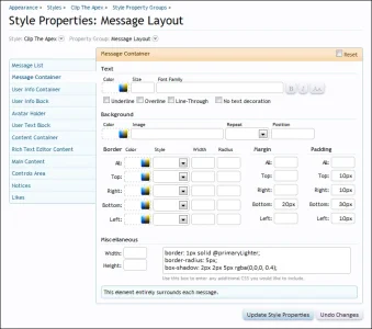
No need for EXTRA.css, you can do it all in Style Properties.
View attachment 11377
View attachment 11380
Brogan,
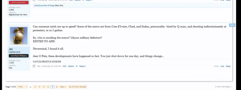
Do I have to edit another section other than message layout? I ended up with just everything but the posts weren't split.
Brogan,
Do I have to edit another section other than message layout? I ended up with just everything but the posts weren't split.
View attachment 11471
What style are you using? I'm using Flexile and it didn't make any difference.
Flexile is a law unto itself when it comes to stuff like this.What style are you using? I'm using Flexile and it didn't make any difference.
You're better off asking in the thread for it, I don't have it installed so I can't help I'm afraid.
The Message Container is for each individual message so I'm not sure how you ended up with that.
Did you edit the correct section?
Did you perhaps do Message List by mistake?
Doh, that is exactly what I did

What style are you using? I'm using Flexile and it didn't make any difference.
Just the standard one
Similar threads
- Replies
- 20
- Views
- 1K
- Replies
- 0
- Views
- 695
- Suggestion
Lack of interest
Idea For 2.0: Separate nodes from node data
- Replies
- 3
- Views
- 620
- Replies
- 0
- Views
- 890
