XF 2.0 Almost got my perfect horizontal postbit but now I'm stuck, can you help me get it right?

Cannabis Ape

Active member
As I want a horizontal postbit instead of vertical I used @mysimsek guide to achieve that.

Although It send me in the right path how I want it is slightly different and I achieved a couple mods that I want but as I'm a newbie now I'm stuck.

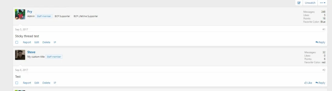
Currently it looks like this:


475svnfnbwpzw.png


And this is the code:
Code:
.message-avatar {
    float: left
}
@media (min-width: 650px) {
    .message-userDetails {
        display:inline-block;
        padding: 10px;
        min-width: auto;
        min-height: 96px
    }

}
@media (max-width: 800px) {
   .message:not(.message--forceColumns) .message-userExtras {
    display: none;
    }
}
.message-userExtras {
    display: block;
    float: right;
    margin-top: -10px !important;
    width: 31%;
    margin-right: auto
}

.message-userArrow {
    display: none !important;
}

.message-userArrow:after {
    display: none !important;
}

.message-inner {
    display: block !important
}

.template-thread_view .message-cell.message-cell--user,.template-thread_view .message-cell.message-cell--action {
    padding: 10px;
    width: 100%;
    max-height: 150px;
}

.message.message--quickReply.block-topRadiusContent.block-bottomRadiusContent .message-cell.message-cell--user {
    display: none
}

.message--simple .message-cell.message-cell--user {
    display: none
}

.message-userExtras dl:nth-child(2n+1) {
    float: right !important;
    width: 49%;
    padding-right: 10px
}

.message-userExtras dl:nth-child(2n+2) {
    float: right;
    width: 49%
}

.template-thread_view .pairs.pairs--justified {
    padding: 3px;
    margin: 1px
}

.message-avatar .avatar {
    border-radius: auto;
    border: 3px solid #d8d8d8;
}

.message-cell.message-cell--user {
    border-right: none;
}
.messageUserBlock .extraUserInfo {
    font-size: 11px;
    padding: 4px 6px;
    float: right;
}
Now I need that part to be above each other and the url space to be wider than it currently allows.

Probably easy fixes but I learn as I go so hopefully someone can help out.

Cheers.
Edit: so like this basically. See how the right side is above each other.

e8pwuqhdl6ja.slack.com_messages_c5xb38p55_.png
 
Last edited:
Yeah sure just add this code:

CSS:
@media screen and (max-width: 768px) {
    .message-userExtras {
        display: block !important;
    }
}
Almost, it also shows on vertical messing the space up.

I think I fixed it. Changed it in min-wdth: 450px

But now the title and badge are not under eachother :LOL: let me check that.
 
Last edited:
@Cannabis Ape are you completely sure you don't have any code above in extra.less that would override that? It worked perfect for me and scaled down perfect when I resized the window and everything.

Here's a screenshot:

ababaOOOUntitled.webp

You'll need to ignore the medals part I never set that up. It should display perfect for you.
 
To reply to your last post. yes if I scale it with a desktop browser it looks ok but when I check it on my samsung s7 it messes up the layout in vertical view.

EDIT:


CSS:
@media screen and (max-width: 768px) {
    .message-inner {
flex-direction: row !important;
    }
    .message-userExtras, .message-userDetails, .message-avatar {
        float: none !important;
        display: block !important;
    }
 
}
 
Last edited:
CSS:
@media screen and (max-width: 768px) {
    .message-inner {
flex-direction: row !important;
    }
    .message-userExtras, .message-userDetails, .message-avatar {
        float: none !important;
        display: block !important;
    }
 
}

EDIT: You can try this and it's basically undoing everything for mobile so if it doesn't work I don't exactly know what to say. It's undoing the code I gave you so should work.

@Cannabis Ape
 
Last edited:
@Cannabis Ape it just needs some padding. Add some padding-left to the user-extras under the media query should fix it. I defaulted it back with the media query so something else must be going on there. Padding will fix it easily. It seems to work for the user that doesn't have the large website name in his custom field so just add padding.
 
@Cannabis Ape it just needs some padding. Add some padding-left to the user-extras under the media query should fix it. I defaulted it back with the media query so something else must be going on there. Padding will fix it easily. It seems to work for the user that doesn't have the large website name in his custom field so just add padding.
Tried several padding but maybe you understand me wrong.

I don't need it to show in vertical view
Now vertical you don't see the details which is logical as there is no room but based on BHW I know it's possible when you hold your mobile horizontal you can see the details.
I only need it to show horizontally.

For my this works:
Code:
@media screen and (min-width: 450px) {
    .message-userExtras {
        display: block !important;
    }
}
Now it doesn't show vertically but it does horizontally as I like it.

Although I'm not sure if it's correct as I came up with that one on my own plus what I dislike is that title and badge are next to each other horizontal and vertical.

mb1.webp
 
You could just utilize XF's built-in horizontal message (it's for mobile).

Style Properties -> Messages -> Message single column break point, change this value to like 10000px (it'll activate on any screens below 10000px)
Screenshot_15.webp

Then extra.less:

Code:
@media (min-width: 1000px)
{
    .message-inner .message-userExtras
    {
        display: block !important;
    }
}

It'll hide the extra user info at 1000px, you can adjust to your liking of course.
 

Attachments

  • Screenshot_16.webp
    Screenshot_16.webp
    11.6 KB · Views: 60
You could just utilize XF's built-in horizontal message (it's for mobile).

Style Properties -> Messages -> Message single column break point, change this value to like 10000px (it'll activate on any screens below 10000px)
View attachment 176339

Then extra.less:

Code:
@media (min-width: 1000px)
{
    .message-inner .message-userExtras
    {
        display: block !important;
    }
}

It'll hide the extra user info at 1000px, you can adjust to your liking of course.
Cheers, I have the same code and set on 480px but without the setting in messages and seems to work is that necessary?

Also, I got an issue which you also have on your screenshot, well, if it can be called an issue, probably just a preference but with the horizontal postbit the title and rank are alligned next to each other, any idea how to get them above each other?
 
Top Bottom