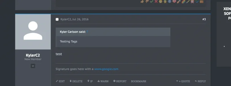
Its showing the arrow on the mobile phone but on the browser on the computer its straight..Do you have the welcome block enabled with the usergroup permissions set for it? The triangle shape only goes on the welcome block.
You are using an out of date browser. It may not display this or other websites correctly.
You should upgrade or use an alternative browser.
You should upgrade or use an alternative browser.
Abyss 1.5.22.0
No permission to download
- Thread starter Dad.
- Start date
Hey guys, I saw UI.X was updated not too long ago. How far off is an update for Xenith and Abyss?
It should be soon. However, I did see here that an XF release is apparently planned for next tuesday, so it may be held off until then
Good to know, thanks Jake!It should be soon. However, I did see here that an XF release is apparently planned for next tuesday, so it may be held off until then
Hey @Mike Creuzer
Just updated to latest version, now the header looks bad on mobile.

Any idea how I can line everything up again? What would be even better is if the logo was centered with the navigation trigger left of it and the visitor tabs trigger to the right, all lined up. Never made it work though.
Just updated to latest version, now the header looks bad on mobile.

Any idea how I can line everything up again? What would be even better is if the logo was centered with the navigation trigger left of it and the visitor tabs trigger to the right, all lined up. Never made it work though.
Sadly something like this is tough. The reason we broke it to the next line is because most people have long logos. So it broke their nav.Hey @Mike Creuzer
Just updated to latest version, now the header looks bad on mobile.

Any idea how I can line everything up again? What would be even better is if the logo was centered with the navigation trigger left of it and the visitor tabs trigger to the right, all lined up. Never made it work though.
So it is possible to do what you want to do.
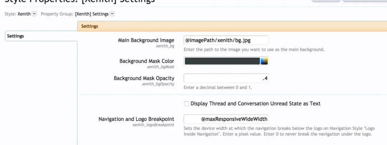
Go to Style Properties > Xenith Settings. Find Navigation and Logo Breakpoint, set to 0.

The above post should fix this issue as well. Its not an issue really, its by design.And the logo doesn't show up in sticky navigation on mobile either now. Hmm.
The above post should fix this issue as well. Its not an issue really, its by design.
Forgot to say, the logo in sticky nav issue wasn't fixed. Only the header design was. Any idea?
Looks like its showing up for me. You may want to change the in nav logo width value. Globally if not just for the sticky nav. The former is a style property in UI.X Logo I believe. The latter requires custom code.Forgot to say, the logo in sticky nav issue wasn't fixed. Only the header design was. Any idea?
Mike Creuzer updated Abyss with a new update entry:
Update to 1.5.9, major sidebar improvements and all bugs reported fixed
Read the rest of this update entry...
Update to 1.5.9, major sidebar improvements and all bugs reported fixed
See full release notes here: https://xenforo.com/community/resources/ui-x.2239/update?update=19885
Read the rest of this update entry...
Mike Creuzer updated Abyss with a new update entry:
Minor regressions from pre-1.5.9, all bugs fixed to date!
Read the rest of this update entry...
Minor regressions from pre-1.5.9, all bugs fixed to date!
See all updates here: https://xenforo.com/community/resources/ui-x.2239/update?update=19952
Read the rest of this update entry...
Hey @Mike Creuzer
couple of issues since latest update. First, these icons are really close together now.

Second, sidebar padding on mobile view. Left has some, right has none.

Finally, under message user info the normal gray background is used (same as behind post content). I feel like the lighter gray should stretch all the way down. It did before.

Smooth update overall though.
couple of issues since latest update. First, these icons are really close together now.

Second, sidebar padding on mobile view. Left has some, right has none.

Finally, under message user info the normal gray background is used (same as behind post content). I feel like the lighter gray should stretch all the way down. It did before.

Smooth update overall though.
This was because on mobile the icons we felt were too far spaced apart. You could increase this to your liking, it would be the navLink padding in Header and Navigation style properties.Hey @Mike Creuzer
couple of issues since latest update. First, these icons are really close together now.

https://gfxf.net/image/ErG
Hmm, this seems odd. I checked your site and its not quite happening for me. Is it happening on guest view for you on chrome? Or rather, what browser are you able to replicate this on?
Finally, under message user info the normal gray background is used (same as behind post content). I feel like the lighter gray should stretch all the way down. It did before.

Smooth update overall though.
Hmm this isn't happening on our demo:

Might want to try reverting a few related style properties or checking if you wrote any custom CSS that might conflict.
Thanks Mike.
This latest update also has brought back a freezing issue. Leaving the Chrome tab for a while then coming back, the forum is completely frozen. Myself and lots of other members notice it.
What does Force Reinstall do under admin.php?uix-styles/? I might see if that fixes the issues, hopefully I don't lose any customizations. My style tree is like this,
[AD]Abyss
--- Abyss (edit)
Any help would be appreciated ! Thanks
https://i.gyazo.com/1061ee252ab3d450be1ed6b9fc33df88.png
Custom Node Add On didn't work well with it. Disabling fixed the Issue..
Last edited:
