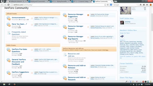
XF 1.1 2 Column Category's?

They have modified their forum display to work with tables and not lists as the default software does. If you ask the owner, they may be able to share it.
 
The fastest way would be:
Code:
.sectionMain { column-count: 2; -moz-column-count: 2; -webkit-column-count: 2; }
However, this doesn't respect the category divs. It's an ugly & imperfect solution, though it may work out based on how many nodes you have (although, even thinking about that, responsive might create problems which would need to be addressed...). If you really want it to be like the site you've linked, you're going to have to do a bit of coding.

Quick screenshot of the code I posted:
Screenshot (123).webp
 
This will sort your categories into two, three, or four columns depending on the width of your browser window. Similar to how the original site does it, only without the JavaScript creating tables. CSS media queries, babes. ;)

I based the max/min widths on what I thought looked good with the default XenForo style, so you'll likely have to adjust sizes based upon your style.

Code:
/* Two columns */
@media (min-width: 1280px) and (max-width: 1700px) {
    {xen:helper clearfix, '.nodeList'}
    .nodeList .category.level_1 {float: left; width: 50%;}
    .nodeList .category.level_1:nth-child(odd) {
        clear: left;
    }
}

/* Three columns */
@media (min-width: 1700px) and (max-width: 2200px) {
    {xen:helper clearfix, '.nodeList'}
    .nodeList .category.level_1 {float: left; width: 33%;}
    .nodeList .category.level_1:nth-child(4n) {
        clear: left;
    }
}

/* Four columns */
@media (min-width: 2200px) {
    {xen:helper clearfix, '.nodeList'}
    .nodeList .category.level_1 {float: left; width: 25%;}
    .nodeList .category.level_1:nth-child(5n) {
        clear: left;
    }
}
Perfect!!!!
 
This will sort your categories into two, three, or four columns depending on the width of your browser window. Similar to how the original site does it, only without the JavaScript creating tables. CSS media queries, babes. ;)

I based the max/min widths on what I thought looked good with the default XenForo style, so you'll likely have to adjust sizes based upon your style.

Code:
/* Two columns */
@media (min-width: 1280px) and (max-width: 1700px) {
    {xen:helper clearfix, '.nodeList'}
    .nodeList .category.level_1 {float: left; width: 50%;}
    .nodeList .category.level_1:nth-child(odd) {
        clear: left;
    }
}

/* Three columns */
@media (min-width: 1700px) and (max-width: 2200px) {
    {xen:helper clearfix, '.nodeList'}
    .nodeList .category.level_1 {float: left; width: 33%;}
    .nodeList .category.level_1:nth-child(4n) {
        clear: left;
    }
}

/* Four columns */
@media (min-width: 2200px) {
    {xen:helper clearfix, '.nodeList'}
    .nodeList .category.level_1 {float: left; width: 25%;}
    .nodeList .category.level_1:nth-child(5n) {
        clear: left;
    }
}
Thank you so much!
Lol :D
 
Top Bottom