You are using an out of date browser. It may not display this or other websites correctly.
You should upgrade or use an alternative browser.
You should upgrade or use an alternative browser.
Implemented Online Status Indicator / move outside of Avatar-image
- Thread starter erich37
- Start date
- Status
- Not open for further replies.
This suggestion has been implemented. Votes are no longer accepted.
OMG just no!
Disregarding the points I made in my post and my specific discussion of that exact suggestion, meanwhile taking a quote out of context to make that point, is not a great way to convince me of your argument...I think the quickest and easiest solution is this one:
http://xenforo.com/community/thread...ve-outside-of-avatar-image.78456/#post-795438
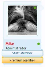
Since XF is already using "banners" and users could quickly change the colors, etc.
It's not often tears stream from eyes due to laughing so much but you managed it.
Disregarding the points I made in my post and my specific discussion of that exact suggestion, meanwhile taking a quote out of context to make that point, is not a great way to convince me of your argument...
sorry, I did not see your post regarding your opinion on "banners".
Where is it ?
It was the line above the one you quoted:
Additionally a banner like that conflates the usage from something that represents a user's status in the community (staff member, premium member, etc) with an unrelated concept (having visited a page on the forum recently).
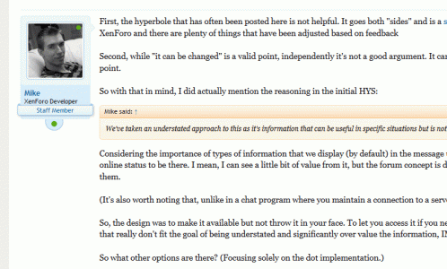
I've seen some examples of really significant banners (over the avatar, full width banners like the "staff member" one, etc) that really don't fit the goal of being understated and significantly over value the information, IMO.
Additionally a banner like that conflates the usage from something that represents a user's status in the community (staff member, premium member, etc) with an unrelated concept (having visited a page on the forum recently).
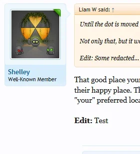
Just a completely different concept:
View attachment 79525
Although this does move the username, I don't think it's quite as distracting as it would be on the main message user info username.
But it's still quite subtle and goes some way to answer some of the feedback so far.
Not to shoot your suggestion down I do honestly appreciate the out of the box thinking. Wouldn't that make simplistic customizations much more difficult for users that like the banner route, and the triangle indicators route. basically any customization really.
Not saying the current placement is the best, imo I personally don't think it is but making alterations, moving it is so simple it's the major factor why I haven't took a disliking to it even though i'm not fond of the placement.
Yeah, more difficult.
It would probably require a two step process. A template edit or CSS to remove the indicator from the controls line, and then additional template edits and CSS to move it back to the message user info area.
I'm still happier with where it is now.
By the way; anyone wondering: the placement in my image is very easy to do if it's something you like yourself.
I understand that the "Staff Banner" is too big, but I think something like this is very nice:
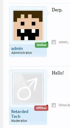
http://xenforo.com/community/resources/rt-online-status-ribbon.1276/
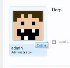

http://xenforo.com/community/resources/rt-online-status-ribbon.1276/

Last edited:
Jay
Active member
I understand that the "Staff Banner" is too big, but I think something like this is very nice:
Just curious, did you read Mike's post and his response to your previous suggestion?
Personally, I like this arrangement
Jay
Active member
Personally, I like this arrangement:
That looks like something you'd do as a customization, not really understated imo.
- Status
- Not open for further replies.
Similar threads
- Replies
- 1
- Views
- 80
- Question
- Replies
- 1
- Views
- 376
- Replies
- 11
- Views
- 1K
- Replies
- 1
- Views
- 279
