You are using an out of date browser. It may not display this or other websites correctly.
You should upgrade or use an alternative browser.
You should upgrade or use an alternative browser.
Implemented Online Status Indicator / move outside of Avatar-image
- Thread starter erich37
- Start date
- Status
- Not open for further replies.
This suggestion has been implemented. Votes are no longer accepted.
EQnoble
Well-known member
Hmmm, I want to have an opinion on this...but I really can't either way. It's an indicator made in css and not that big of a deal to change it and when you consider the arguments being made for either side it is pure opinion and compared to other changes made in updates , it is really of no consequence.
If I was forced to have an opinion on this:
If I was forced to have an opinion on this:
FredC
Well-known member
the dot was hard on the eyes difficult to spot (probably the point) i understand understated but on my forums avatars regularly have a green background (grass) and although i've yet to see how the dot would work on my own forum it also just seemed so ~Bla~ i like the splash of style added to the new indicator..
Shelley
Well-known member
Couldn't you just add the following (as posted before to get the offline indicator displaying?
Code:
.messageUserBlock div.avatarHolder .offlineMarker { display: bloat;}John L.
Well-known member
I like the new bloat display property. I bet a lot of other software uses that fairly oftenCouldn't you just add the following (as posted before to get the offline indicator displaying?
Code:.messageUserBlock div.avatarHolder .offlineMarker { display: bloat;}
The Sandman
Well-known member
Considering the importance of types of information that we display (by default) in the message user info, the online status probably doesn't even rank -- but of course, it was a commonly requested element. I can't say that I see a really compelling reason for the online status to be there. I mean, I can see a little bit of value from it, but the forum concept is designed around asynchronous discussion and discussion involving multiple parties.
That was quite a post Mike. The time you took to write in (and on a Sunday) and the thoughts behind it make it easy to understand XenForo's success.
The one thing I would disagree with (and it's unrelated to the choice of online indicator) is in the passage I quoted above. There's a dichotomy here - of course, forum participation is asynchronous and that's one of the powerful things about forums - it allows users to interact without the necessity of being on at the same time. But there's more to it than that - first, because even when users aren't involved in discussion at the same time, there is the illusion (consciously or subconsciously) that it is sycnhronous - a real-time discussion. To be sure, the illusion is only sustainable on a moderately busy forum.
Second, things change a bit when two or more members of a discussion are online concurrently and the replies are immediate. In that case, there is often an amplification effect - the posts start flying back and forth furiously (sometimes literally). It takes posting to a different level.
Most of the time, I don't really care if a particular member is online when I'm posting and in that case I don't look for them. But sometimes it is important, and I do check. And since as you say this is a commonly requested element, it seems I'm not alone in wanting this information at certain times. I'm glad it's available in XF 1.4!
Grover
Well-known member
This is extremely insulting.
Just because you don't agree with the comments, it does not mean they are not sensible.
'This IS...' you say Paul. I respectfully disagree. It is not how things are. However, it is how you interpreted it. The only thing I meant is that I found @Eric Russell 's comments sensible, especially compared to the comments that took things into the ridiculous. Hence why I said:
Nice to see someone talk sensible in this thread that some feel the need to be taken into the ridiculous. I would have hoped/wished for a more mature discussion.
I have said nothing whatsoever about the normal (non-taken-it-into-the-ridiculous) comments that express another -even so valid- point of view. This is obviously what a forum is all about: expressing our different point of views.
Communicating through digital means (especially written words) is not always easy, because one does not know how the person on the other side of the digital highway meant his or her words.
Bionic Rooster
Well-known member
Actually I prefer the Green Dot. The Wedgie looks kinda......well you know.....G Stringish???
Shelley
Well-known member
Actually I prefer the Green Dot. The Wedgie looks kinda......well you know.....G Stringish???
hmm that gives me an idea. I wonder if we can add in the letter "Y" to sit inside it and rotate it a little. << Class that as a suggestion. Y-fronts online indicator.
Martok
Well-known member
If Brogan feels insulted by something, whether you intended it to so or not, then he feels insulted. You can't disagree with how someone feels. How they feel is a FACT.'This IS...' you say Paul. I respectfully disagree. It is not how things are. However, it is how you interpreted it. The only thing I meant is that I found @Eric Russell 's comments sensible, especially compared to the comments that took things into the ridiculous. Hence why I said:
Grover
Well-known member
If Brogan feels insulted by something, whether you intended it to so or not, then he feels insulted. You can't disagree with how someone feels. How they feel is a FACT.
You are right. And again, your remark illustrates perfectly my point of the fact that communicating through written words is sometimes problematic. I am not arguing with how somebody feels, I said that I respectfully disagree that something 'IS' insulting (in this case). It is not. It is how the receiver perceives it. That is what I said, or at least tried to make clear in this wonderful community...
Last edited:
Grover
Well-known member
First, the hyperbole that has often been posted here is not helpful. It goes both "sides" and is a strawman. Similarly, the appeals to authority (that the devs chose it so deal with it) don't really add anything. By definition, we made every single decision in XenForo and there are plenty of things that have been adjusted based on feedback
Second, while "it can be changed" is a valid point, independently it's not a good argument. It can be changed relatively simply and that is something to note, but doesn't really say anything about the validity of any choice and thus is not a particularly useful point.
I am really pleased to see the remarks above posted (all of them, since I completely agree with the 3 points being made). I think it's good for the community overhere to become aware of these points, because (concerning point #3) -especially in the Xenforo Suggestions Forum- one sometimes sees suggestions posted and 'the community' reacts by posting all kinds of tips to change the css/code or whatever to be able to reach the result you (as the suggestion poster) are looking for. First of all: this is very kind (and one of the reason why this community is so great) and appreciated indeed. But... it is not what the suggestion maker is looking for. The intention is namely: to improve the default product.
Hence my own reaction in this lively thread:
This is a feature suggestion to improve the default XF. We know we could change it through CSS, that is not the point. Thank you.
It could be different for some people (?), but I assume one only posts suggestions to improve the default install of Xenforo. That's what I do myself. So the product and everyone using it, benefits. So although it is useful to receive many tips from the community how to achieve what we are looking for in the suggestion, it does not serve the goal of the suggestion. Which is to improve the product for everyone that buys Xenforo.
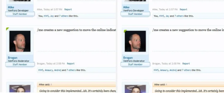
Going to consider this implemented...ish. It's certainly been changed based on feedback.
The current implementation is a big improvement over the first attempt. The way Xenforo is listening to feedback of it's customers and takes it seriously, is one of the reasons I am here and not anymore on vBulletin.com. Thank you.
Last edited:
Shelley
Well-known member
I don't really care where it is, to be honest.
Once 1.4 is out beta, I'm going to make the status text-based (e.g., Status: Online) and have it be the first item in the message user info box elements.
yeah, i mean most people are going to change it so I was always happy.
 << I'll be going for a image based pants status icon myself.
Daniel Hood
Well-known member
Just a completely different concept:
View attachment 79525
Although this does move the username, I don't think it's quite as distracting as it would be on the main message user info username.
But it's still quite subtle and goes some way to answer some of the feedback so far.
I actually like the new indicator in the corner but I did want to make a suggestion to possibly make @Chris D's example work without moving the username. You could make a "holder" element with a set width next to the username that pushes the username to the right x pixels, and then the indicator can go in it if they're online. If they aren't, the padding is still there so the username is in the same spot. Initial instinct would be that the username would have some arbitrary padding next to it if they're offline but if the post has a like, it would actually line up with the text in that element (due to it's padding).
Regardless, I don't care because if nobody has noticed, it is just a dot and really not that big (nor that big of a deal).
erich37
Well-known member
Going to consider this implemented...ish. It's certainly been changed based on feedback.
Well done @Mike
Although, I would have moved it to the "top-left corner" outside the Avatar-image... (so that it does not interfere with the Avatar-image / does not overlap the Avatar-image).

Last edited:
AndyB
Well-known member
- Status
- Not open for further replies.
Similar threads
- Replies
- 1
- Views
- 78
- Question
- Replies
- 1
- Views
- 375
- Replies
- 11
- Views
- 1K
- Replies
- 1
- Views
- 279

