You are using an out of date browser. It may not display this or other websites correctly.
You should upgrade or use an alternative browser.
You should upgrade or use an alternative browser.
Implemented Online Status Indicator / move outside of Avatar-image
- Thread starter erich37
- Start date
- Status
- Not open for further replies.
This suggestion has been implemented. Votes are no longer accepted.
Is that attachment suggesting I was online when I posted a reply?
Is that attachment suggesting I was online when I posted a reply?
No, it's showing where the online indicator is displayed when on responsive view. - the reason the location was chosen by the devs.
One thing to consider is that 90% of the XenForo forums use a default style and will not change the location of the dot, so it's pretty important to choose a location where it will work the best in most situation.
I think the dot is difficult to see against the many different types of backgrounds and would be more easily seen outside of the avatar.
On my forum the feature will be disabled because I see no use for it in while reading a thread.
I think the dot is difficult to see against the many different types of backgrounds and would be more easily seen outside of the avatar.
On my forum the feature will be disabled because I see no use for it in while reading a thread.
One thing to consider is that 90% of the XenForo forums use a default style and will not change the location of the dot, so it's pretty important to choose a location where it will work the best in most situation.
I'm pretty sure that is why it is where it is now.
On my forum the feature will be disabled because I see no use for it in while reading a thread.
I think we all knew that was coming.
After every release announcement there is always at least one instance of bikeshedding.
In 1.2 it was the editor toolbar background colour.
Remember that?
This is clearly the 1.4 instance.
In 1.2 it was the editor toolbar background colour.
Remember that?
This is clearly the 1.4 instance.
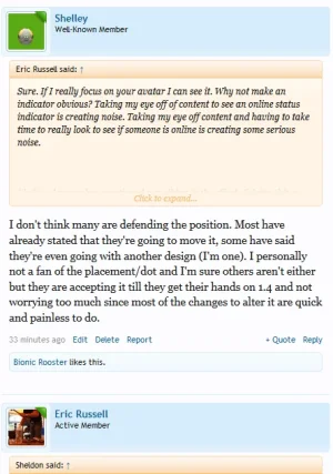
I'll just say, on Xenforo.com I can't tell who is online or not. It takes away from what I'm doing to have to look closely to see if someone is online. I'm not a big fan of being teased. If the developers could go into extra css and change it so we all could see who was online I'd appreciate it.
Brogan, did the editor toolbar background change constantly? Did you have control over how your users viewed the toolbar? Would you prefer your users had control over how others user saw the toolbar?
Brogan, did the editor toolbar background change constantly? Did you have control over how your users viewed the toolbar? Would you prefer your users had control over how others user saw the toolbar?
While I see both sides of this I also do not like the default placement. There is no consistency with it, looks a bit odd and almost looks different on every other avatar.
With that said, I don't mind moving it myself and will likely have plenty of RM submissions to help other do things beyond the default.
With that said, I don't mind moving it myself and will likely have plenty of RM submissions to help other do things beyond the default.
I'll just say, on Xenforo.com I can't tell who is online or not. It takes away from what I'm doing to have to look closely to see if someone is online. I'm not a big fan of being teased. If the developers could go into extra css and change it so we all could see who was online I'd appreciate it.
Unless users have bad eyesight, it's pretty easy to see, even without looking for it and even on green background (except in Chris' case earlier since it completely blended in).
This is extremely insulting.Nice to see someone talk sensible in this thread
Just because you don't agree with the comments, it does not mean they are not sensible.
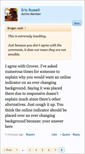
I agree with Grover. I've asked numerous times for someone to explain why you would want an online indicator on an ever changing background. Saying it was placed there due to responsive doesn't explain much since there's other alternatives. Just cough it up. You think the online indicator should be placed over an ever changing background because: your answer hereThis is extremely insulting.
Just because you don't agree with the comments, it does not mean they are not sensible.
The simple answer is, that is what the developers chose to do.
If you don't like it: http://xenforo.com/community/resources/resposition-the-online-indicator.3453/
I don't like the default style.
Guess what? I created my own.
If you don't like it: http://xenforo.com/community/resources/resposition-the-online-indicator.3453/
I don't like the default style.
Guess what? I created my own.
The simple answer is, that is what the developers chose to do.
If you don't like it: http://xenforo.com/community/resources/resposition-the-online-indicator.3453/
I don't like the default style.
Guess what? I created my own.
Well duh! The developers can do what they want and they did.
Are you able to point out a core feature which is hidden in the core style which members have control over? If you're going to defend something at least add some reasoning behind it.
In responsive the current location is very difficult to see.

That's actually quite easy to see -- at least to me.
Looking at Shelley's screen shot, I think she solved the problem of the tiny dot being hard to see.Wow..so much hate directed at something so tiny . . . .
Looking at Shelley's screen shot, I think she solved the problem of the tiny dot being hard to see.
Sometimes, not always simplicity really is the solution. And if you didn't notice the arrow was intentionally left in just on the offchance some still find it difficult to see the online indicator.
- Status
- Not open for further replies.
Similar threads
- Replies
- 1
- Views
- 80
- Question
- Replies
- 1
- Views
- 376
- Replies
- 11
- Views
- 1K
- Replies
- 1
- Views
- 279


