You are using an out of date browser. It may not display this or other websites correctly.
You should upgrade or use an alternative browser.
You should upgrade or use an alternative browser.
Need Customization?
- Thread starter Sheldon
- Start date
Ernest L. Defoe
Well-known member
I can highly recommend @Sheldon to anyone looking to make their pre made style really stand out. I am using Antiquark by @Audentio on my site and other than some of it still looking like Antiquark you wouldn't be able to tell. Sheldon has done an amazing job customizing my site. I let him have free roam to do as he wished but gave a little input and I am more than pleased with the job he has done. If you want to see it in action check out http://www.secforu.ms/forums and you will also be amazed at what can be done by Sheldon.
Sheldon
Well-known member
It seems we have a ton of car forums here... which can be a good thing. Been working on creating a user option for their own "vanity" plates....
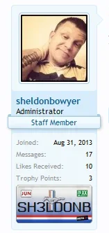
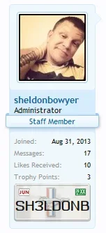
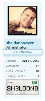
Users would of course be able to select the 8 characters (just going off my state) they want shown on their plate... I'd tag everyone that has a car forum, but I am almost certain I'd be over the limit.. haha.
Anywho...


Users would of course be able to select the 8 characters (just going off my state) they want shown on their plate... I'd tag everyone that has a car forum, but I am almost certain I'd be over the limit.. haha.
Anywho...
Sheldon
Well-known member
are you still doing this?
Customizing, yes.
Ernest L. Defoe
Well-known member
It seems we have a ton of car forums here... which can be a good thing. Been working on creating a user option for their own "vanity" plates....
View attachment 61028 View attachment 61029 View attachment 61030
Users would of course be able to select the 8 characters (just going off my state) they want shown on their plate... I'd tag everyone that has a car forum, but I am almost certain I'd be over the limit.. haha.
Anywho...
That's an awesome idea! I highly recommend @Sheldon for site customization. He is amazing at what all he can do.
Adam Thomson
Member
Mike Edge
Well-known member
Sheldon
Well-known member
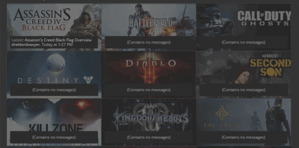
More progress on this concept...
2 different tab images, 3 different looks
--- blue with playstation like background is "active"
--- gray with playstation like background is "hover"
--- solid gray is "inactive"

I think I am sold on the fact gamers don't need to see titles as much, images seem to do the trick. Stats for the most part are useless when first beginning, once you have grown a bit, simply add back in the stats and place where you'd feel they are needed.
Also, you can't see this on smaller screens. For desktop, works and looks good, mobiles and tablets, not so much..
2 different tab images, 3 different looks
--- blue with playstation like background is "active"
--- gray with playstation like background is "hover"
--- solid gray is "inactive"

I think I am sold on the fact gamers don't need to see titles as much, images seem to do the trick. Stats for the most part are useless when first beginning, once you have grown a bit, simply add back in the stats and place where you'd feel they are needed.
Also, you can't see this on smaller screens. For desktop, works and looks good, mobiles and tablets, not so much..
QenTox
Well-known member
Try what part exactly?
My comment was to this part of your comment:
Also, you can't see this on smaller screens. For desktop, works and looks good, mobiles and tablets, not so much..
I guess it would be cool to make changes that work on all PlayStation browsers too
QenTox
Well-known member
Good to know, I might need your services very soon, I like what you can do with sites. But I guess there is a long queue of xenforo owners waiting for you to be available for themIt works on the PS3 browser. Haven't checked others.
Sheldon
Well-known member
My "availability" depends on a lot of different things.... usually the more clear the person is in describing what they want is the best help. A lot have asked me for my ideas... well, when it comes down to it, my ideas mean squat when it is your site, your members, your baby... My ideas are usually way outside the box, the ones that don't like them, really hate the look, the ones that like it, really like it. Not much of an in-between in what I do.
I'm not really comfortable going onto someones site and changing everything to where I think it looks unique (with the exception of those that seriously said I could do what I want... @Mike Edge @Ernest L. Defoe @Azhria Lilu @Daniel Hood ) because in the end, it is not my site. I only did it with the previously mentioned because I feel comfortable enough around them to try things first, ask opinions later, then change whatever needs to be if needed or come to a compromise. With most customers, they like to see progress/implementation on test site/move over to live site. Myself, I prefer to work on a live site (yes, I know sacrilege). The more involved the community is with what is going on, the more motivated I become to change things, make things look better, try out different concepts, etc.
Some things I don't want to touch at all, some themes I refuse to touch, some modifications I feel don't look right on a site and wouldn't put my work on it and attach it to it that way......
Yeah, I am picky and choosy, but then again, I'm not really breaking down the tax brackets with my rates etiher. It's still in major hobby phase.
Lisa
Well-known member
To get the best from @Sheldon you really need to give him carte blanche to just get on with it. As he said, he doesn't conform to inside-the-box thinking and sometimes he'll come up with something really unusual that does make you wonder if it'll work. If you leave him alone to tweak, I've yet to see those unusual things go wrong.You do well what you do and people like it and that is important, right?
Simply put, I can't sing his praises loud enough for the things he's done to my styles
Jeremy
in memoriam 1991-2020
I absolutely love this concept. What does it look like if there are new messages?More progress on this concept...
2 different tab images, 3 different looks
--- blue with playstation like background is "active"
--- gray with playstation like background is "hover"
--- solid gray is "inactive"

I think I am sold on the fact gamers don't need to see titles as much, images seem to do the trick. Stats for the most part are useless when first beginning, once you have grown a bit, simply add back in the stats and place where you'd feel they are needed.
Also, you can't see this on smaller screens. For desktop, works and looks good, mobiles and tablets, not so much..
Similar threads
- Locked
- Replies
- 83
- Views
- 12K
