You are using an out of date browser. It may not display this or other websites correctly.
You should upgrade or use an alternative browser.
You should upgrade or use an alternative browser.
Xenith 1.5.22.0
No permission to download
- Thread starter Dad.
- Start date
@Mike Creuzer when a guest visit my site the see this: ( not ready yet )
View attachment 115918
is it posible to set a fix header like this for members?
View attachment 115920
In Header and Navigation i use these settings: Header Logo Image Path: style/mylogo.png but i makes no difference.
This functionality would be very nice, if it's feasible.
@Mouth What about an eye .. 


Code:
.LoggedIn .discussionListItem .unreadLink {
    font-family: FontAwesome;
        font-size: inherit;
    font-style: normal;
        font-variant: normal;
        font-weight: normal;
}
.LoggedIn .discussionListItem a.unreadLink:hover { text-decoration: none; }
.LoggedIn .discussionListItem .unreadLink:before {content: '\f070';}@mcatze
Thanks... that works for me!
@Mike Creuzer
Hi Mike,
I didn't have a force update option, I did the force reinstall and still the notice doesn't show.
Thanks... that works for me!
@Mike Creuzer
Hi Mike,
I didn't have a force update option, I did the force reinstall and still the notice doesn't show.
Terrific, thanks!@Mouth What about an eye ..
I went with fa-commenting-o: Font Awesome Icons for the icon instead.

I really like this theme; also there are a lot of brilliant suggestions for customisation in this thread.
Feeling slightly overwhelmed by the range of options the theme offers, I'd appreciate any help on the following two issues:
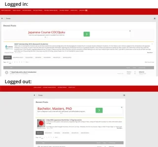
1. I cannot wrap my brain around why there are different widths for users logged in and logged out out (see below). How can I set the width to 94% for both?

2. How do I disable the sticky header that appears when scrolling up? I must be missing something pretty obvious.

Feeling slightly overwhelmed by the range of options the theme offers, I'd appreciate any help on the following two issues:
1. I cannot wrap my brain around why there are different widths for users logged in and logged out out (see below). How can I set the width to 94% for both?

2. How do I disable the sticky header that appears when scrolling up? I must be missing something pretty obvious.

You should try to read & test the style properties for these style. There're so many options to enable/disable, set or unset ..
Point 1 is the "Toogle Width". This can be set in the style properties and the default can be set in the ui.x add-on.
For example ..

Point 2 is an option in the style properties called navigation, this can be enabled or disabled ..

Point 1 is the "Toogle Width". This can be set in the style properties and the default can be set in the ui.x add-on.
For example ..


Point 2 is an option in the style properties called navigation, this can be enabled or disabled ..

@Mike Creuzer @Jake B.
When the "search position" is set anything other than "Breadcrumb" - login trigger button at the top is obscured under some layer. See pic.

I hope you will spot that in your testing and fix for the next release.
@Mike Creuzer you didn't fix this
Anyone else seeing this?
I don't understand why notices work on the demo, but not the release version?
Please help.
Please help.
On mobile devices, for the left hand side slide-out menu, the text navigation items are very pale and hard to read against a pale background. Anyone know where to change the typography and/or background colour for this menu?
Seconded. I've been struggling with this issue too. Can anyone help please?
Audentio told me it was because of a very short-lived bug, and to 'force update'. I don't know where/what that is, so re-downloaded the latest full package from customer area.I don't understand why notices work on the demo, but not the release version?
Didn't fix it though, and block notices still aren't working for me. Cannot go live with my new site design until this is fixed. My support ticket with Audentio is awaiting feedback.
Hopefully they'll resolve the issue shortly.
I agree with @thomas1 and @Mouth - Audentio is lacking with this theme. Quite a few quirks remain. Some of the bugs/quirks are so obvious. I find it hard to believe @Mike Creuzer and @Jake B. can miss those with the quality checks they claim to do before a release.
Having said that I am using this on a live site because it has that fresh look. I wish it had more more bug squashing devs though...
Having said that I am using this on a live site because it has that fresh look. I wish it had more more bug squashing devs though...
Last edited:
Similar threads
- Replies
- 0
- Views
- 675


