You are using an out of date browser. It may not display this or other websites correctly.
You should upgrade or use an alternative browser.
You should upgrade or use an alternative browser.
Xenith 1.5.22.0
No permission to download
- Thread starter Dad.
- Start date
Is it possible to show the background image on the forums list only?
Would like to show the solid color on every other page...
I believe I saw a ticket for this, not sure if it was yours. But this is what it should do by default.
Is it possible to enable the popup login form on the frontpage when i click that Sign Up Now button on the sidebar?
There is a login style for that. It should be under UI.X Header style properties.
I just purchased Xenith but am having problem completing the installation.
Step #6 Enter API key,
Step #7 Appearance --> UI.X --> Styles: Click "Install"
In the middle of installation, I get an error page like this:
View attachment 117316
I should mention there was one thing I found odd: During the FTP process, in the Xenith UPLOAD --> Styles --> Default --> there's a index.html file. However, there is already index.html file in Xenforo. So I just renamed it as index_uix.html and transferred (see below). Not sure if this has anything to do with it?
View attachment 117318
Any help would be appreciated.
It looks like your site is timing out, you may need a server capable of installing themes on XenForo. We offer hosting solutions if you are interested. If thats not the issue, its likely still server side. Many people install the theme just fine without said error.
Is there a way to solve this problem temporarily?
Currently, you can just hide it in CSS. But we have a fix in just a few days to be released.
@Mike Creuzer
I have a style issue on a mobile phone:
View attachment 117340
And on every device my header image looks different
Pc with Chrome logon screen: View attachment 117342
Pc with Chrome logged in screen:View attachment 117343
Chrome on a mobile phone: View attachment 117344
How can i fix this?
Essentially you need to add a media query to reduce the font size of the text. Ill post the code below as someone else has the issue.
@Mike Creuzer
Some of our users report messy headers on Android devices (in both Chrome and Firefox):
View attachment 117347
The menu button is displayed below the site logo on Android, while even being correctly displayed on my old iPhone 4.
The mobile menu doesn't display correctly either on Android: you can scroll to the right in the mobile menu, thereby revealing the jumbled contents of the non-selected tabs.
View attachment 117348
Last but not least, and this has been asked in this thread before: the "Personal details" page on the mobile menu barely have any contrast (light gray background with only slightly darker text) which makes them look like they're disabled. Where exactly can we style them?
View attachment 117349
This code should fix the issue.
Code:
@media (max-width:@maxResponsiveMediumWidth) {

 .uix_textLogo {

 font-size: 12px; /* whatever size works for your logo length */

 }


}
As for contrast, I guess I would just recommend modifying the color palette a bit. I know some have mentioned its a bit bright, so we've added it on our list of improvements to make.
Why are these child nodes presented vertically, instead of horizontally and using the empty space to their right?
View attachment 117479
Hmm very interesting, is this on your dev board in your ticket? Ill take a look if so.
@Mike Creuzer
Any ETA on a 1.5.1 update, Mike?
Is there instructions on how to merge files manually somewhere?
Its coming very soon, sorry for the delay!
YesHmm very interesting, is this on your dev board in your ticket? Ill take a look if so.

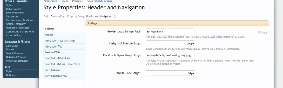
You can change that in:I am trying to change out the default Xenith logo with my own png logo file. In the Settings it says "if empty falls back on logo image on the server" Where can I find this image (which directory folder) so I can change to my own?
View attachment 117842
Style Properties: Header and Navigation
Header Logo Image Path


You can change that in:
Style Properties: Header and Navigation
Header Logo Image Path
@Lindal_Oronar thank you
But doing this for some reason breaks my logo
Last edited:


A couple quick questions:
1.) How should I deal with the template merges after upgrading to XF 1.5.1. Seems it wouldn't automatically merge.
2.)Which template do we use for additional css that would be loaded at the end that we can edit for tweaks.
Thanks!
1.) How should I deal with the template merges after upgrading to XF 1.5.1. Seems it wouldn't automatically merge.
2.)Which template do we use for additional css that would be loaded at the end that we can edit for tweaks.
Thanks!
A couple quick questions:
1.) How should I deal with the template merges after upgrading to XF 1.5.1. Seems it wouldn't automatically merge.
2.)Which template do we use for additional css that would be loaded at the end that we can edit for tweaks.
Thanks!
1. Best to wait for the official Xenith 1.5.1 release from Audentio
2. Extras.css
hello, where can i find the option to make "register now" always shown for everyone, including logged-in users?
i want to replace that with "Create new post" button link
option on admin.php?options/list/uix_welcomeBlock did nothing (the welcome block wont appear at all)
EDIT
btw is there a manual for "where is where"?
so, i want to change some of the icons (the bell icon, the new message icon, etc)
i want to replace that with "Create new post" button link
option on admin.php?options/list/uix_welcomeBlock did nothing (the welcome block wont appear at all)
EDIT
btw is there a manual for "where is where"?
so, i want to change some of the icons (the bell icon, the new message icon, etc)
Last edited:
Just checked your demo, it looks to be behaving correctly.
View attachment 117856 View attachment 117857
Has anyone got this to work when using Google DFP or Adsense?
As per above screenshots, the banner media is not centered.
Depending on the media, this could not work. Such as a flash banner perhaps. It was primarily for image based banners, but in theory could work to any ad properly setup as display: inline-block; But of course this may not work properly if its a block type element a few levels deep or something floated left or right for example. There is no way to center that ad without specific CSS.
I saved it under header and navi:
View attachment 117893
But I get this:
View attachment 117891
And this is is filezilla:
View attachment 117894
Your image URL is Logo8X.png and the path shows Logo8x.png. Note the lower case character, it is indeed case sensitive.
hello, where can i find the option to make "register now" always shown for everyone, including logged-in users?
i want to replace that with "Create new post" button link
I recommend adding in a new button, not editing that one. But regardless, you can find that code inside of sidebar_visitor_panel template.
option on admin.php?options/list/uix_welcomeBlock did nothing (the welcome block wont appear at all)
This setting also requires usergroup permisisons. So if you go to the usergroup you want to see the welcome block, you can go find UI.X permissions to enable ability to view the welcome block.
btw is there a manual for "where is where"?
Its under construction currently, just needing to go in and add some technical bits. Hopefully in the next few days itll be ready.
I agree this would be very helpful;Its under construction currently, just needing to go in and add some technical bits. Hopefully in the next few days itll be ready.
Videos would be a wonderful addition but I assume this is asking too much
Sorry, no.Just checked your demo, it looks to be behaving correctly.
Adjust your browser width so that their is 3 columns, and the node's last post info is on the horizontal beside it - you should then see below.

At second glance, is there even room for gloves next to electronics? I think it might be doing what its supposed to, what there is room for.Sorry, no.
Adjust your browser width so that their is 3 columns, and the node's last post info is on the horizontal beside it - you should then see below.
View attachment 118159
As per my original query on this issue, I'm asking why it doesn't use the empty space underneath the last post details, if so, there is plenty of room for 5 or 6 sub-forum listed horizontally in that space. Not using this empty space makes it look quite ugly and incomplete.At second glance, is there even room for gloves next to electronics? I think it might be doing what its supposed to, what there is room for.
Thanks for your reply, but the fix doesn't work for me. There're no changes after insert the code in EXTRA.css ..
It seems the Problem it a compatibility with the flex part in the CSS and Safari ..
View attachment 110504
How did you change the words "Posts" "Likes" "Points" to icon?

so... how to change the icons for top-right buttons? (alert, new message, notification, login, etc)
At the moment, it requires CSS.
This should be a setting inside the UI.X Sidebar settings.
Similar threads
- Replies
- 0
- Views
- 675