Xenforo on mobile?

Robert9

Well-known member
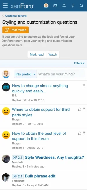
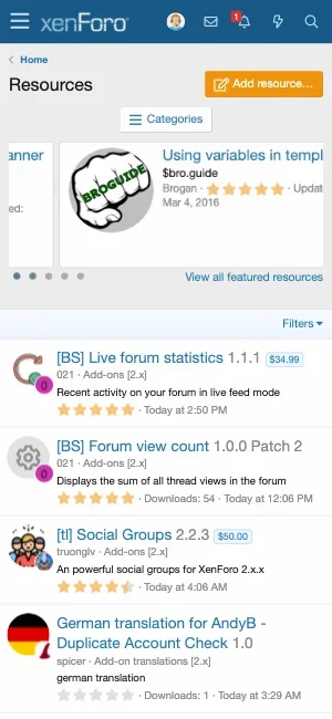
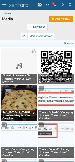
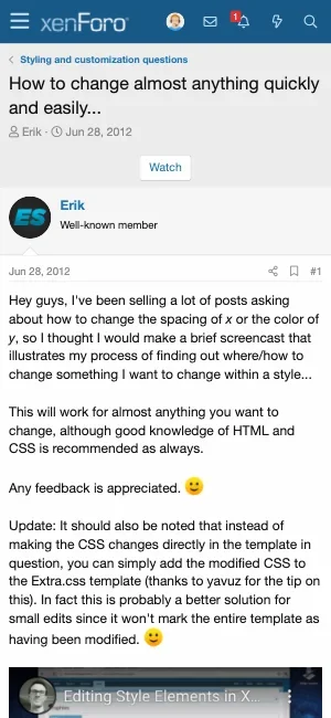
I never use a mobile to view my forum, but maybe more than 60% of my visitors do that. So i tried it yesterday and was shocked.
To many links, to many blabla, it was an absolute terrible experience - and i know what to do and where to click.

From the view of a newbie there could be only one thing to do, close the page!

Now my question: Is there any template for mobiles with a heavy reduction to two points: read and write, please?

 
Maybe you start with the forum itself;
you have so many cats and forums, that some people will hate it.
All the forums for Babies from 0-6, 7-12, 13-whatever should be one forum and prefixes; later if you forum grows you take the threads and put them to forums. Have you ever watched your forum on a mobile? Puh! No fun!

it was much more ugly with the old theme, now it has improved. My only problem is a nice theme compatible with mobile .. It used to be visually very nice, but because the code is too much, it gave very bad scores on mobile google
 
I have started to make a really clean mobile version of a clone of the normal style.
Is there a way to stop template changes for a style? (Yes, i can change the code, so the modify fails).
And how can i get rid of the notices just in this style?
 
@bebekforum

Sorry, i never cared for styles. At the beginning of XF i tried to make one to have back my beloved VB3.8, but it was a stupid idea. Normally no style will be so good as the original one. Because of this i change smaller things, but try to use what xf gives me.
 
@JoyFreak @Robert9 @mcatze
I worked on the child default theme in 10 minutes...
Even if you don't know the code, you can do it in a simple way. Not bad .. Can you give advice?


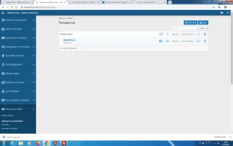
https://www.bebekforum.net.tr/

View attachment 226554
View attachment 226555
I’m currently on mobile but here are my thoughts:
  • logo isn’t clear. Try a light colour and also make it more bigger. Your logo is important to your visitors, it’s what brands you and makes you forum stand out.
  • the image you are using in the header has too much going on. I would remove it completely.
  • I would also remove the background image but if you really want to keep it then I’d advise altering it to remove the “baby” bit as looks out of place with the rest.
  • It should look ok but then you have the problem of it looking like any other start up forum that haven’t made any effort at all to make it different and stand out from the default settings.
Good first attempt though. Try keep it simple. People like simple. As long as it does what the forum needs to do , that’s the important thing.

Edit: go for a different colour, steer away from the light blue. Seems to be overused! Look at brand colours on google for inspiration! There are so many to choose from!
 
I don't see anything wrong with xenforo.

Google is so full of *** by the way with their pagespeed crap. I know because i just made my wordpress site 95/100 on mobile and the user experience is now crappy compared to how it was when the score was 23/100. The site loaded super fast, images and everything loaded at same time. To improve the scores, now the images are lazy loaded as lazy loading is a behavior i remember from dialup days lol, the text is big and the styling of forum is loaded later. Exactly dialup behaviour.

Look at Google own sites and they're crappier than what you experience on web. Loading slow, too much "loading" indicators, look at YouTube yet it's ranked better than sites hundred times more quality.

It's sad but Google is pushing the web to be crappier. We have no choice but to follow the rules but if you notice Google is interested in 2000s era sites. Just a lot of text, keywords, no fancy shmancy features. Waiting for content to load as you scroll down. I hate lazy loading so much, it's very jarring
 
Maybe Mcatze is able to translate my language to a better english text. Xenforo like it is, is well done on mobiles.
I am talking about reducing xenforo (in one style not at all) to a version with less links, because some „normal“ people are just confused with to many things to see and click.

In my first version i have deleted a lot of things like stars, stats, infos, links for report, quote and many things more. The result was very nice to handle as a style just for reading and writing.

Today i try to care for more complicated things like subnavi, notices and other stuff.
 
In that case, it should be easily done with a little bit extra.less. Take a look at the element class and set it to hidden at a special viewport.
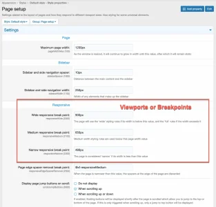
Here are the 3 breakpoints for the extra.less:
Less:
@media (max-width: @xf-responsiveWide) { break at width < 900px; }
@media (max-width: @xf-responsiveMedium) { break at width < 650px; }
@media (max-width: @xf-responsiveNarrow) { break at width < 480px; }

2020-06-01_10-10-53.webp
 
Back
Top Bottom