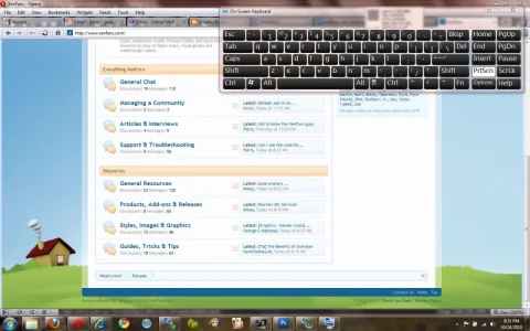
XenFans new XenForo style... gotta love it

It's 100% spreading, so on a bigger monitor the house is visible, like on my 20" where the browser matches up. It keeps it playful. There are more tweaks needed such as a side gradient so the image can be smaller and wrap around the design more. But I don't really want to go public with those images and ideas yet. Baby steps :) The original image is 1024 big, so I can imagine with a forum fixed to 976 that it's filling up your screen. Appreciate the feedback, I've updated my todo list with more checks for the future.


Here's what it looks like to me Floris... don't get me wrong, I like it a lot it's a nice image and a good fresh look, just not showing much of that nice image.
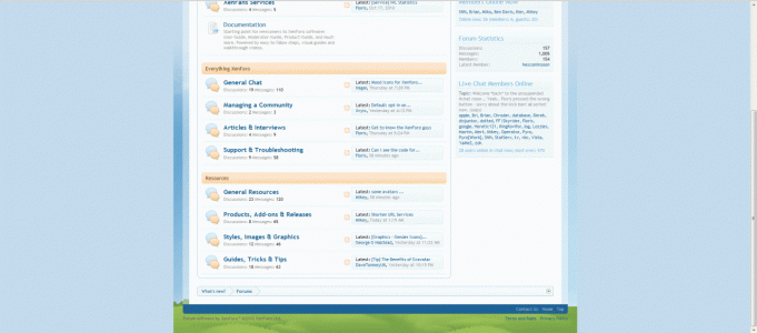
xenfans.gif

Edit.. weirdly the board here has resized this image, it was 1920x1080 from my 23" monitor.

Sorry for the poor quality gif too, it was the smallest file size.

 
I like the look of how the style is evolving. I particularly like the header above the logo something which I already had planned when I push bbsmiley to a live environment except it'll be more similar to the admincp header and about the same height as the admincp header where floris one is much thinner.

Overall, The whole style at xenfans is taking shape. A few little tweaks with the colouring and adding some padding to the top and bottom of the header and it'll (on a visual scale) feel better.
 
Here's a video of how it Should look - and does to me. I will check again tomorrow to see if I simply got confused and used a fluid background trick from 1995 rather than 2005 ;p It's been a bit of a tipsy weekend.

[vimeo still uploading]
To view this content we will need your consent to set third party cookies.
For more detailed information, see our cookies page.

VLC media player plays this original recording just fine: http://dl.dropbox.com/u/693961/xenfans_fluid_background.mov
 
Floris they brought up my point, using a 24" widescreen at 1920 and it could use an improvement. Look forward to seeing the update :)
 
... and I don't see why it had to be pointed out in a thread talking about the fantastic new design elements Floris has added to the site ;)

Thank you, me neither. Let's drop this now and restart the conversation on XenFans great visual design. For me it is now a really great example of how an almost stock XenForo install can look. I sincerely hope that more well-known/bigboards are going to switch to XenForo soon.
 
Top Bottom