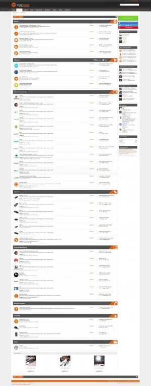
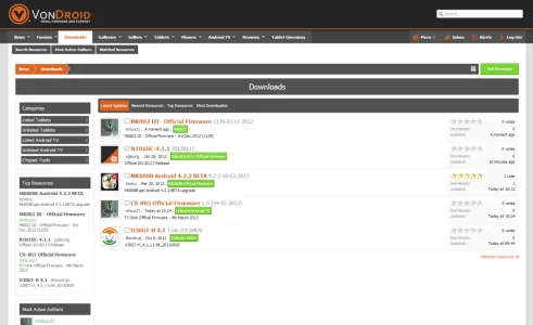
How you do this downloads? To my I would like to have it in my forumHere is the downloads area, guests will have access but I'm still working on the design tweaks.
View attachment 35622
You are using an out of date browser. It may not display this or other websites correctly.
You should upgrade or use an alternative browser.
You should upgrade or use an alternative browser.
VonDroid - critique welcome!
- Thread starter xenTheory
- Start date
Adam Howard
Well-known member
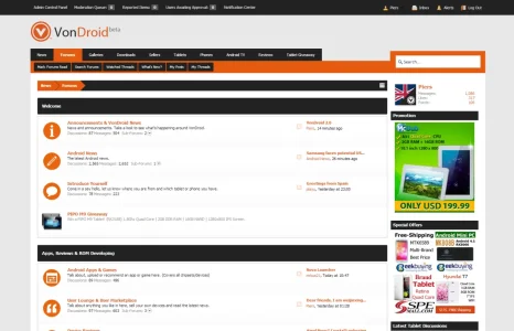
Love the design. Although I would tone down the bright white background. At 3:00 AM, that white look isn't going to make for easy reading.
But overall, I think you've done a fine job.
But overall, I think you've done a fine job.
I've updated the design slightly, added new features and customised the registration button as well as the social integration design. I've also set up automated news on the front page from RSS (can't remember if that's an addon or included with XF) - either way members seem to be happy with it.
Aarmin
Active member
Very impressed!
I'm on the fence about purchasing an Android phone. A couple of certain carriers have no-contract plans and the prices look like they may be starting to get reasonable. I haven't completely looked into it yet, my pre-paid cell will expire in April, so until then I may join.
Forgive me for bringing up forum politics, but I don't see how those silly things work. I always close them out and find theme more intrusive than beneficial. The website itself is how you gain members, not bribery.
I'm on the fence about purchasing an Android phone. A couple of certain carriers have no-contract plans and the prices look like they may be starting to get reasonable. I haven't completely looked into it yet, my pre-paid cell will expire in April, so until then I may join.
You should put in an a delay for your "hi there" notifation for unregistered users. This way uses will focus on content first, be interested, and fx after 30 seconds the notification pops up and users say "yes, I will register"
Forgive me for bringing up forum politics, but I don't see how those silly things work. I always close them out and find theme more intrusive than beneficial. The website itself is how you gain members, not bribery.
Looking really nice Piers  , two things...
the "Category Items" on the left side such as Listed Tablets, Unlisted Tablets ect could use some side padding I feel.
Lastly not sure how much I like the grey title bar on this page as the grey is a little "overwhelming" from the breadcrumb and the tabs. But.... it's great work so far
the "Category Items" on the left side such as Listed Tablets, Unlisted Tablets ect could use some side padding I feel.
Lastly not sure how much I like the grey title bar on this page as the grey is a little "overwhelming" from the breadcrumb and the tabs. But.... it's great work so far
Looking really nice Piers, two things...
the "Category Items" on the left side such as Listed Tablets, Unlisted Tablets ect could use some side padding I feel.
Lastly not sure how much I like the grey title bar on this page as the grey is a little "overwhelming" from the breadcrumb and the tabs. But.... it's great work so far
I agree with the padding - added 10px to the left, However the grey bars are there to keep the design consistent throughout the site. Appreciate the feedback
You seem to have alignment issue with your breadcrumbs (by the orange part) and the arrow overlapping by a pixel or two. Might just be the screenshot fooling the eyes so unsure whether that was by design or my eyes playing tricks on me.
I think I like your other design better. I'm not a fan of the non radius look in your navigation area which seems more exposed in showing the non radius squared look.
I think I like your other design better. I'm not a fan of the non radius look in your navigation area which seems more exposed in showing the non radius squared look.
You seem to have alignment issue with your breadcrumbs (by the orange part) and the arrow overlapping by a pixel or two. Might just be the screenshot fooling the eyes so unsure whether that was by design or my eyes playing tricks on me.
I think I like your other design better. I'm not a fan of the non radius look in your navigation area which seems more exposed in showing the non radius squared look.
There is an issue with the breadcrumbs and other areas, the design is in beta and still not completed. You can see the live version http://www.vondroid.com (username: test pass: test)
There is an issue with the breadcrumbs and other areas, the design is in beta and still not completed. You can see the live version http://www.vondroid.com (username: test pass: test)
I take that back. The screenshot obviously doesn't do your style justice. Seeing the live preview I'm liking the style alot. Excellent work indeed.
I take that back. The screenshot obviously doesn't do your style justice. Seeing the live preview I'm liking the style alot. Excellent work indeed.
Cheers
Although there are parts which I just can't seem to get working no matter what I try, actually the main one being having an image for each nod title, example: 'Tablets'. I have the CSS from before the 1.1.4 update but can't get it working
wouldn't the following work (this is an example) 121 seems to be the ID for your tablets area
Code:
.node .node_121 .forumNodeInfo .nodeIcon, .node .node_121 .categoryForumNodeInfo .nodeIcon {
    background-image: url("@imagePath/xenforo/icons/node121-read.png");
    background-position: 0;
    background-repeat: no-repeat;


}
.node .node_121 .forumNodeInfo.unread .nodeIcon, .node .node_121 .categoryForumNodeInfo.unread .nodeIcon {
    background-image: url("@imagePath/xenforo/icons/node121-unread.png");
    background-position: 0;
    background-repeat: no-repeat;

}wouldn't the following work (this is an example) 121 seems to be the ID for your tablets area
Code:.node .node_121 .forumNodeInfo .nodeIcon, .node .node_121 .categoryForumNodeInfo .nodeIcon { background-image: url("@imagePath/xenforo/icons/node121-read.png"); background-position: 0; background-repeat: no-repeat; } .node .node_121 .forumNodeInfo.unread .nodeIcon, .node .node_121 .categoryForumNodeInfo.unread .nodeIcon { background-image: url("@imagePath/xenforo/icons/node121-unread.png"); background-position: 0; background-repeat: no-repeat; }
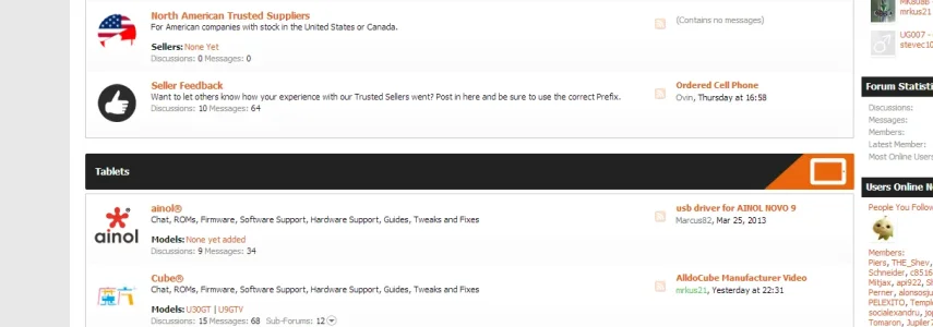
It's the category image that I previously had, it was on the right hand side. Here's a screenshot:

This is the code I used for it which should work unless I've missed something.
Code:
.catImage117
{
    background: url(http://vondroid.com/site-img/vnodes/tablet.png) !important;
    float: right !important;
    width: 120px !important;
    height: 47px !important;
    margin-top:-16px !important;
        margin-right:-14px !important;
}And here's the bit of CSS to control that, I know I've missed something, somewhere.
Code:
.node.category.level_1.node_3 .categoryText,
.node.category.level_1.node_55 .categoryText,
.node.category.level_1.node_96 .categoryText,
.node.category.level_1.node_117 .categoryText,
.node.category.level_1.node_122 .categoryText,
.node.category.level_1.node_147 .categoryText,
.node.category.level_1.node_171 .categoryText,
.node.category.level_1.node_252 .categoryText,
.node.category.level_1.node_207 .categoryText
{
padding: 15px 12px;
background: #222222;
}Similar threads
- Replies
- 1
- Views
- 1K
- Replies
- 7
- Views
- 1K
- Replies
- 5
- Views
- 961
- Replies
- 15
- Views
- 3K
- Replies
- 61
- Views
- 11K


