vBulletin 6 has arrived, what do you think about it?

Miri

Well-known member
Today, I received an email from vBulletin about the new version 6 (X.x.x). I took a quick look, but as a user, I don't see a significant change. The interface design remains the same, including the tabs and panels.

I haven't delved into the specifics of what has changed in the underlying code, but I believe that changes of this nature (at least those mentioned by vBulletin) would be considered minor updates here at XenForo, represented as x.X.x, and not major ones.

I agree that nowadays, there isn't much left to innovate in forum interfaces, but at the very least, with major updates (X.x.x), I would expect a refresh in the design as well.
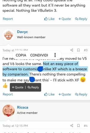
 
Yes, indeed, there's no comparison with XenForo.

When I visit other forums and the text selection-based quoting feature is missing (just a small example), it feels like a fundamental part of user interaction is lacking.

Screenshot_20230823_140502.webp
I don't know about you all, but I absolutely love it.

These improvements and innovations are what make a forum more engaging than others.
 
I received an email about it too.
I've got one forum over there which is going to get upgraded to it.
should be really interesting for my group of members to see if they like it now or still like xenforo's software.
We're waiting for version 2.3 arrives here of course.
Don't know if it will have similar features or what else.
 
I went from UBB to vBulletin and then XenForo. I've tried many others but none have given me any desire to walk away from XenForo.

vBulletin was my favorite for a long time... I really liked vB3 and vB4 - but NOT vB5. I see vB6 seems to have "groups", which is nice, but the interface looks terribly outdated to me, and I didn't see anything in the features that surprised me. I'm not sure how Shopify can be integrated - that does seem interesting. I imagine you can sell items in your Shopify store right through messaging - and yeah, that does sound nice - but not something that makes me want to switch.

I have many old vBulletin licenses and, in the past, I've always updated one to install the latest version - but I will pass this time...
 
The style looks rather bland but they did integrate Shopify so that has to be good. They added CK Editor 5, Font Awesome and reactions. Nothing big at all. They could update the software all they want but it’ll never be anything special. Nothing like VBulletin 3.
They have plenty of built in styles for you to look at.
That's the beauty of it. There's a lot of hidden stuff in both version vB 5 and vB 6.
Of course there'd be stuff in it you don't actually like. But that's the beauty of it. You can do what you want with it.
 
I looked at a demo from the admin side. The page builder is still confusing. There seems to be no straight "text" block? I see an HTML one, but I'd rather use a WSYWIG or BBC editor for styling the page content. Still not good enough for me.
 
At first glance I’m not impressed. I was browsing from my phone and the default style seems to lack attention to detail. The dropdown menus, especially on mobile at least (haven't checked on desktop), are kind of ugly. For example:

uyxXSiR.png


Not sure what's going on with the search button there and the black text against blue background looks hard to read. I also found instances of the text cutting off on mobile and not wrapping properly in the Recent Articles widget. This should all be easily fixed, but the fact that it's looking like this just after a major release, isn't a good first impression. I caught these issues just quickly looking at it for a few minutes :\
 
I've taken a look at it and this should have been vBulletin 5.8, at best. That Shopify integration could have been via an addon, but I could see it's usefulness for some sites.

Everything I'm involved with now, is on XenForo and I see nothing in this 'vB 6' release that would draw anyone back.
Notwithstanding that the third-party market is essentially dead and finding developers to bring a 1:1 parity [with an existing production site] would be expensive if not nearly impossible due to either cost or technical limitations.
 
At first glance I’m not impressed. I was browsing from my phone and the default style seems to lack attention to detail. The dropdown menus, especially on mobile at least (haven't checked on desktop), are kind of ugly. For example:

uyxXSiR.png


Not sure what's going on with the search button there and the black text against blue background looks hard to read. I also found instances of the text cutting off on mobile and not wrapping properly in the Recent Articles widget. This should all be easily fixed, but the fact that it's looking like this just after a major release, isn't a good first impression. I caught these issues just quickly looking at it for a few minutes :\
Haha you sound like their former developer!
But seriously yes you're correct. They said that they were going to fix everything up.
 
Back
Top Bottom